This work was undertaken by the Sheffield City Council Business Intelligence team from around September 2023. New analysis was carried out on available data with the aim of understanding school attendance Sheffield and informing the requirements of the city’s response. This report summarises the findings of that analysis, along with commentary derived from discussions of those findings with colleagues in SCC, Learn Sheffield and from Sheffield schools.
This report covers the following:
recent trends
benchmarking and comparisons
key drivers of absences
demographic differences:
age
gender
ethnicity
geography & deprivation
distance to school
young carers
severe absence (<50% attendance)
the absence patterns of annual year cohorts
day level data analysis - mapping out a school year
Within the same analysis but out of scope of this report are:
special educational needs (this is covered in depth in the SNA report)
the performance of individual schools
exclusions
the reach and effectiveness of existing teams, services and interventions
some terms & definitions
Unless otherwise stated, absence refers to both authorised and unauthorised absences. Correspondingly, attendance refers to registered time in the classroom. Absence in this report may include periods of study leave, approved offsite activity
Unless otherwise stated, the word year refers to the academic or exam year. So 2023 refers to the period of schooling between September ’22 and July ’23.
1.2 Data sources & processing
Attendance, exclusion and school registration data and student details used in this report are from Capita One, retrieved from the OSCAR database, which is maintained by the Performance & Analysis Service (PAS). Supplementary information on school types and locations, geography & deprivation are held in spreadsheets.
An R script gathers, combines, processes and aggregates this data into a data model. That data model was last updated 16/8/24 to include the first release of the full year 2024 attendance data.
1.3 Release notes
1/7/24 - Giles Robinson. First complete draft for circulation.
16/8/24 - GR - updated with latest data, full 2024 academic year, various revisions, analysis of daily data; young carers
9/5/24 - GR - significant update with data now available up to Easter 2025.
2 Trends
Recent changes in overall attendance, by the major reasons covered by Department for Education (DfE) absence codes. We also discuss some codes that do not count as absences, but contribute to the picture around attendance, such as late present.
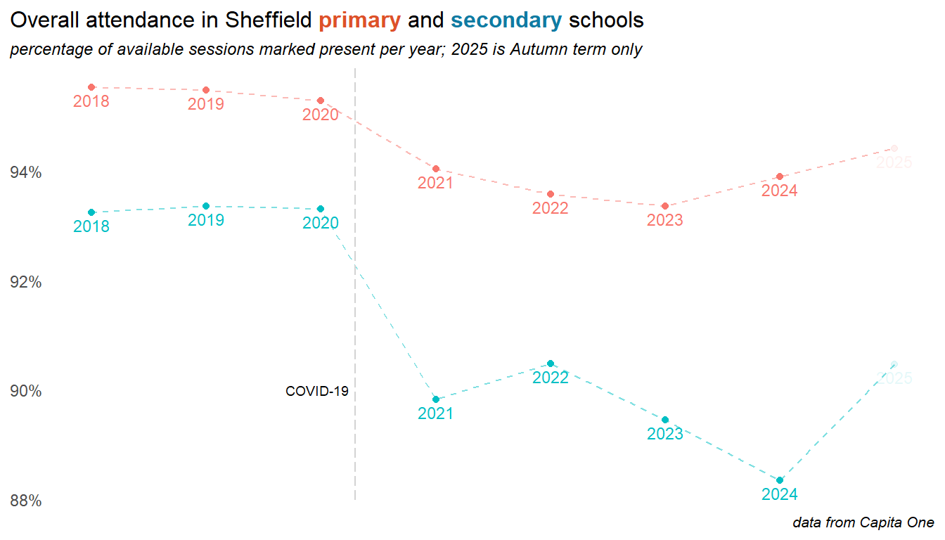
2.1 Overall attendance
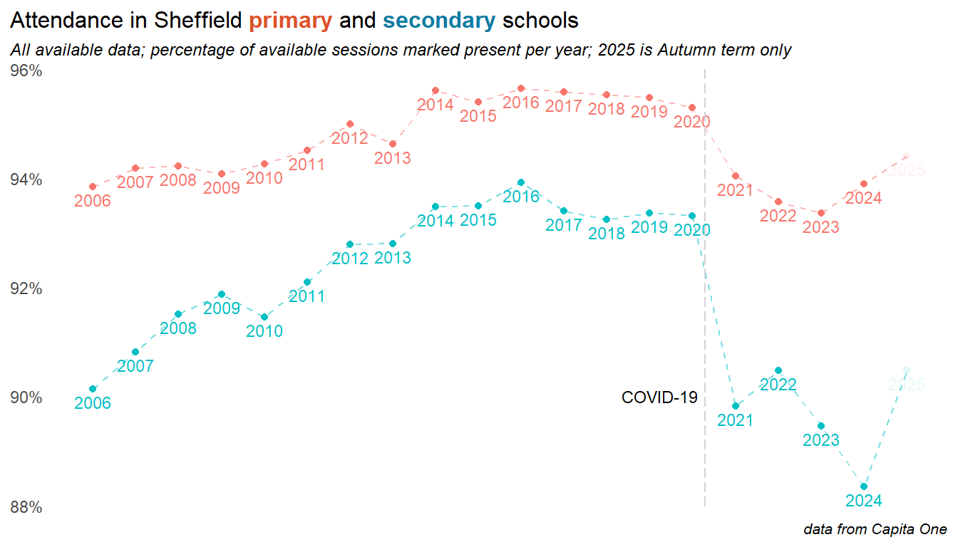
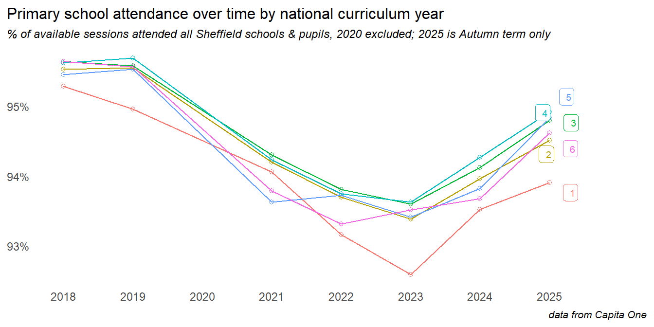
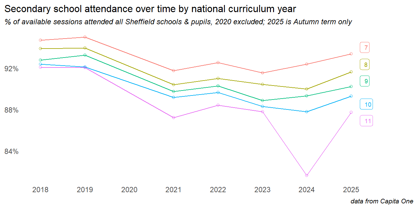
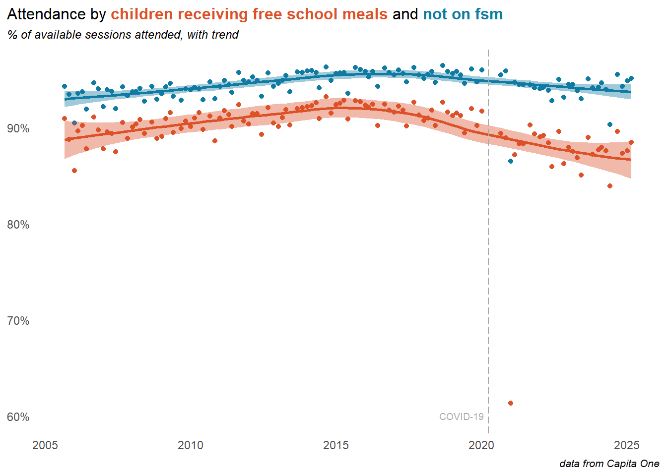
The COVID-19 pandemic and lockdowns saw a significant drop in attendance rates - although many of these trends beggan before the pandemic. Secondary age pupils were affected more than those in primary. In 2024 a gap continued to grow, with primary school attendance improving but worsening in secondary (though this was, in part, a result of the return of study leave as a coded reason, accounting for around 1% of secondary absences).
Important
At the time of writing (May 2025), there has been a significant shift into the current year. Primary school attendance continues to improve, while secondary has improved sharply on the previous year.
Our data prior to 2018 is less reliable and less complete, but taking a longer view suggests that at least some of the drivers of recent trends predate the pandemic. Attendance was improving to a peak in 2016, and was gradually dropping away from there, particularly in secondary schools. Things were getting worse before COVID, but the pandemic changed everything - despite recent improvements, attendance in Secondary schools remains well below pre-pandemic levels.
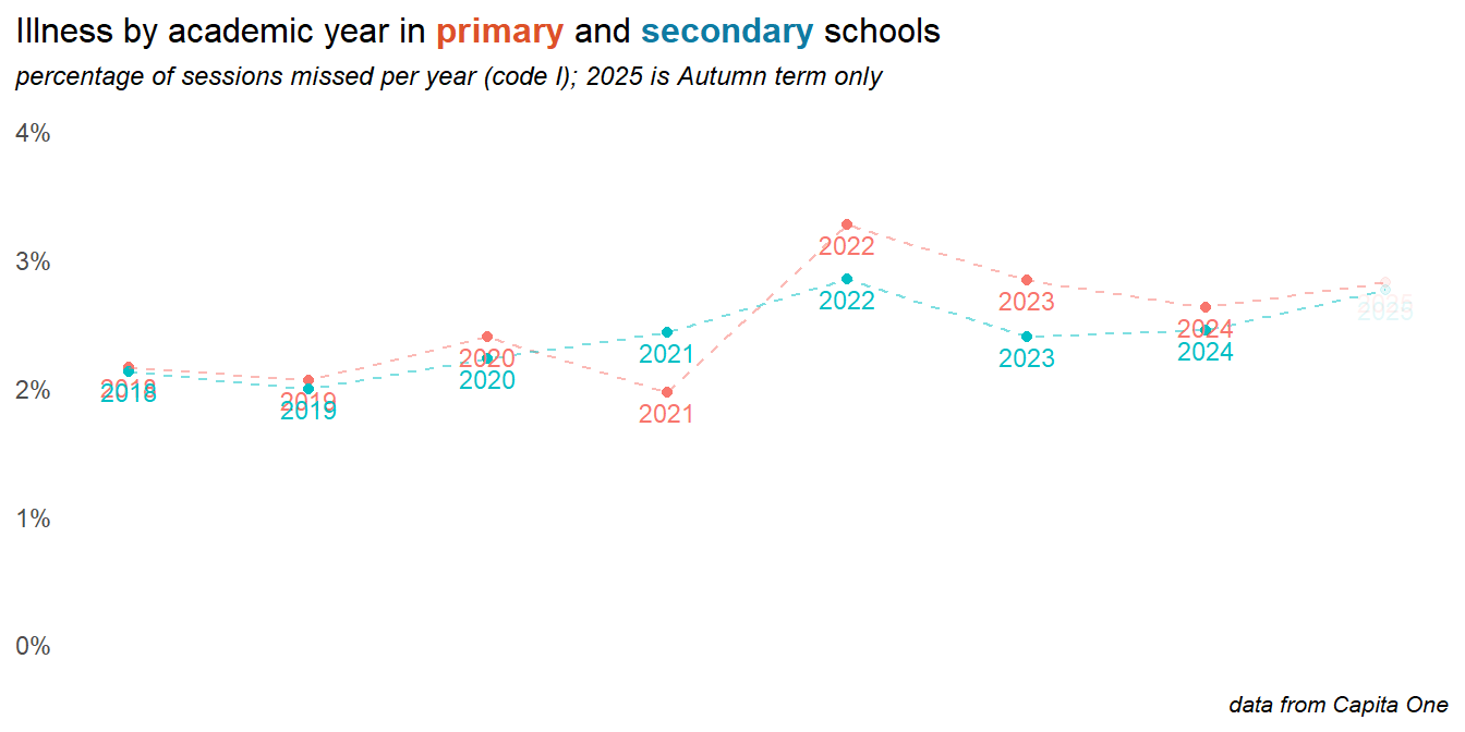
2.2 Illness
The recorded data on illness shows an increase year on year. The big rise into 2022 particularly affected primary age children, and was probably a mixture of COVID-19 itself and post-lockdown viral bounce-back. Illness rates increased slightly into 2025.
Caution
Patterns in the day level data, and feedback from head teachers suggests that we are probably not seeing the true picture on illness. Differences in reporting (and the honesty of parents), policy and recording may be as significant here as changes in actual illness.
recomendation
The data on illness is worth monitoring in 2025 and considering in relation to schools’ recording policies, particularly at the day level, and in proximity to bank holidays and half term holidays. It’s possible that the new DfE rules around penalty notices and family holidays will create perverse incentives to increase reported illness rates, especially as we head into the 2025 summer term. It might be detectable in the day level data (see later in this report).
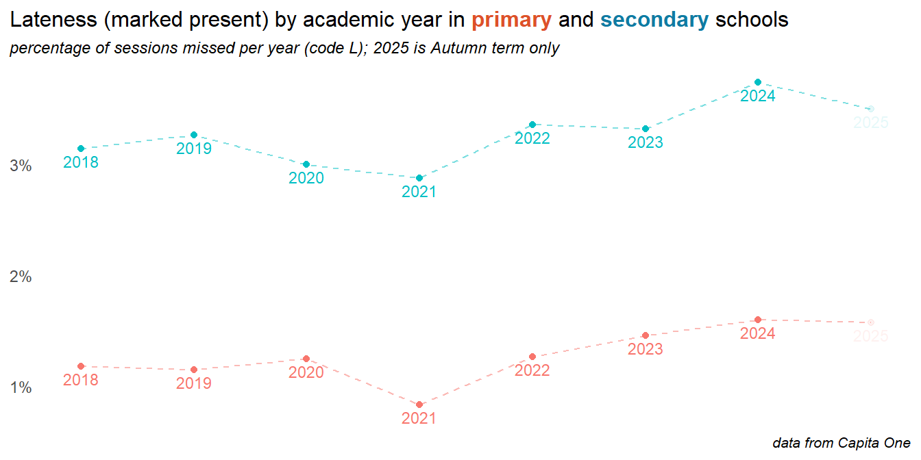
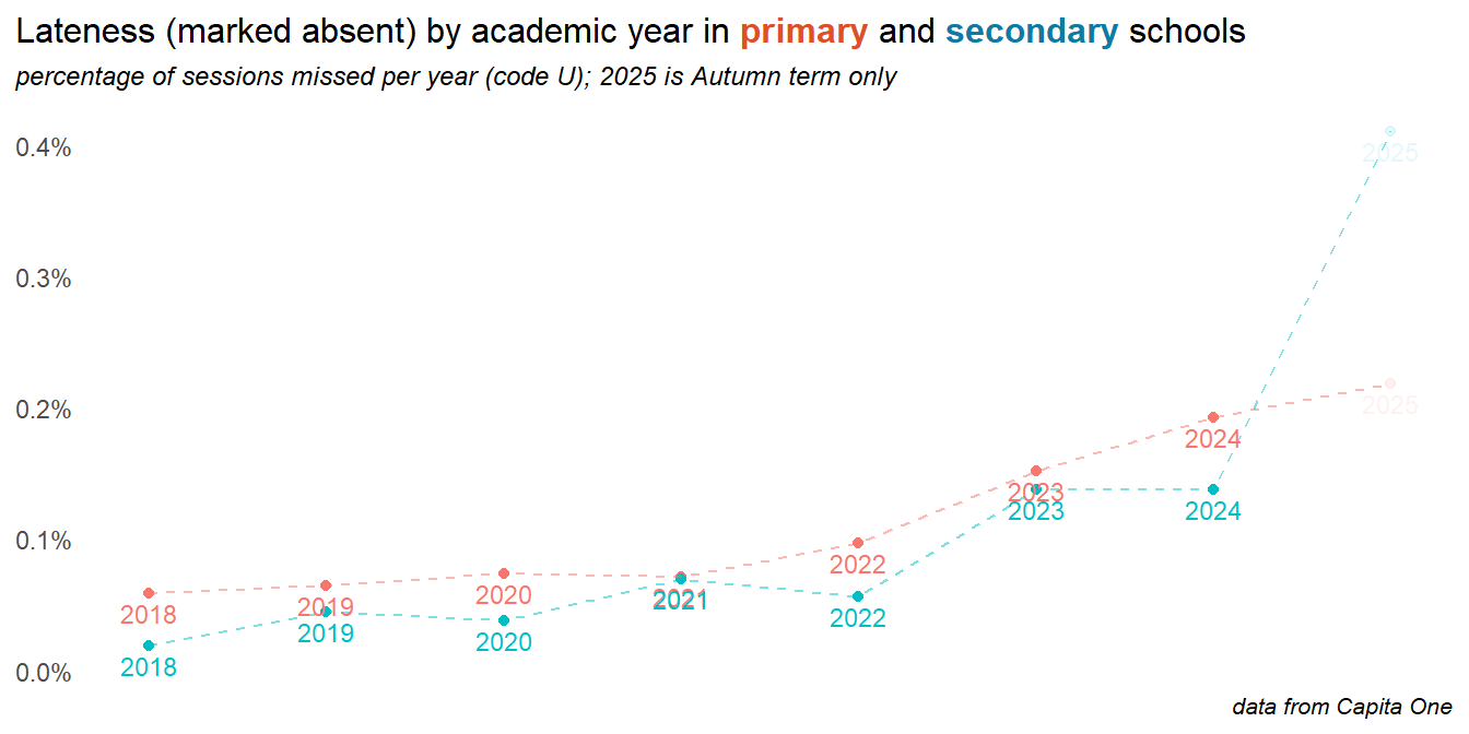
2.3 Lateness
Head teachers report that lateness, even if marked as late present can have a significant can impact on activies that are regularly done first thing in the day, such as phonics. Lateness can be recorded as late present or late absent, the latter meaning that the child attends only after the registers have closed. Both categories are on the rise, with late absence in primary schools in particular growing problem. In secondary schools, late present is more common - and has been rising in recent years.
Late absent (after registers closed) make up a much smaller percentage of available sessions, but in secondary schools this is dramatically up in 2025 (note that this data does not yet include the summer term):
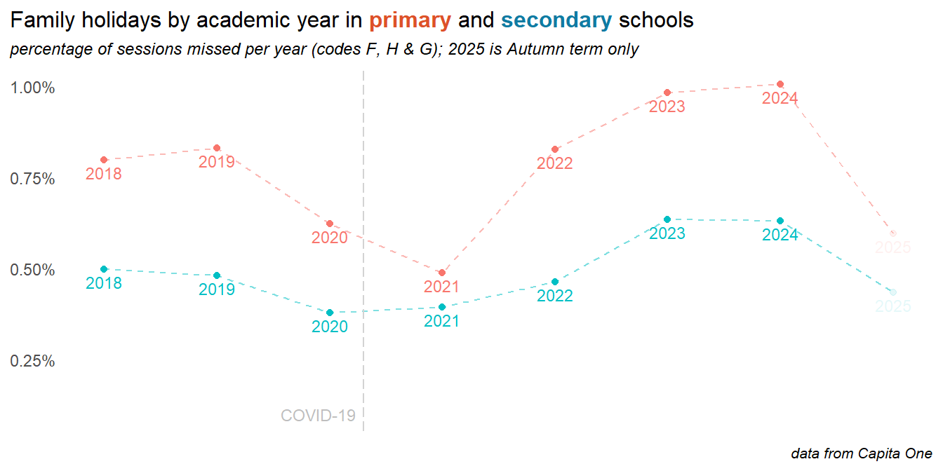
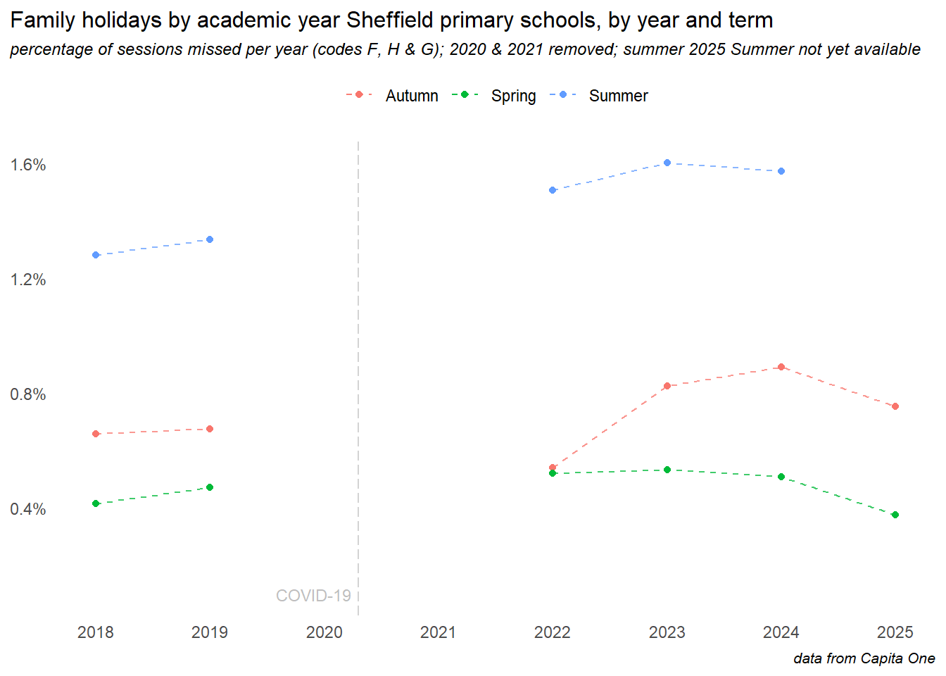
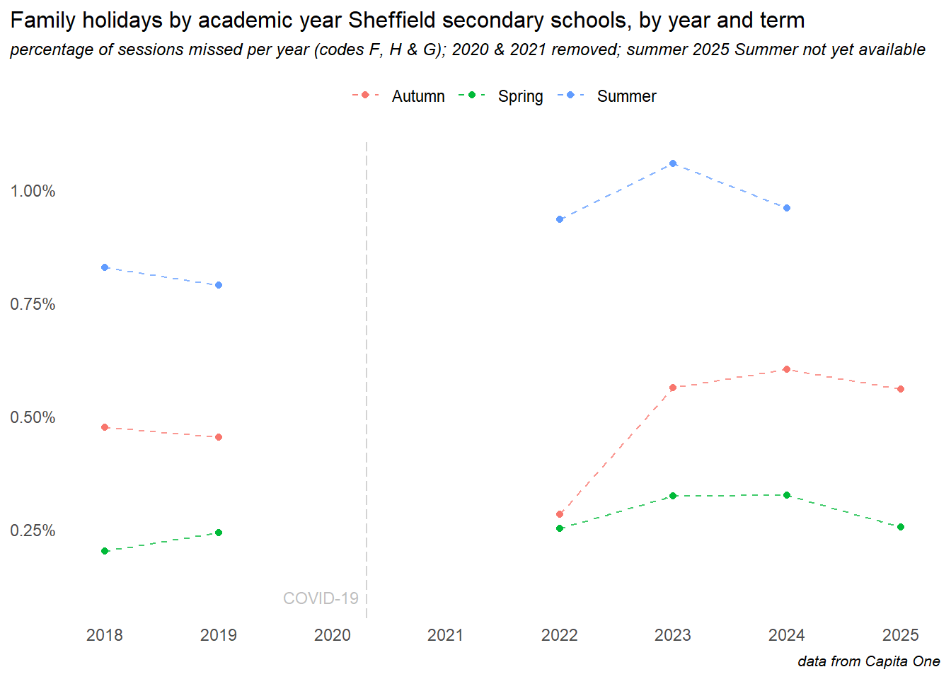
2.4 Family holidays
Absences for family holidays are higher in primary, but have risen in secondary also. The cost of living crisis likely plays a part here. Rates appear lower in 2024, but at the time of writing the summer term is missing from the 2024 data, which is excluded from the plot below. Family holidays can be authorised or unauthorised, but due to differences in recording and coding policy between schools, both are grouped together here.
New DfE guidance and harsher penalties around family holiday absences came into effect August 2024, and the chart above appears to show a significant reduction, though this is mostly due to the summer term data is not yet (as of May ’25) being available. Breaking this down by term shows two things:
- in all previous years (COVID period aside, and the lockdown years have been removed here), the summer term has been the time when most holidays are taken - so far in 2025, the impact of the new rules is apparent in the autumn and spring term data - though the impact appears small, and levels are still well above pre-COVID years. The real test of this policy will be the rates in the summer term
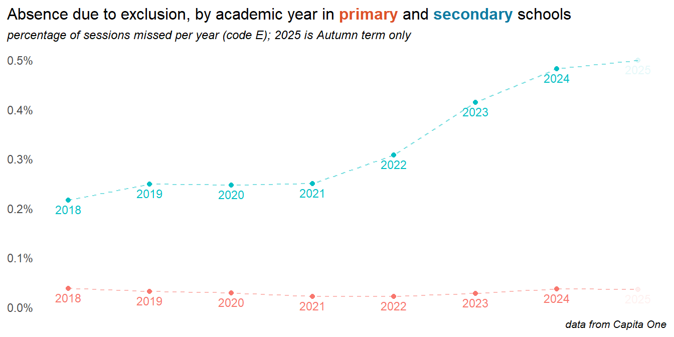
2.5 Exclusions
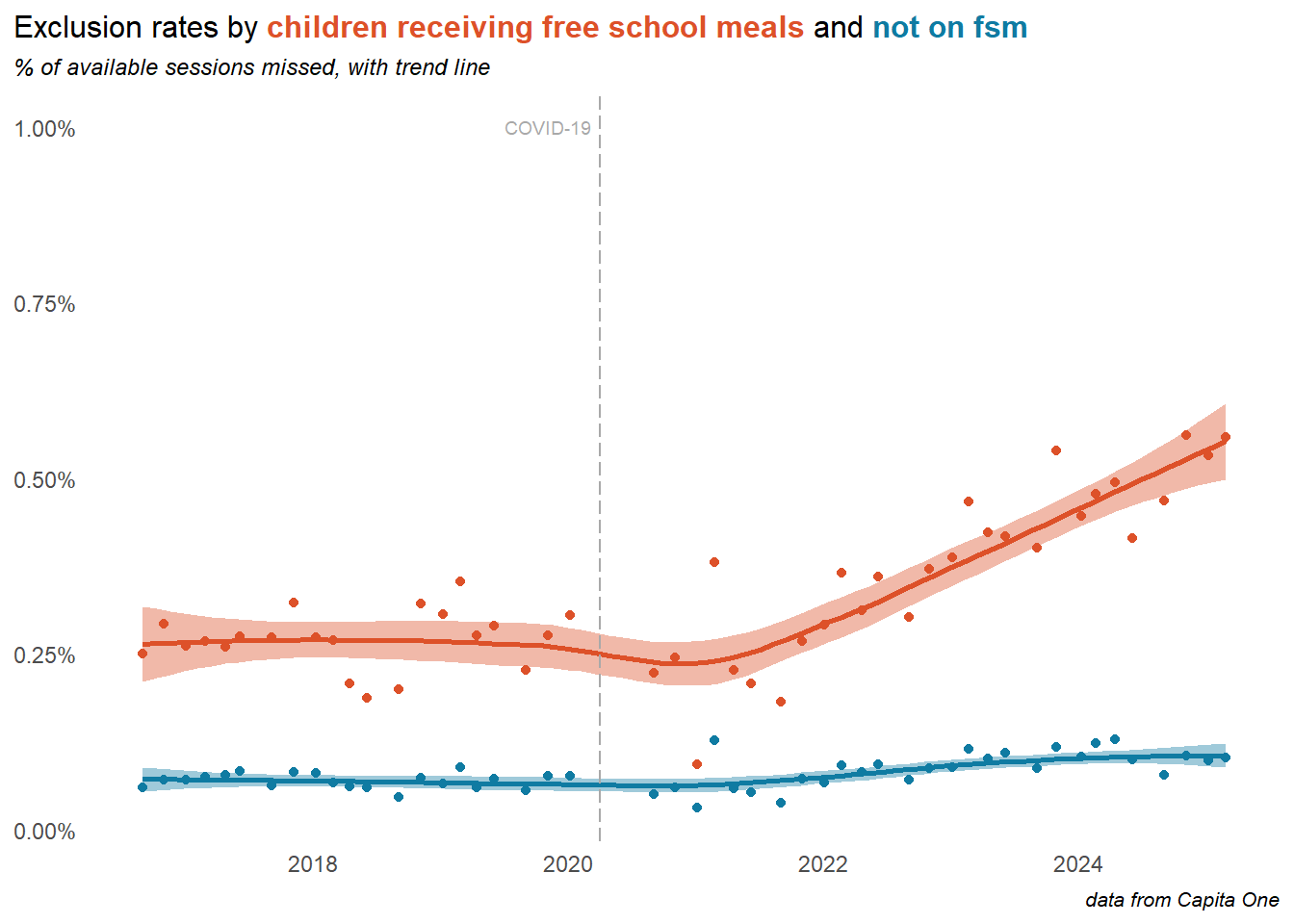
Exclusions have risen very rapidly, particularly in secondary schools. This is mostly driven by temporary suspensions, largely as schools clamp down on what is classified as persistent disruptive behaviour. This makes only a small contribution to overall absence rates, but is growing, and for some children is a major contribution to their overall school absence. Exclusion rates in 2025 (part year at the time of writing) look to have levelled off.
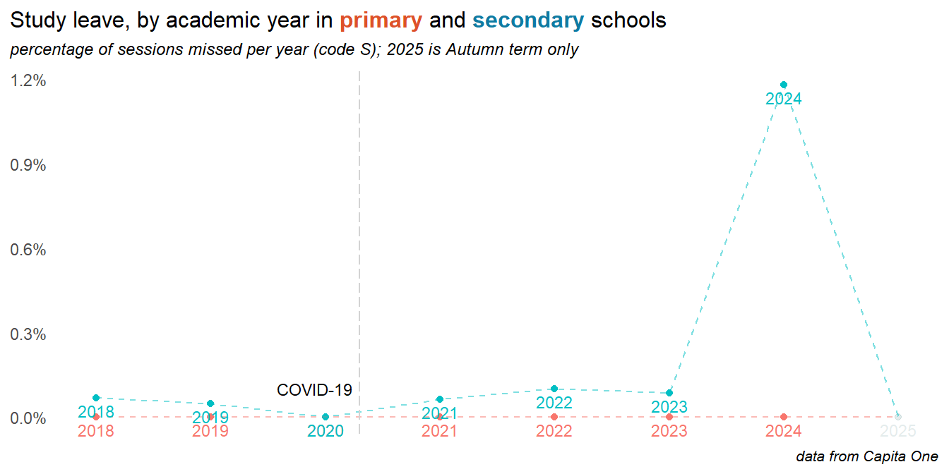
2.6 Study leave
2024 saw seen the return of study leave as a coded absence reason, with a significant impact on overall attendance levels in secondary and particularly y11. At the time of writing the 2025 data does not include the summer term and shows only minimal study leave.
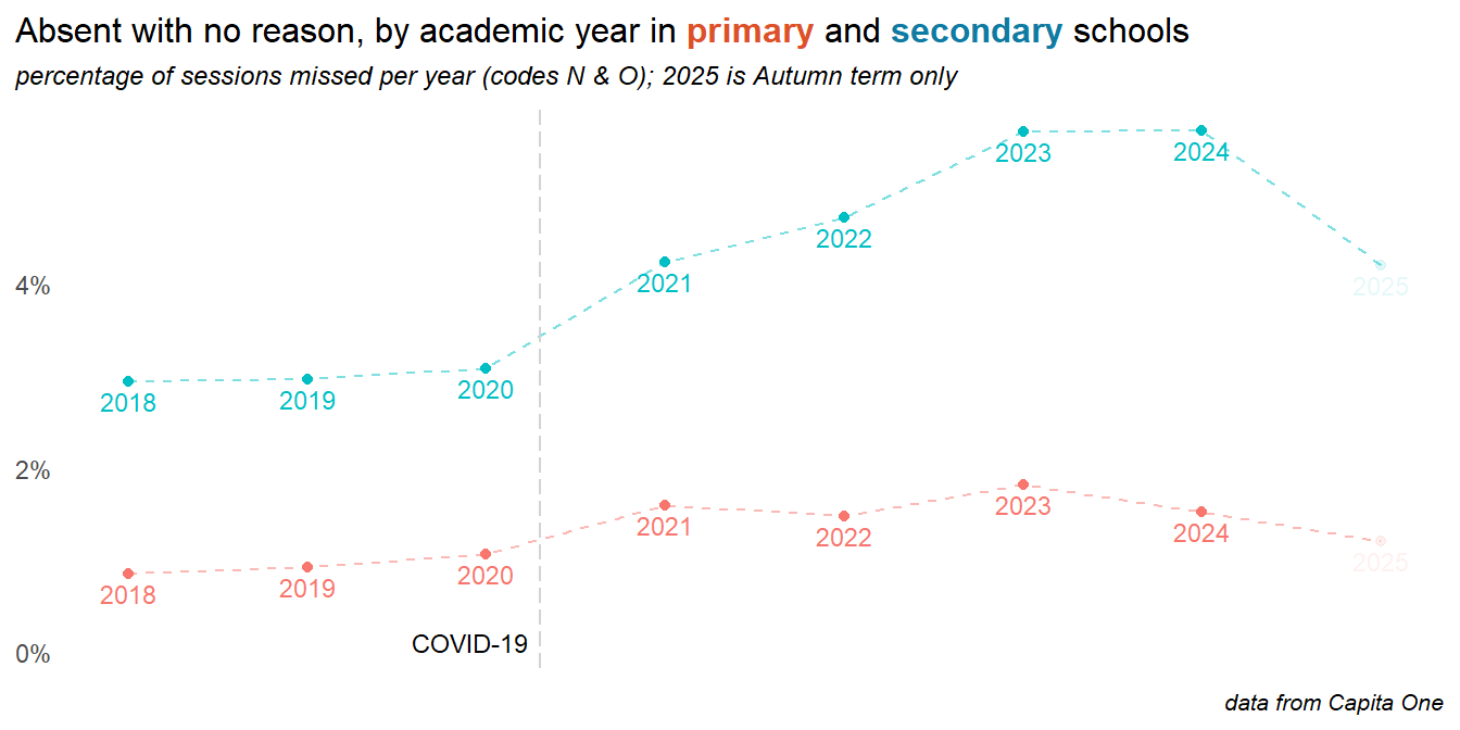
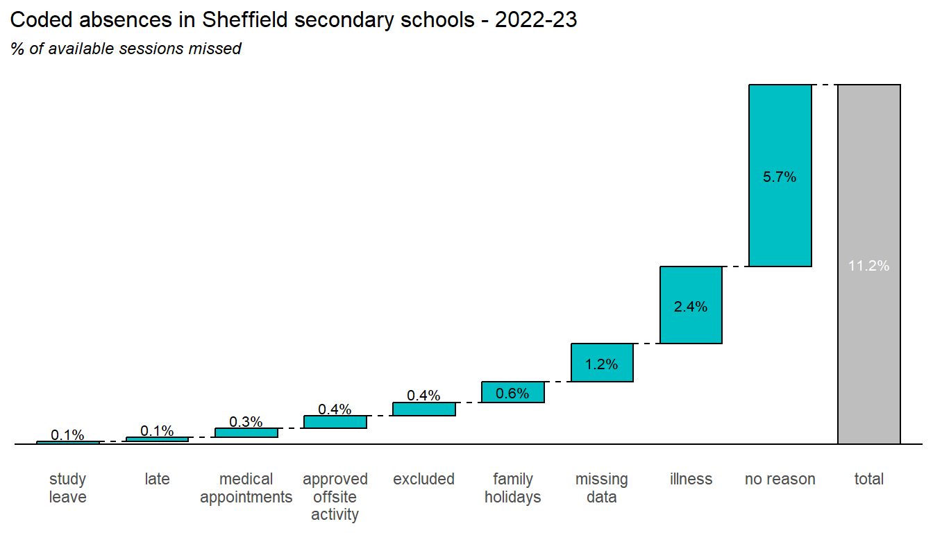
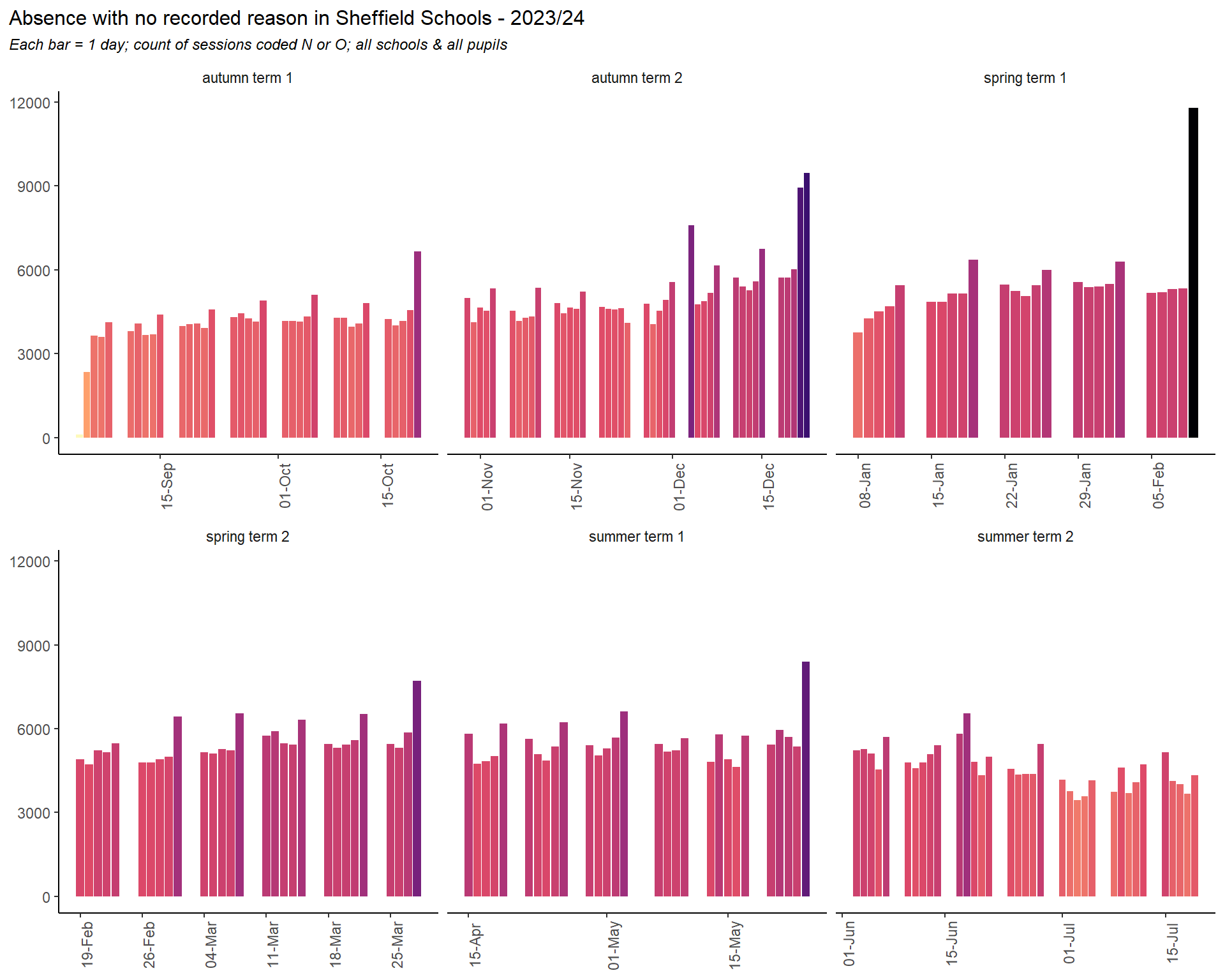
2.7 No reason
The plot below comprises two DfE codes. Code N is intended as a placeholder until schools can establish a reason for absence, and code 0 is for unknown or other circumstances. Here both are grouped together - though the bulk is code O.
Important
The increase in no reason absences levelled off into 2024 and is down dramatically 2025. Some of this is likely due to the changes to recording from September 2024. Even so, the no reason category remains the biggest contributor to overall absence rates in secondary, and the increase in no reason absences are the biggest contribution to the post-pandemic rise in absences. Furthermore, no reason absences are significantly more prevalent in more deprived areas of the city, where attendance in general is poorer.
We can draw two possible conclusions from this: parents and children are not reporting the true reasons for absence, and the DfE codes are no longer suitable for capturing those reasons. In either case, this represents a serious blind spot in the data.
recomendation
Analysis of recorded case notes and text on Capita One, along with interviews or surveys of pupils, teachers, parents or community groups may help to understand the stories behind these no reason absences
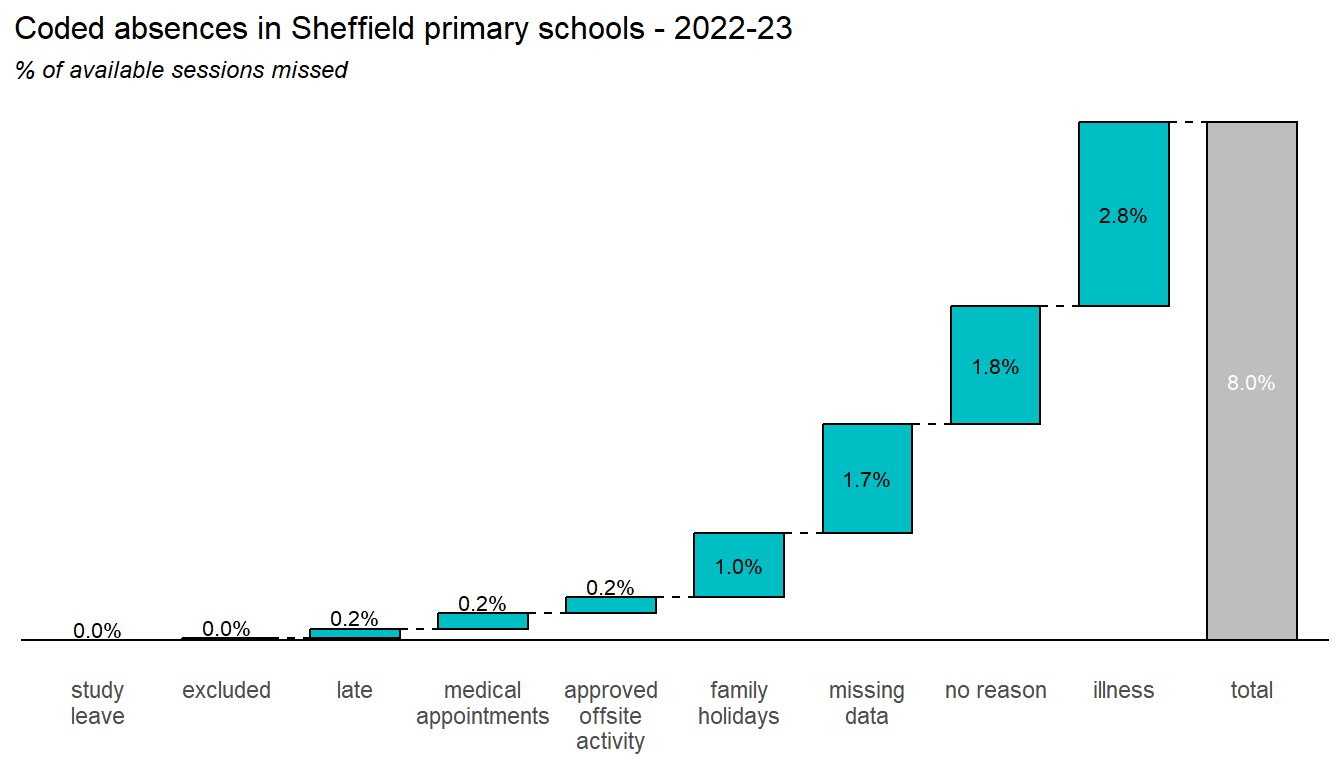
Finally, the two charts below summarise the contributions of each of these coded absence reasons to the overall absence picture, during 2023-2024:
3 Demographics
Looking at how attendance varies with age, gender and ethnicity, and how this picture is changing over time.
3.1 Age
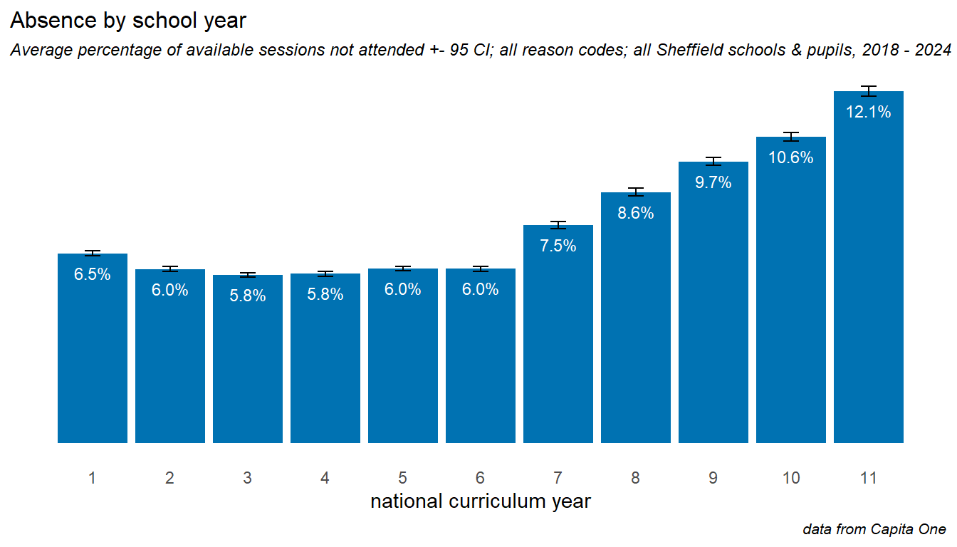
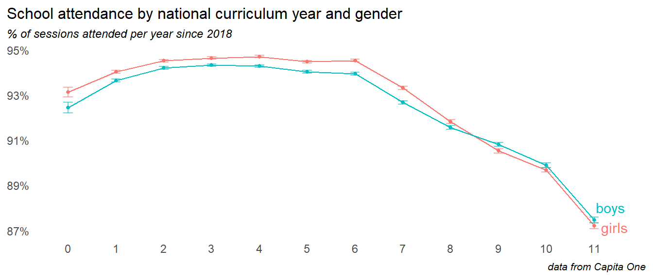
Absence is little higher in Y1 and Y2 when children are very young, and is level through primary. The transition to secondary school is associated with a big increase in absence, which continues year on year up to Y11. As we’ll see later on - this transition drop into Y7 and subsequent decline is more severe for groups with particular risk factors.
Note
The ImpactEd report Understanding Attendance - Report 1 identified an emerging trend of a jump in absence between Y7 and y8. The Sheffield data does not support this, with the increase from Y7 to Y8 looking broadly the same - around 1% increase in absence - as any other year on year increase within secondary years.
Looking at trends over time for primary school years, we see that the youngest and oldest primary age children were most affected. There are encouraging signs of recovery among all primary years into 2024, and particularly in Y1.
In secondary schools, we can see how disproportionately affected children in Y11, and encouraging signs of recovery in years 7 and 9. It is worth noting that the children in years 10 and 11 in 2024 were those who had their crucial Y6 and y7 transition years disrupted by the pandemic.
The drop off in Y11 is driven in part driven by study leave in 2024; this is yet to occur in the 2025 year
These trends will be explored in more detail in the Trends by annual cohort section later in this report.
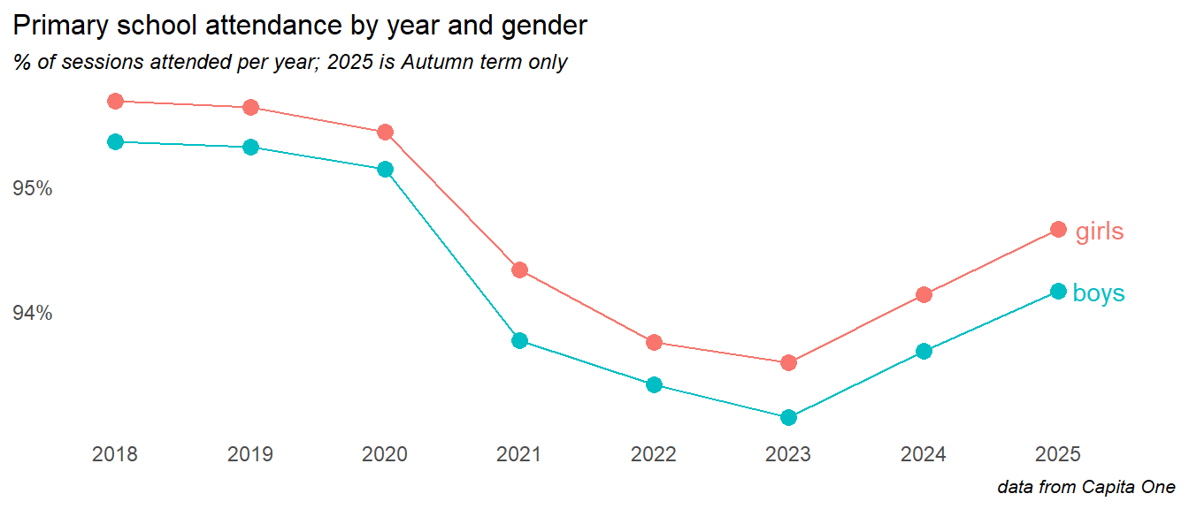
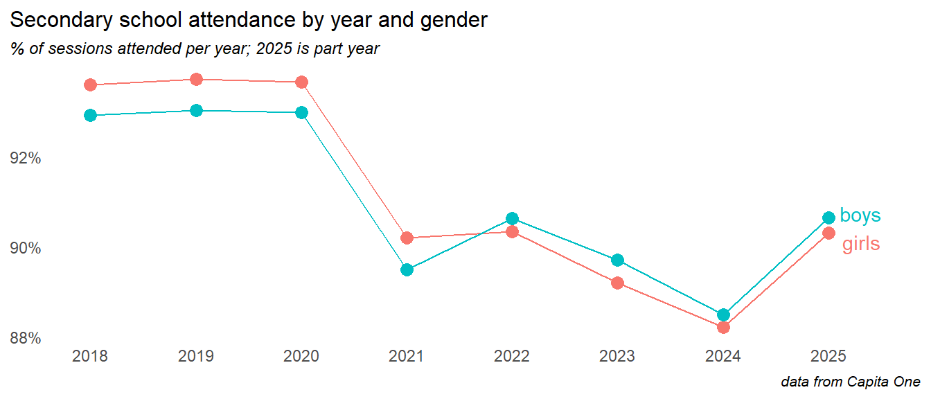
3.2 Gender
Looking at overall school attendance since 2021, girls attend slightly better than boys, a difference of about 0.5%.
The gender time series show boys and girls moving in lockstep through primary school, separated by about half a percentage point:
In secondary we see boys’ attendance overtaking girls in the aftermath of the pandemic, but all continuing to decline into 2024.
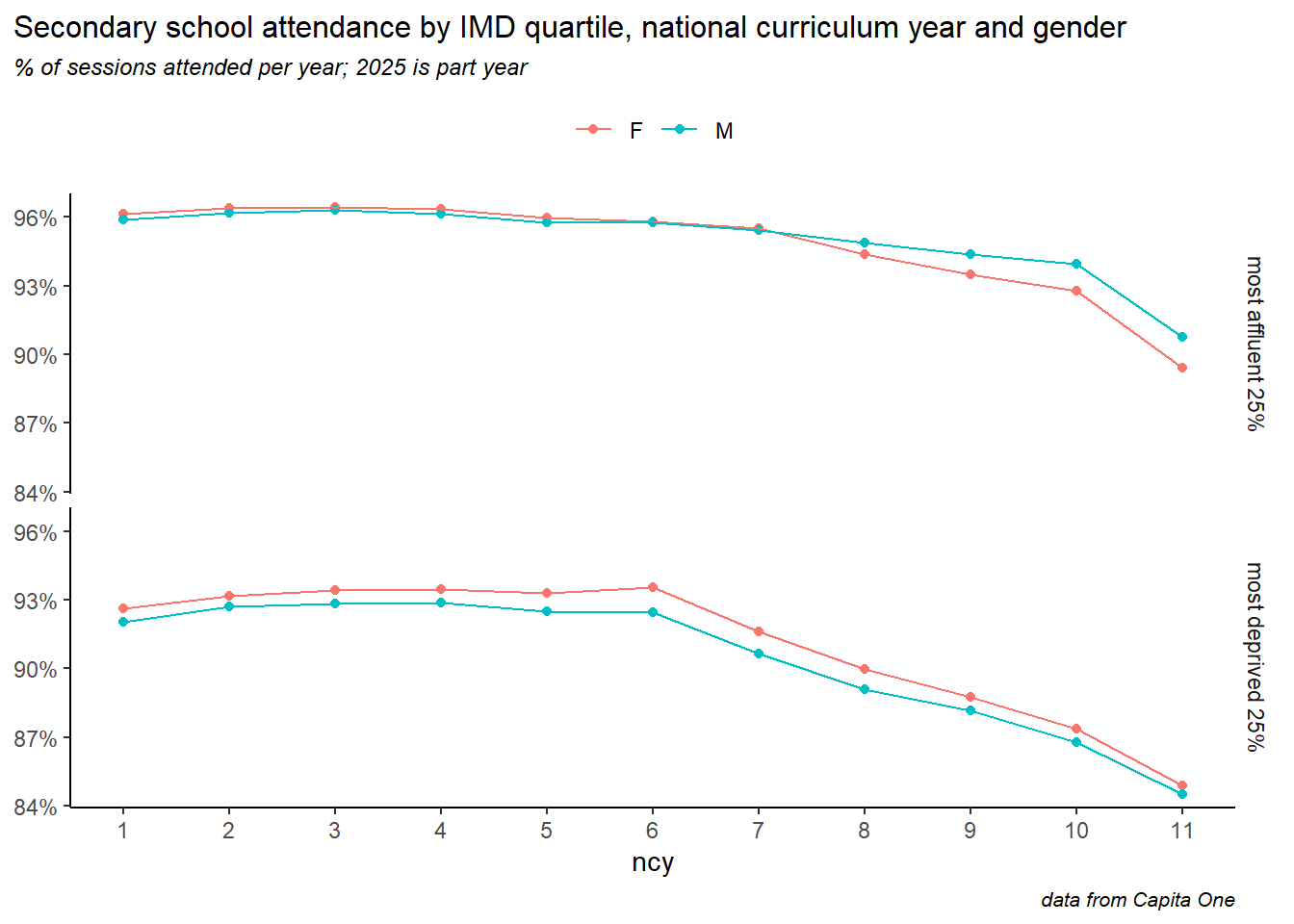
Looking at age, gender and deprivation together, we see the pattern reversed in older children. In poorer wards of the city, girls consistently attend better than boys across all ages. In the most affluent wards, this is reversed in older children, with a gender gap widening from Y8 onwards, where boys have higher attendance.
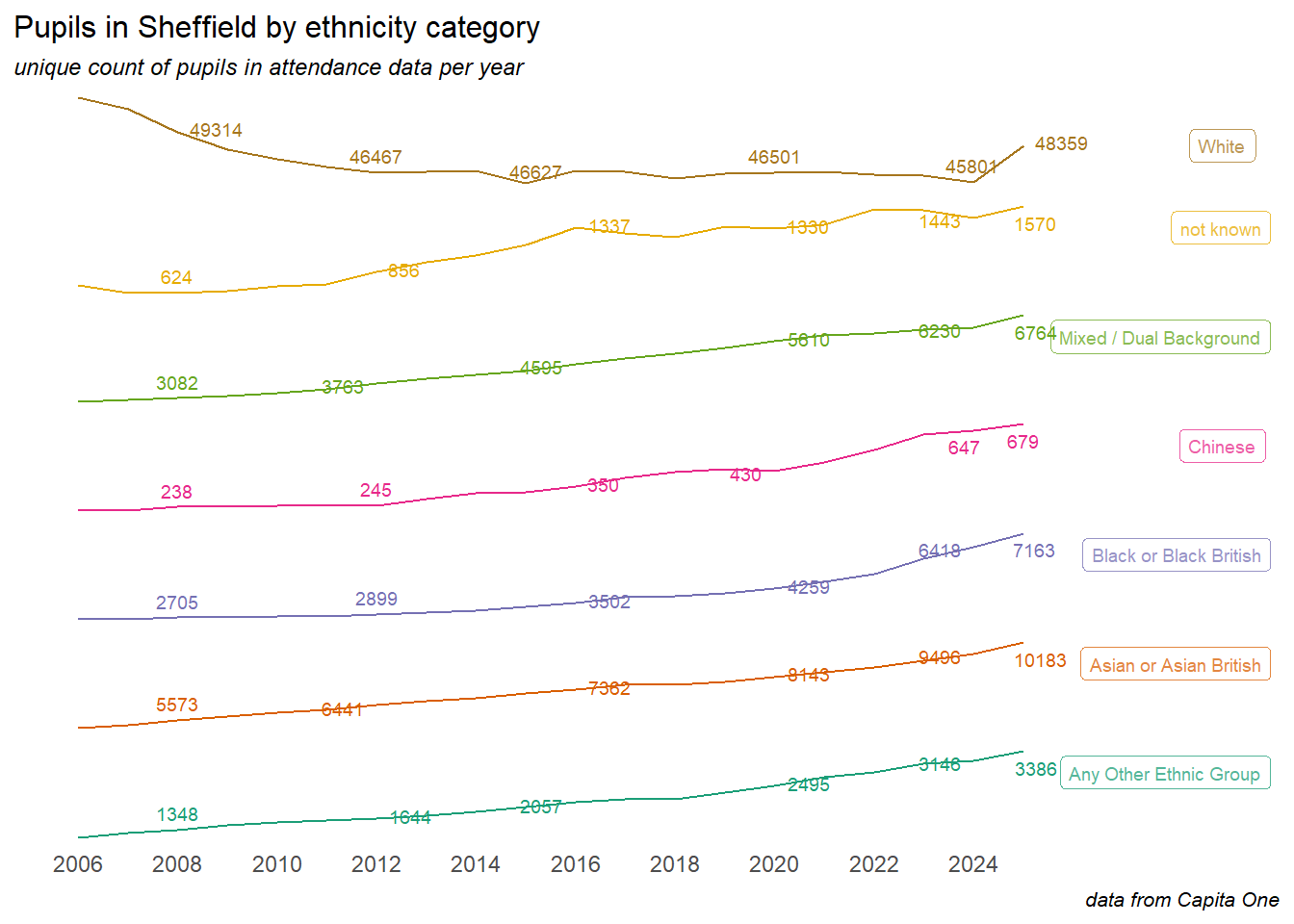
3.3 Ethnicity
The ethnic makeup of Sheffield’s population continues to change, and there are differences in attendance rates between children in different ethnic groups. Here we summarise the data around ethnicity.
Caution
The ethnic groups and subgroups used in this analysis are those available the Capita One source data. These don’t necessarily align with the groupings used by ONS for census data, other organisations, or in other SCC data and reporting
With the caveat that data prior to 2018 may not be wholly complete, the attendance data allows us to look at a long term view of changes in the ethnic makeup of the Sheffield school population. Note the free y-axis scales on the following chart, means that the lines are not directly comparable:
Pupils and attendance in Sheffield by ethnicity description
pupils on roll in 2023/24; data from School Census & Capita One attendance records
Total
Primary
Secondary
count
% of pupils
% absent 2023/24
count
% of pupils
% absent 2023/24
count
% of pupils
% absent 2023/24
all children
73154
100.0%
8.5%
40342
55.1%
6.1%
32821
44.9%
11.7%
White British
41229
56.4%
8.5%
22372
54.3%
5.6%
18859
45.7%
12.0%
Black African and White/Black African
6223
8.5%
5.1%
3616
58.1%
4.1%
2607
41.9%
6.5%
Pakistani
5522
7.5%
8.2%
3133
56.7%
7.1%
2390
43.3%
9.7%
Any Other Ethnic Group
3144
4.3%
8.4%
1767
56.2%
6.9%
1379
43.8%
10.3%
Any Other White Background
2763
3.8%
9.3%
1546
56.0%
7.1%
1217
44.0%
12.1%
White/Black Caribbean
1971
2.7%
12.6%
1098
55.7%
8.7%
874
44.3%
17.9%
Other Asian Background
1863
2.5%
7.2%
1089
58.5%
6.2%
774
41.5%
8.7%
Gypsy, Roma and Traveller of Irish Heritage
1696
2.3%
21.2%
881
51.9%
16.0%
817
48.1%
27.0%
White/Asian
1679
2.3%
8.5%
958
57.0%
6.4%
722
43.0%
11.6%
Any Other Mixed
1623
2.2%
9.1%
934
57.5%
6.7%
689
42.5%
12.5%
not known
1443
2.0%
12.4%
607
42.1%
7.3%
836
57.9%
16.2%
Indian
1278
1.7%
6.1%
866
67.8%
5.8%
412
32.2%
6.7%
Bangladeshi
830
1.1%
8.1%
476
57.3%
7.1%
354
42.7%
9.6%
Any Other Black Background
773
1.1%
6.2%
450
58.2%
5.1%
323
41.8%
7.8%
Chinese
647
0.9%
4.1%
329
50.9%
3.5%
318
49.1%
4.7%
Black Caribbean
367
0.5%
9.1%
169
46.0%
5.8%
198
54.0%
12.1%
Irish
103
0.1%
8.3%
51
49.5%
4.8%
52
50.5%
12.0%
4 Geography & deprivation
There are many ways to divide up the city geographically, but we’ll look at the 28 wards, and in particular their deprivation as measured in the 2019 Indices of Multiple Deprivation (IMD) scores. More recent (and older) measures of deprivation may be available, but the analysis is broadly the same.
4.1 Attendance by ward
The table below shows overall attendance by ward of residence during 2023-24.
Pupils in Sheffield, by ward of residence
pupils on roll & attendance in 2023/24; data from School Census & Capita One attendance records
Total
Primary
Secondary
count
% of children
% absent 2023/24
count
% of children
% absent 2023/24
count
% of children
% absent 2023/24
Sheffield
73154
100.0%
8.5%
40342
55.1%
6.1%
32821
44.9%
11.7%
Burngreave
5720
7.6%
10.5%
3052
53.3%
8.1%
2672
46.7%
13.3%
Firth Park
4217
5.6%
9.5%
2369
56.2%
6.9%
1848
43.8%
13.0%
Darnall
4020
5.3%
10.2%
2368
58.9%
7.7%
1652
41.1%
14.2%
Manor Castle
3868
5.1%
9.5%
2188
56.6%
6.4%
1680
43.4%
13.8%
Shiregreen & Brightside
3656
4.8%
9.8%
1984
54.3%
6.7%
1673
45.7%
13.5%
Southey
3560
4.7%
10.7%
1975
55.5%
7.7%
1586
44.5%
14.4%
Ecclesall
3205
4.2%
4.7%
1727
53.9%
3.4%
1479
46.1%
6.3%
Gleadless Valley
3187
4.2%
9.7%
1787
56.1%
7.6%
1400
43.9%
12.6%
Nether Edge & Sharrow
2876
3.8%
6.6%
1603
55.7%
5.1%
1273
44.3%
8.5%
Park & Arbourthorne
2750
3.6%
9.9%
1555
56.5%
7.1%
1195
43.5%
14.4%
Beauchief & Greenhill
2702
3.6%
9.0%
1532
56.7%
6.8%
1171
43.3%
12.0%
Richmond
2553
3.4%
9.2%
1430
56.0%
6.5%
1124
44.0%
12.7%
Dore & Totley
2419
3.2%
5.3%
1340
55.4%
3.6%
1079
44.6%
7.3%
Woodhouse
2336
3.1%
9.9%
1320
56.5%
6.7%
1016
43.5%
14.0%
Hillsborough
2310
3.1%
7.8%
1275
55.2%
5.1%
1035
44.8%
11.6%
Stannington
2280
3.0%
6.8%
1234
54.1%
4.2%
1046
45.9%
10.0%
Walkley
2224
2.9%
7.3%
1366
61.4%
5.3%
858
38.6%
10.6%
West Ecclesfield
2168
2.9%
8.5%
1142
52.7%
5.5%
1026
47.3%
11.6%
Stocksbridge & Upper Don
2160
2.9%
8.8%
1134
52.5%
5.3%
1026
47.5%
12.7%
Birley
2041
2.7%
9.6%
1101
53.9%
6.3%
940
46.1%
13.6%
Graves Park
1988
2.6%
6.0%
1097
55.2%
4.3%
891
44.8%
8.1%
East Ecclesfield
1975
2.6%
7.5%
1032
52.3%
5.5%
943
47.7%
9.6%
Beighton
1913
2.5%
8.1%
1056
55.2%
6.2%
857
44.8%
10.7%
Crookes & Crosspool
1892
2.5%
6.1%
972
51.4%
3.9%
920
48.6%
8.4%
Fulwood
1733
2.3%
5.6%
933
53.8%
3.6%
800
46.2%
8.1%
Mosborough
1724
2.3%
8.1%
979
56.8%
6.1%
745
43.2%
11.1%
Broomhill & Sharrow Vale
1459
1.9%
6.1%
877
60.1%
4.9%
582
39.9%
8.1%
City
705
0.9%
9.2%
464
65.8%
8.2%
241
34.2%
11.4%
4.2 Economic deprivation
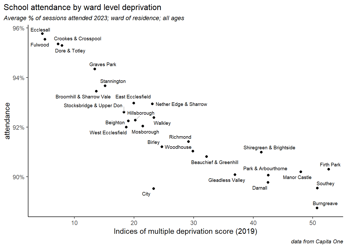
These ward level attendance figures line up neatly with deprivation indicators. Plotting attendance against the 2019 Indices of Multiple Deprivation (IMD) scores shows a tight correlation.
Caution
Since school attendance figures one of the input variables to the IMD scores, there is some circular logic at work here. Even so, attendance is only one of 39 inputs, so this analysis is worth pursuing.
The link to deprivation has always been there but is stronger today - recreating the chart above with 2010 attendance and IMD scores shows a weaker relationship.
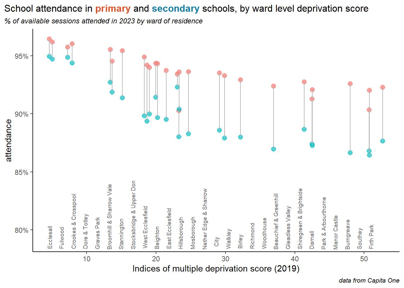
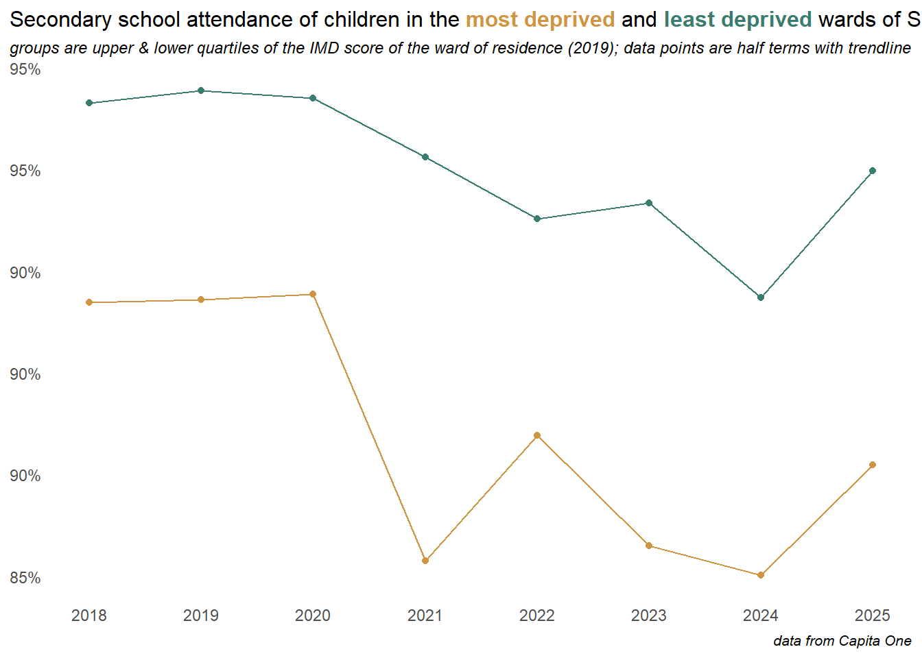
The link to deprivation less evident in primary schools, but stronger in secondary schools, and the gap between primary and secondary attendance widens in poorer areas of the city.
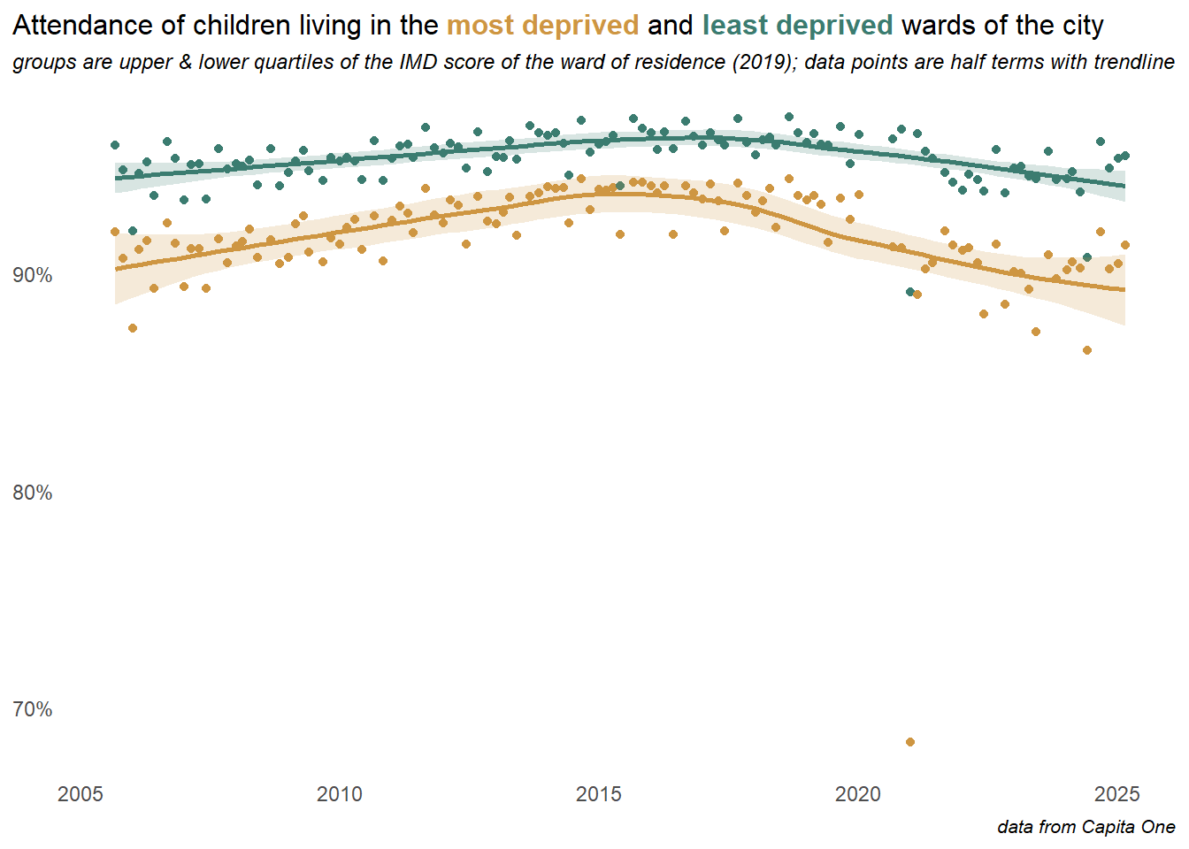
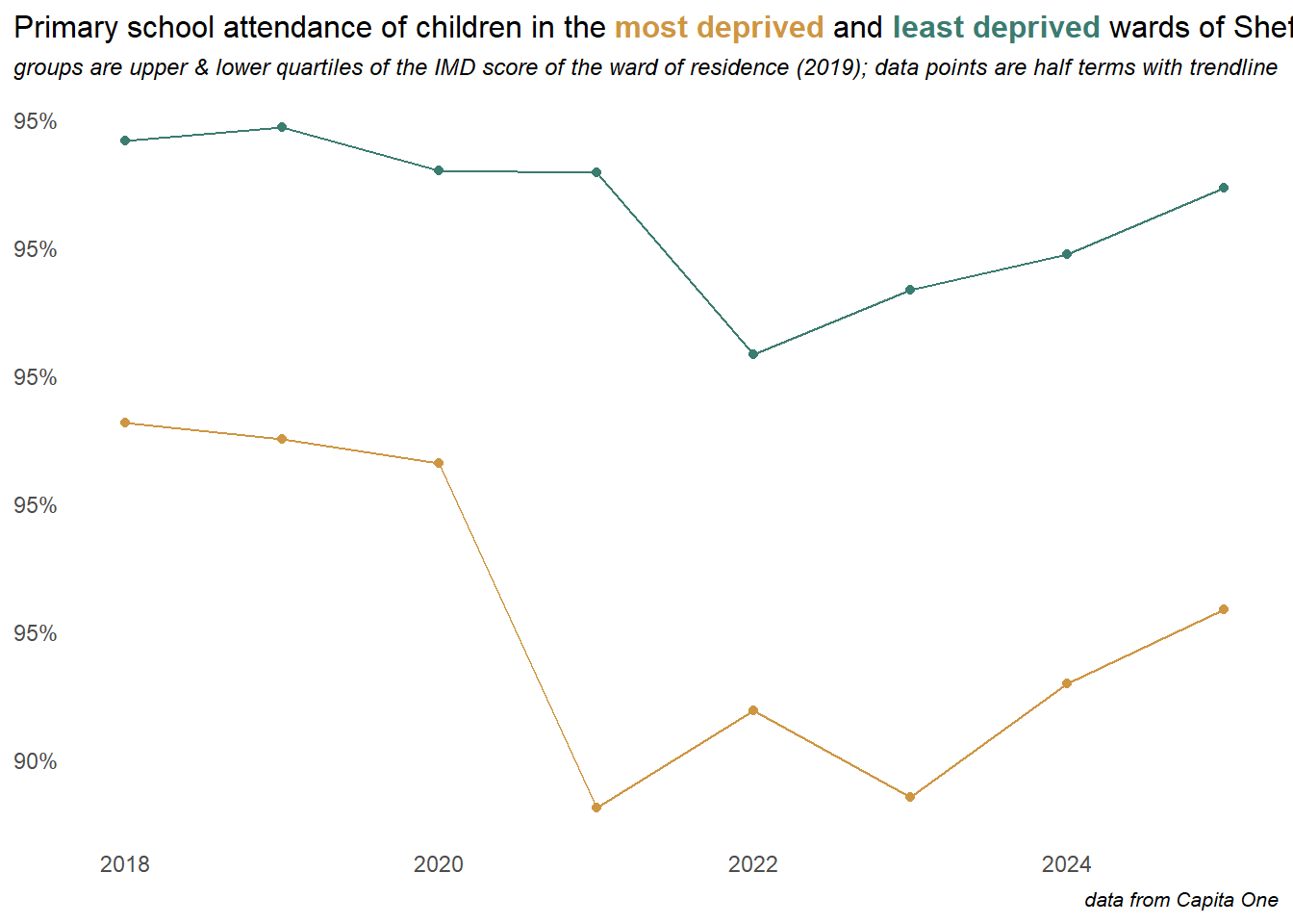
This longer term view below compares the trend in attendance between the top and bottom quartiles of the ward level deprivation scores, at the half-term level with a trend-line. The middle two quartiles are excluded from this plot. The gap between the most and least deprived areas narrowed towards the peak attendance rate in 2016, so gains were disproportionately made in poorer areas, but the most deprived quartile then falls away more rapidly since the pandemic.
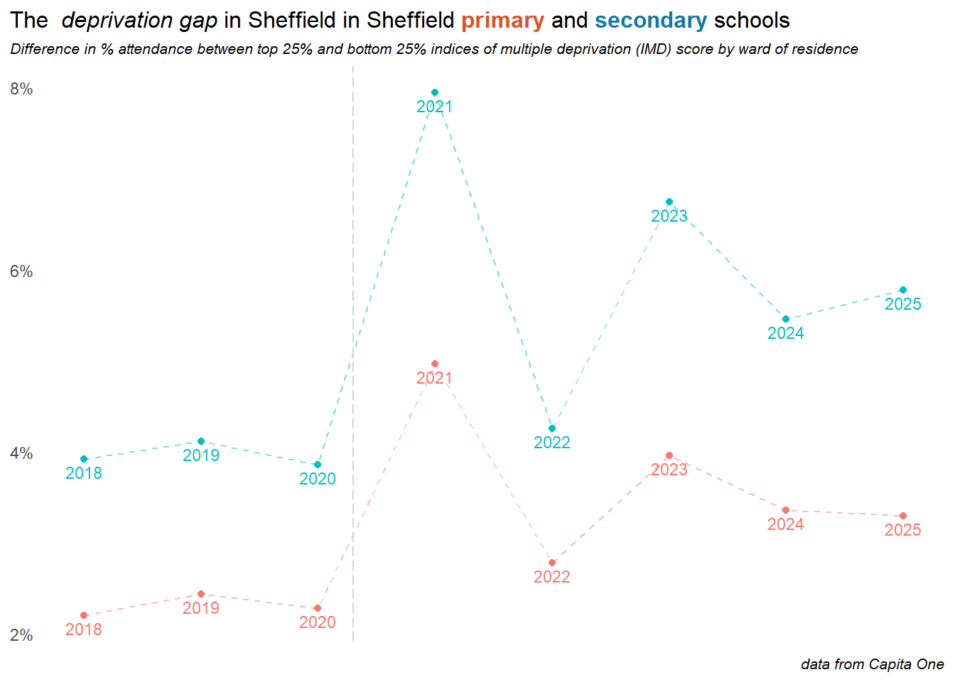
Finally here, since it’s not so easy to read from the above charts we we can look at the change in the difference in attendance between the most and least deprived quartiles of the city. Plotting this reveals that although attendance is increasing in both primary & secondary, and across all levels of deprivation, the gap between the most and least deprived quartiles of the city is reducing in primary schools, but continues to grow in secondary:
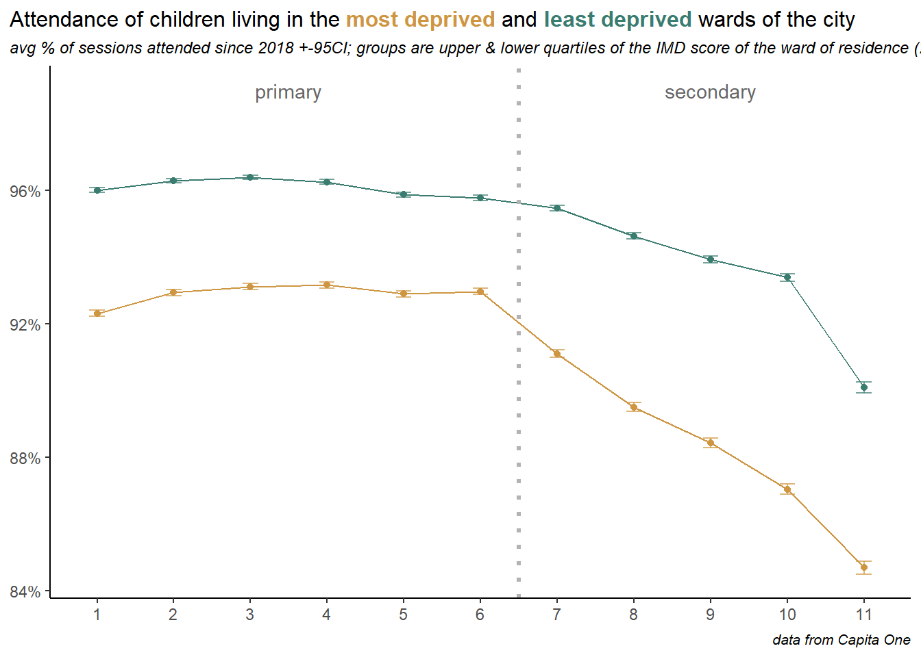
The age profile by deprivation quartile shows how children in poorer areas have a steeper drop off through secondary school. Children in the most affluent 25% of wards attend better across all years, but show a more significant dropoff into Y11. Could study leave be a factor here?
4.3 Free School Meals
Free School Meal (FSM) status is perhaps a better indicator of socio-economic status of children than ward of residence, since it is means tested at the family level.
Pupils in Sheffield, by free school meal status
count of pupils on roll in 2023/24; data from School Census & Capita One attendance records
Primary
Secondary
count
% of children
avg % absent (2023)
count
% of children
avg % absent (2023)
0
26477
65.6%
4.6%
21639
65.9%
8.4%
1
13865
34.4%
8.9%
11182
34.1%
17.9%
total
40342
55.1%
6.1%
32821
44.9%
11.7%
More concerning are the exclusion rates for children with Free School Meals, which are rapidly diverging from those without.
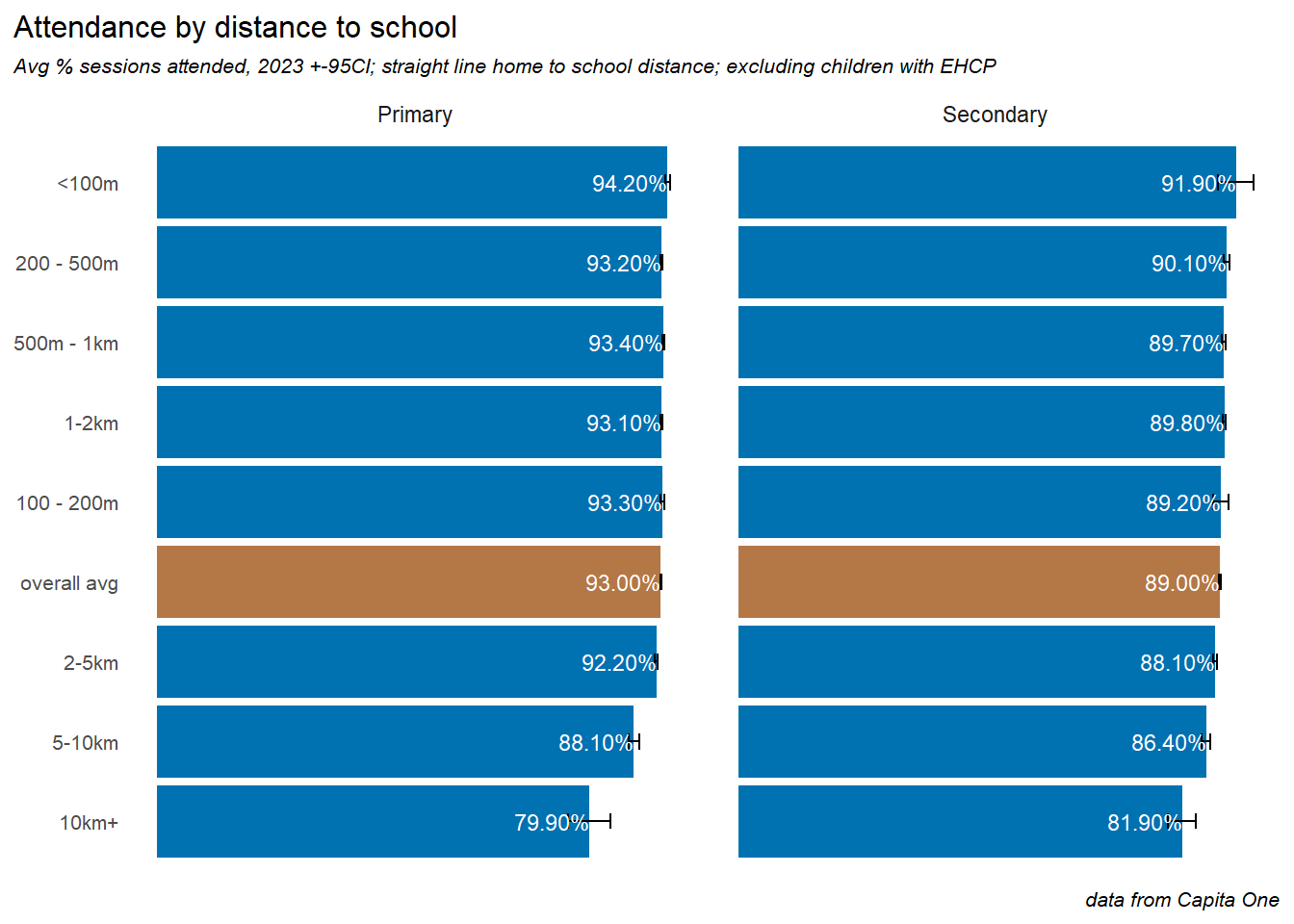
4.4 Distance to school
We used the postcodes of each child’s home address and school location to calculate a measure of straight-line distance between the two.
Attendance is significantly better, on average for children who live closer to school. Children living very close to school (<100m) attend about 1.5% better on average in Primary. For secondary schools this difference is 2.3%. Conversely,
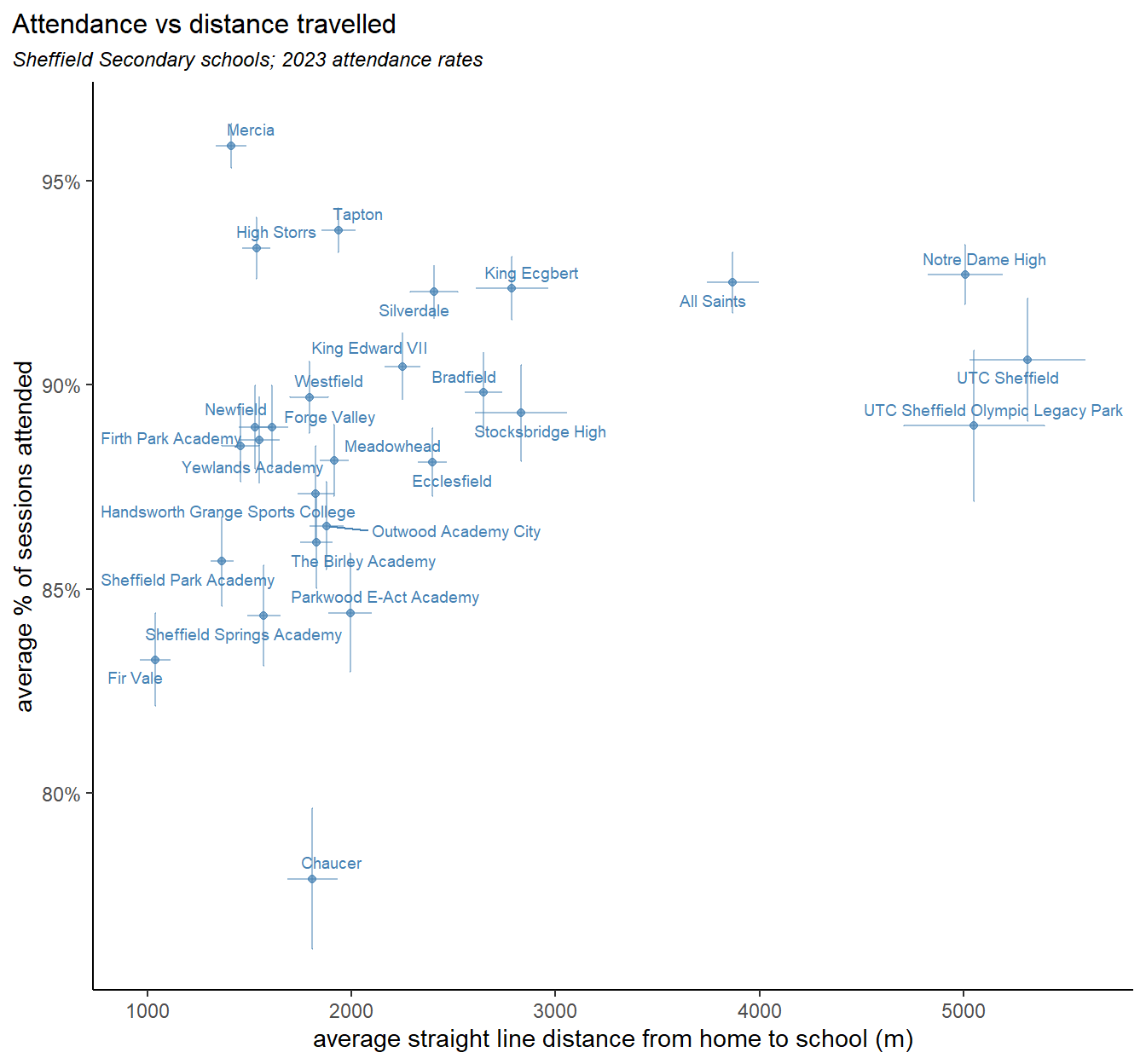
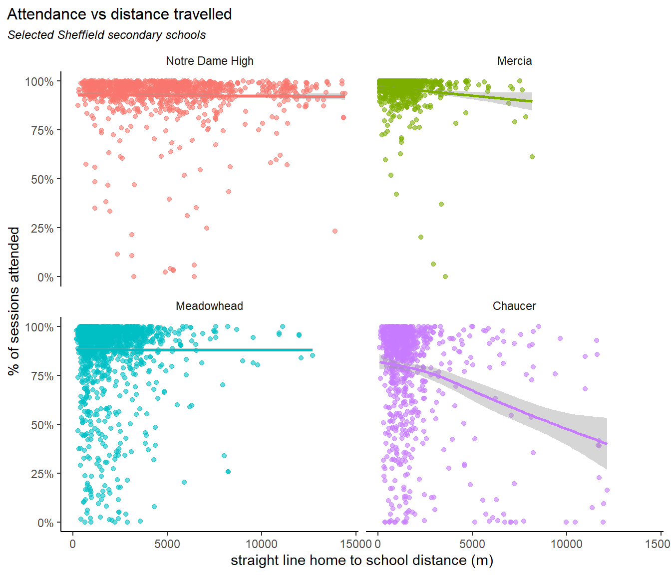
Plotting the average distance travelled against average attendance rates for secondary schools reveals four groupings:
on the right are two specialist facilities - UTC Sheffield & UTC Sheffield Olympic Legacy Park) and two catholic schools - All Saints and Notre Dame. All of these may incentivise pupils to travel further than normal.
the main bunch of schools in the middle seems to show a linear relationship between distance and attendance. Though this relationship is weak, and relies on us discarding the outliers (more on these below), and may not be a causal relationship.
Outlying this group above, Mercia, Tapton and High Storrs schools, are all in affluent areas of the city, and show higher attendance with average distance travelled
Below this group Chaucer school shows average distance travelled and below average attendance. Though, as we’ll see below, the average distance travelled disguises some significant differences.
Plotting the distance travelled against attendance at the child level reveals further differences. In the plot below we take one example from each of the four groups described above.
We can think of dividing these plots into four quadrants:
Notre Dame High has good attendance across the board, which varies regardless of the distance travelled. Mercia has excellent attendance, and a limited distance travelled, presumably due to it’s oversubscription and high demand, with most datapoints appearing in the top left. The trend line points slightly down, as a few children who live further away have lower attendance. Meadowhead has typical average values for both attendance and distance, appearing in the middle of the pack in the plot above. Most children attend well and those with poorer attendance generally live close by - there are few in the bottom right. Chaucer by contrast has a small but significant number of points in the bottom right quadrant - those who attend very poorly and live far away. Some of this may be explained by families failing to secure a place at closer schools, and being placed across the city, with the distance then contributing to poor attendance.
5 Young carers
It is difficult to establish the true number of young carers in the city - and perhaps dependent on definitions & methods. A 2023 all party parliamentary group (APPG) for young carers and adult carers report cites several sources:
1.6% of pupils (2021 Census)
0.5% of pupils (2023 school census) Though it places little confidence in these first two, preferring the estimates of two surveys:
10% of all pupils provide high or very high levels of care (BBC / University of Nottingham)
13% of pupils surveyed (COVID Social Mobility & Opportunities study)
Applying the 10% figure to Sheffield’s pupil population would indicate over 7000 young carers in the city. Our local data identifies just 904 since 2020, so we provide the analysis here with the following caveat:
data on young carers
The data used in this section of the report comes from young carer type involvements in capita one, covering around 900 children from 2020 onwards. Clearly our data doesn’t capture all young carers (and may skew towards those at the more severe end of the caring spectrum) and/or we are working with different definitions of what a young carer is. Issues with getting people of all ages to self-identify as carers are well known, and the perceived stigma attached to caring roles is likely more acute in young people - indeed this is probably a factor in explaining differences in school attendance.
The involvements have an open date, but no close date, so a time series analysis of volumes isn’t possible, and also that the data implicitly assumes that a young carer remains so for the rest of their school career.
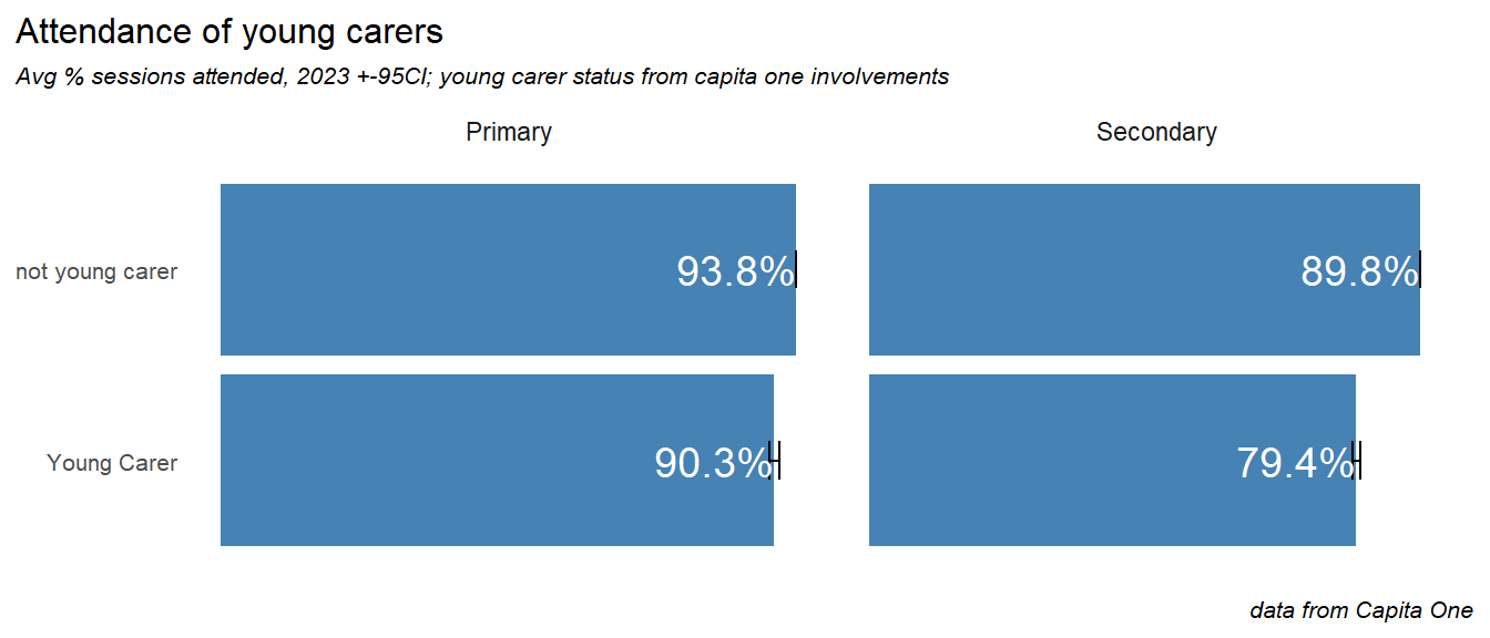
A descriptive of demographic analysis may also be misleading, but we can make a comparison of attendance rates, which shows a significant impact. Primary age young carers attend just under 4% less that those without a caring role. In secondary school this gap rises to 10%:
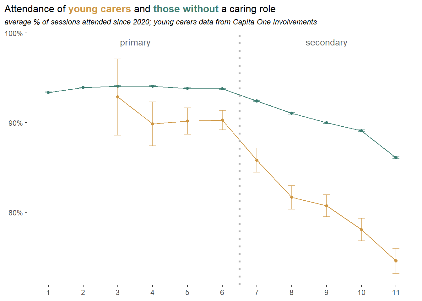
As we did for deprivation quartiles above, we can create an age profile of attendance for young carers, and compare it to pupils with no caring role. Again we see the greater impact on attendance as age increases, and presumably the expectations and stigmatisation around caring roles also increases. There is a particular drop in attendance going into year 8.
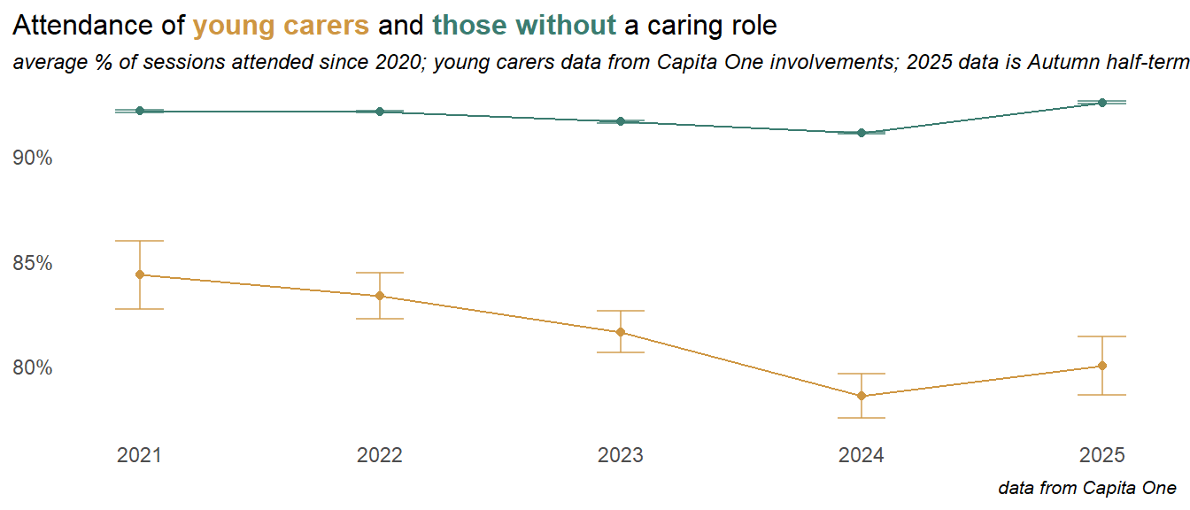
Along with other groups, the attendance of young carers improved into 2025.
Note that some of the decline seen effect here may be a function of the cumulative nature of the data, which has no end dates attached, so our cohort of young carers is ageing in in the system
recomendation
Better long term data is required to understand volumes, impacts & the geographical distribution of young carers, as well as change over time and the provision of services to young carers.
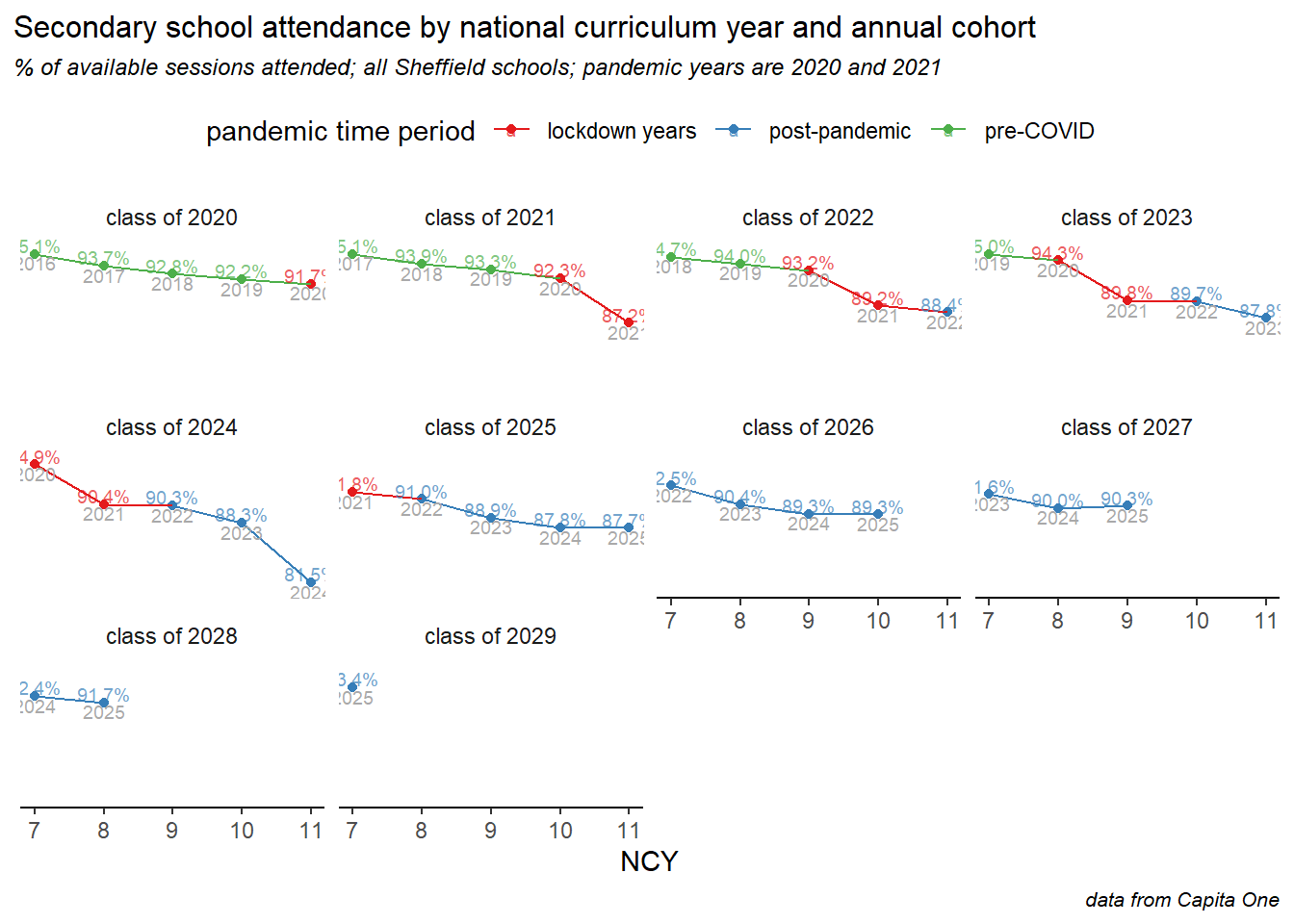
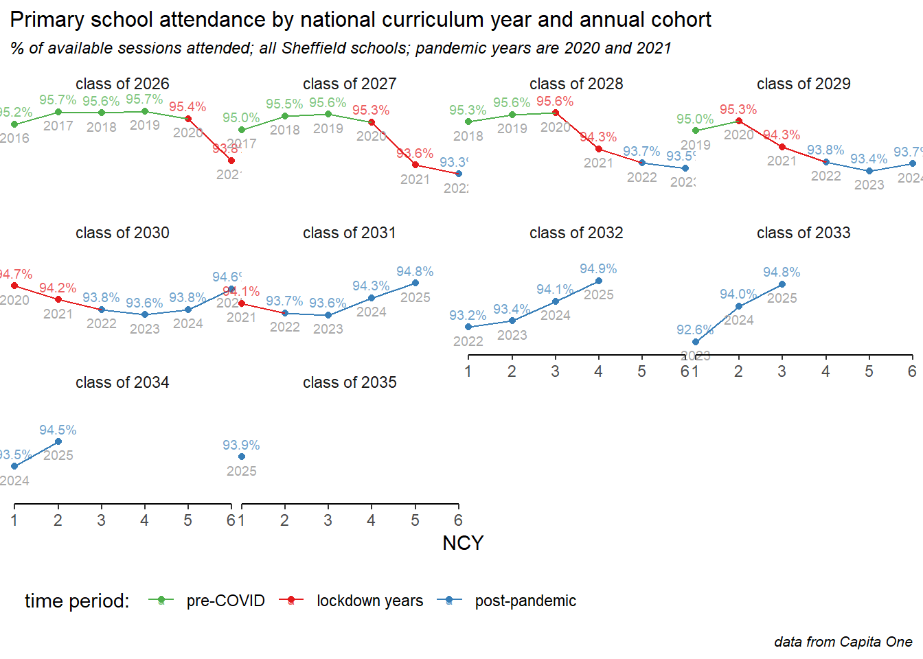
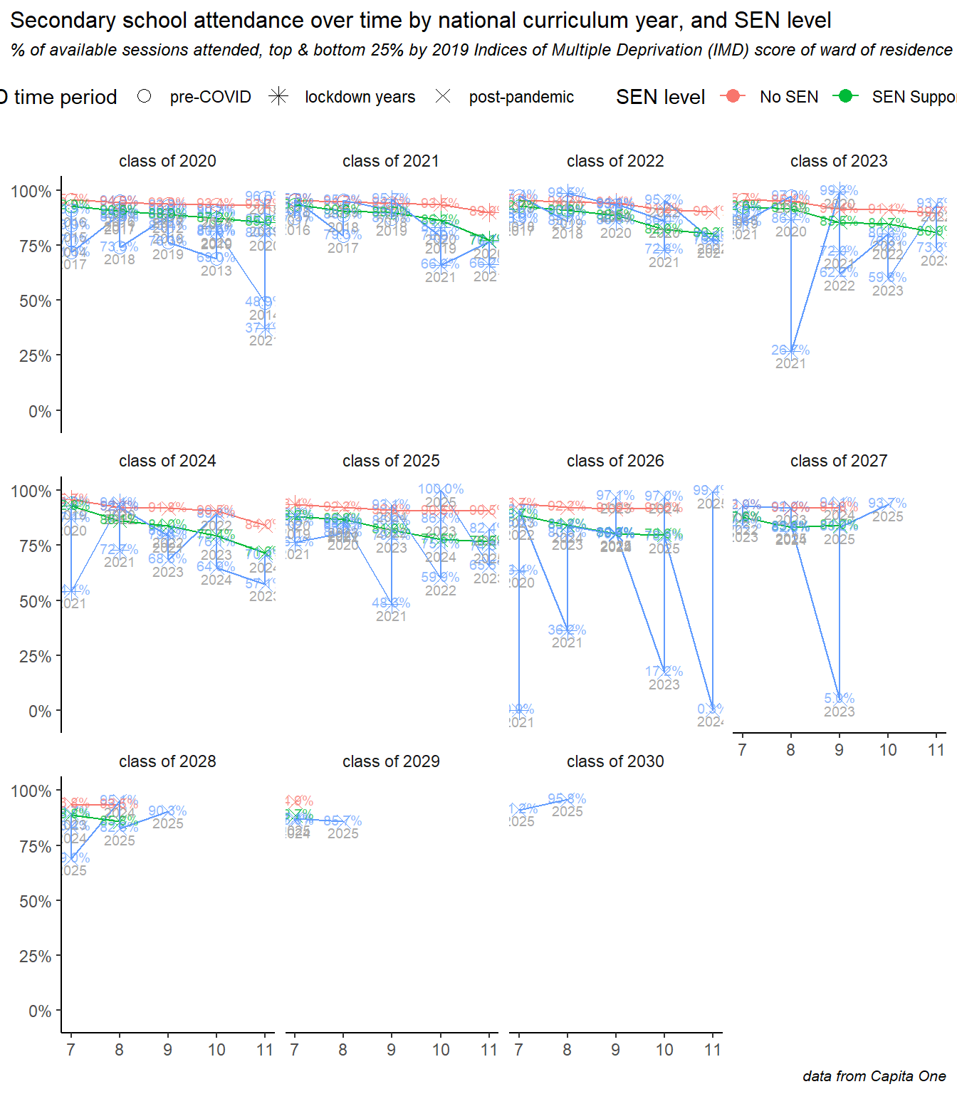
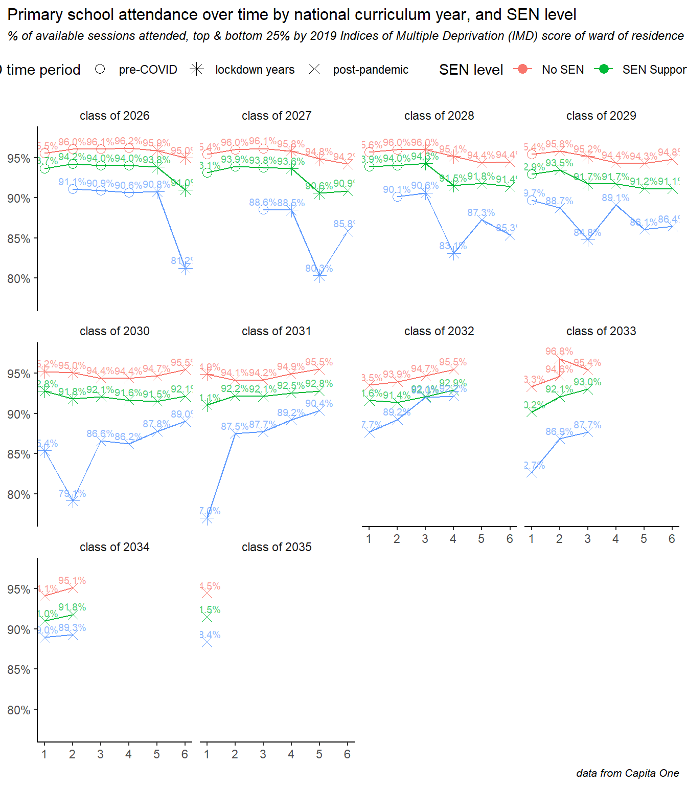
6 Trends by annual cohort
He we show how attendance is changing for each annual year group cohort of children, and explore some of the intersectionality between age, deprivation and special educational needs. This analysis particularly demonstrates differences in how the COVID pandemic, lockdowns and subsequent societal shifts have affected different groups.
Annual cohorts of children are referred to here as, for example, the “class of 2025” meaning the year group who began year 1 in September 2014 and will complete Y11 in July 2025. In each case there is a separate small line chart for each annual cohort. Data are labelled with the academic year and the % attendance rates, and the time period is divided into three phases: pre pandemic, during (2020 & 2021), and post pandemic - all years since. The time periods are denoted by colours or shapes, depending on the chart.
The first chart shows the overall picture in secondary schools. The first cohort shown here is the class of 2020, who completed most of Y11 before the pandemic struck, their GCSE exams were wildly disrupted, but their attendance follows only a shallow decline from Y7 through to Y11, while the classes of ’23 to ’25 (on the middle row), saw dramatic drops during the COVID years, and a continued decline in the period since. The classes of ’24 and ’25 were perhaps worse hit by the pandemic, effectively missing Y6-7 and Y7-8 respectively. Finally, the bottom row shows the latest three cohorts and some small but encouraging signs of recovery: the class of ’27 have less of a drop off to Y8, and the class of ’28 had the best attendance in Y7 since before the pandemic.
The picture in primary schools looks very different. Children generally attend better in years 2 to 4 than they do in Y1, so the underlying profile is more of a hump than a steady decline seen in secondary. The pandemic had a less dramatic effect on primary age children, and the decline also persisted into the post-pandemic years for many cohorts. However the big difference here, and an encouraging sign for the future, is that all cohorts from the class of ’29 onwards show improvements in recent years (here coloured blue), and that the youngest cohorts are showing the fastest improvements of all.
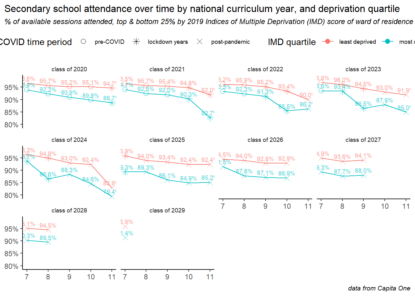
Re-creating the same plot but split by deprivation quartile, it becomes clear how the effects of the pandemic were concentrated in the more deprived areas of the city. Here the middle two quartiles of deprivation have been removed, and the pairs of lines show the most and least deprived quartiles of the school population, according to the 2019 indices of multiple deprivation scores of their ward of residence.
For all annual cohorts, the gap is stark, children living in more deprived areas were worse affected during the pandemic and have seen worse post-pandemic declines in attendance. If there is good news here, it is a narrowing of the gap in the latest Y7 intake.
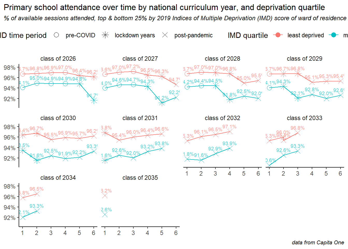
Repeating the same deprivation analysis for primary, and again we see how the pandemic disproportionately affected children in more deprived areas, with steeper dropoffs during the lockdown years. But we can also see recovery after the pandemic, for all cohorts and with steeper rates of increase for children in more deprived areas - but the deprivation gap still remains.
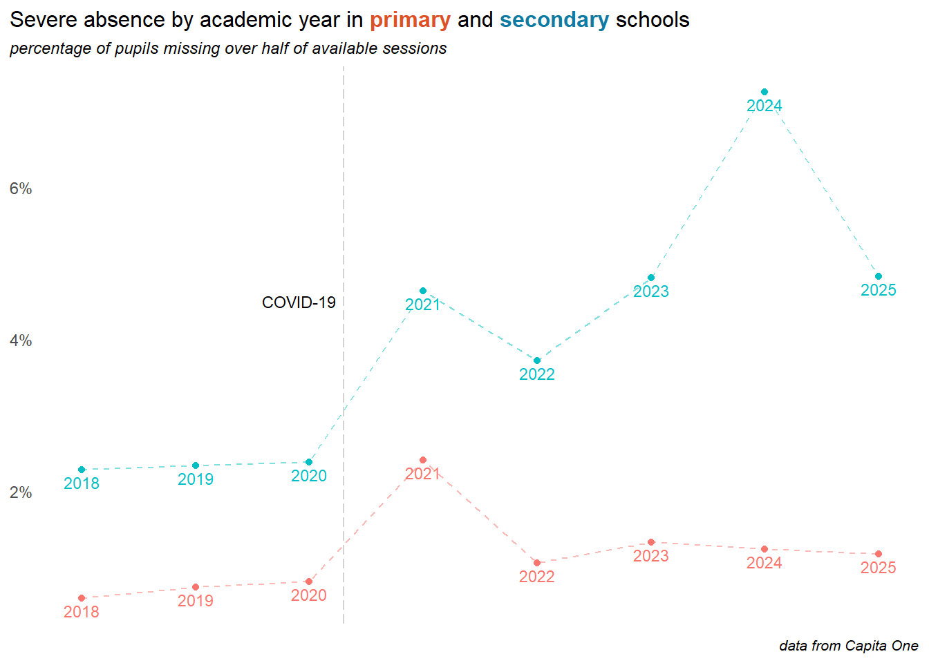
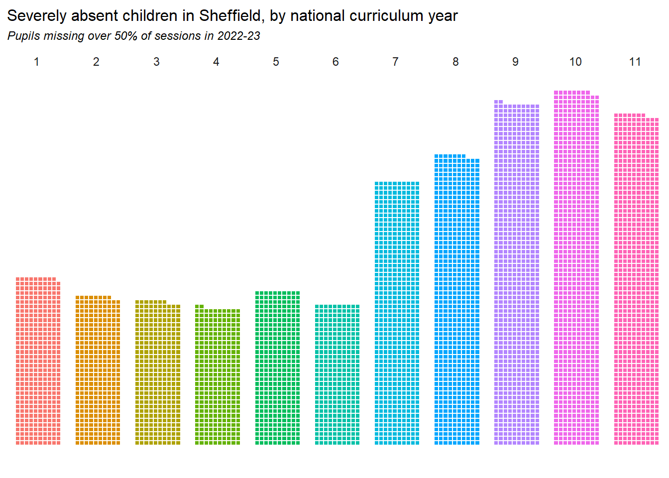
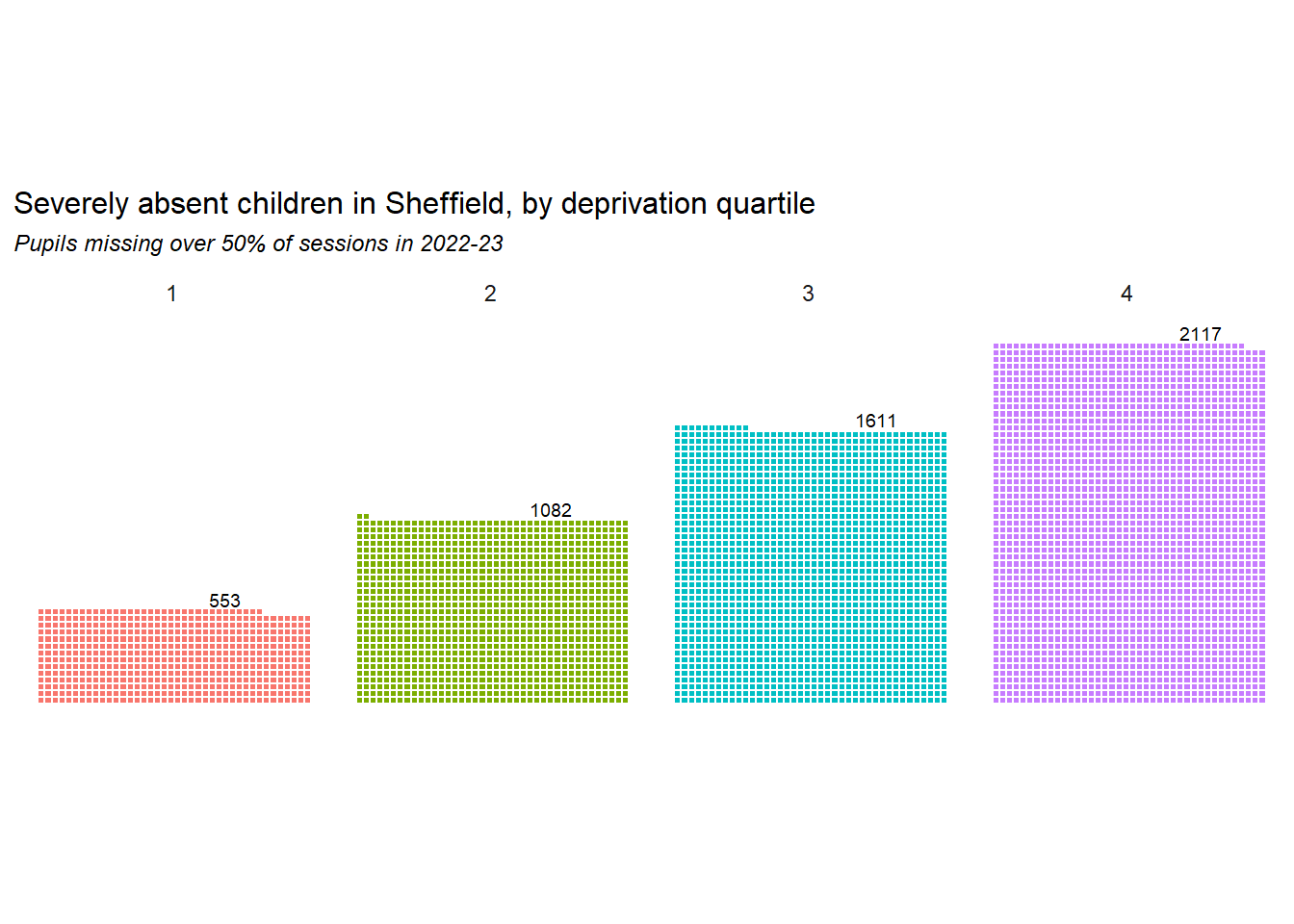
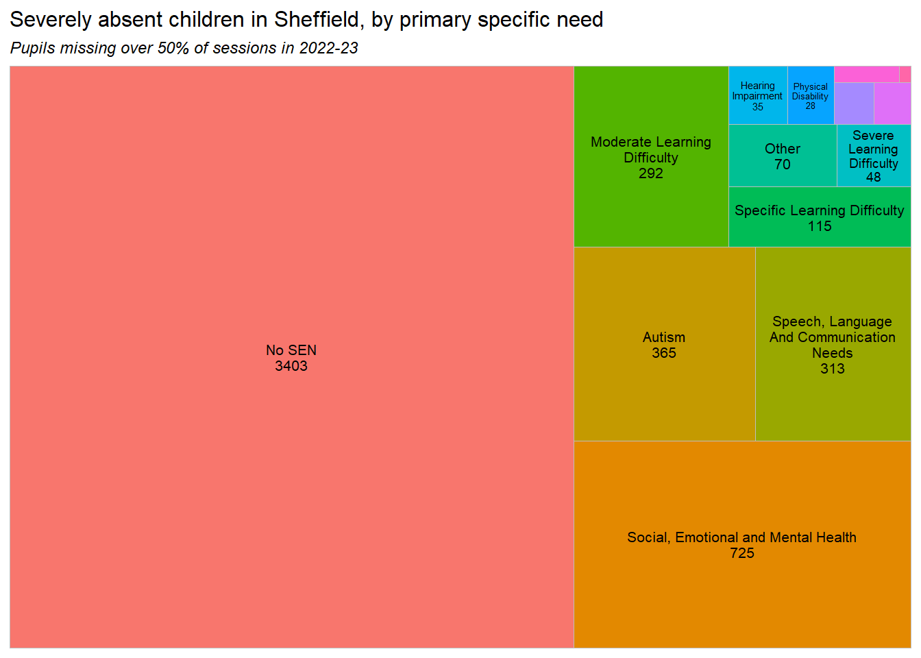
7 Severe absences
Children are classed as severely absent if they miss over 50% of available sessions in any given period. This section explores the characteristics of severely absent children, and how this is changing over time.
Important
Almost 1 in 20 children at Sheffield secondary schools was severely absent in 2023.
Severe absences in secondary schools appear to have peaked in 2024.
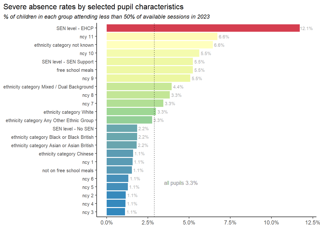
Next we look at the severe attendance rates of groups with different characteristics in 2023-24. The groupings here are chosen as those that show significant differences in severe absence rates. Note that the characteristics given here are not mutually exclusive. Children with an EHCP plan were nearly 8% more likely to be severely absent than average. Children in Y11 have twice the average rate.
All primary years, and a few ethnic groups have significantly lower severe absence rates.
The chart above shows relative severe absence rates of different groups, but we’ll complement that by quantifying the cohort of severely absent pupils in 2023 by their characteristics.
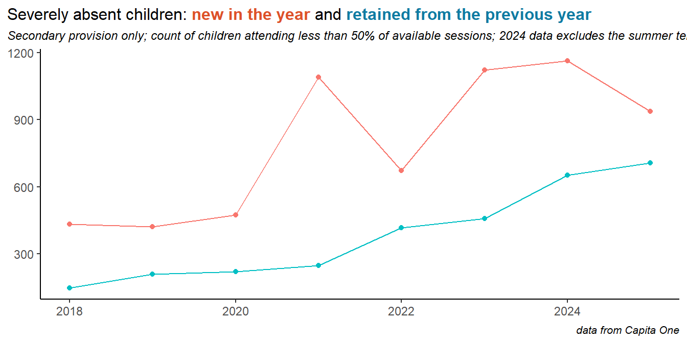
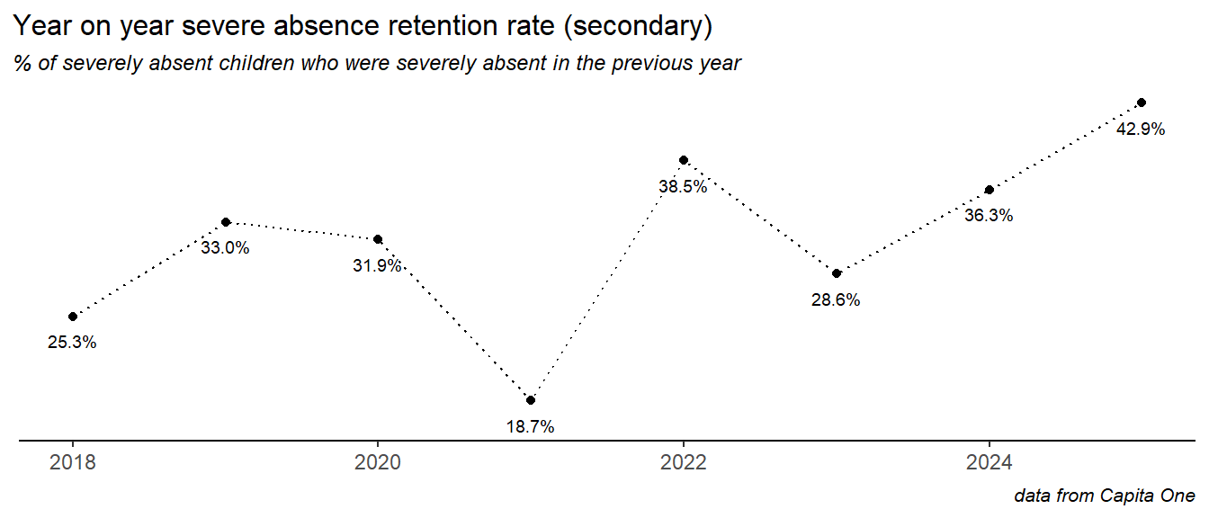
7.1 Severe absence - turnover and retention
It seems likely that there are children for whom severe absence is for some reason a persistent behaviour, and children for whom a severe absence happens in one or more years for some specific reason - like a crisis of health or personal circumstances. To try to understand this, we looked at year on year turnover and retention in the cohort of severely absent children.In the chart below, severely absent children are classed as retained if they were also severely absent the year before, and new if not. Both categories have risen in recent years:
So the problem of severe absence is, in part, due to a cohort we could describe as chronically severely absent.
The retention rate here is calculated as the percentage of all severely absent pupils in a given year that were also severely absent the year before. In secondary schools, in 2023, this was around 40% of children who were severely absent in 2023 were also severely absent in 2022.
This retention rate has risen in recent years:
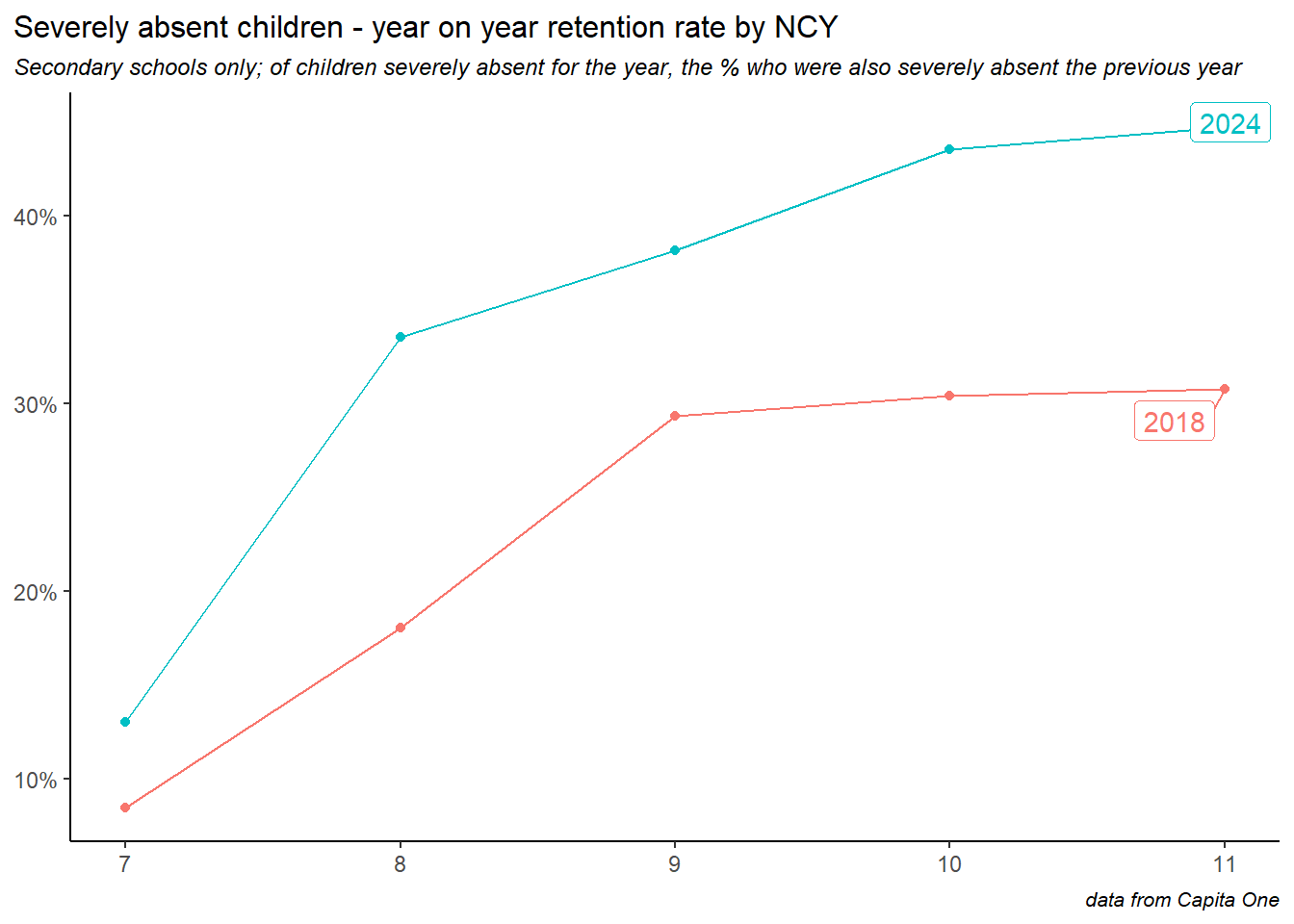
Plotting the retention rate by NCY shows increased year on year retention as children grow older. Here we’ve included the NCY profiles of two years: 2018 and 2024, showing the increased retention rates across the board into 2024.
8 Daily attendance patterns
The analysis so far in this report has used data aggregated up to the half term or annual level. During the course of this project we processed the raw daily data (recorded as a string of symbols and codes) to allow analysis of attendance at the level of the individual day.
8.1 Week day
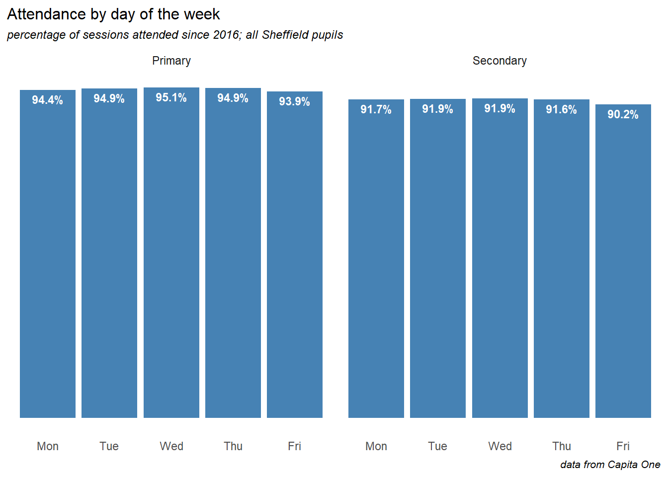
Fridays,(to a lesser extent Mondays) see significantly lower attendance than the other days of the week.
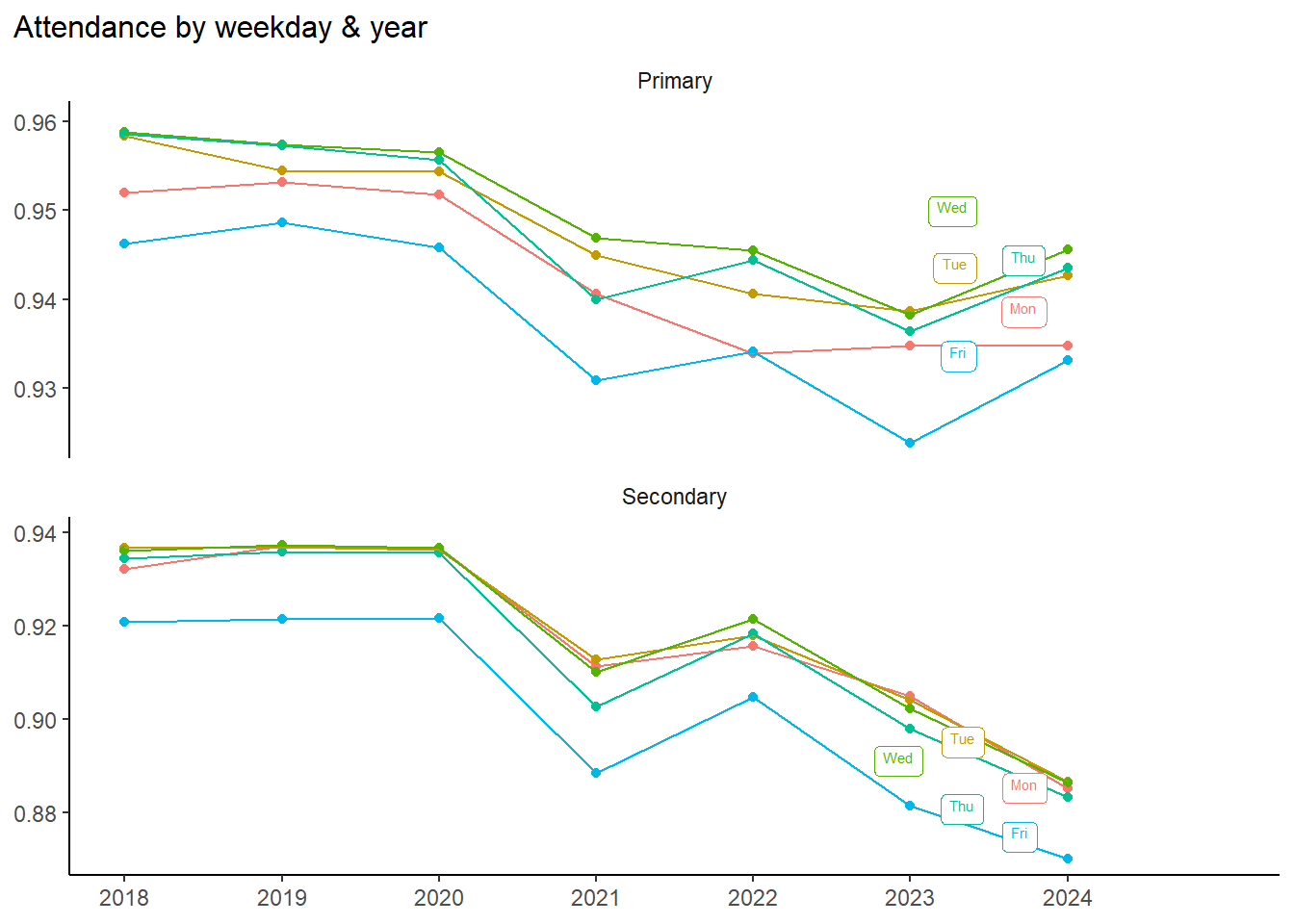
Looking at a time series, we see that Friday’s lower attendance is nothing new, and the gap has not really changed over time:
8.2 School attendance across the year
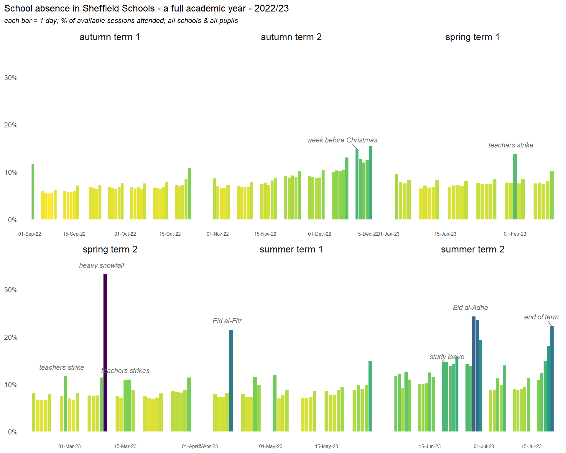
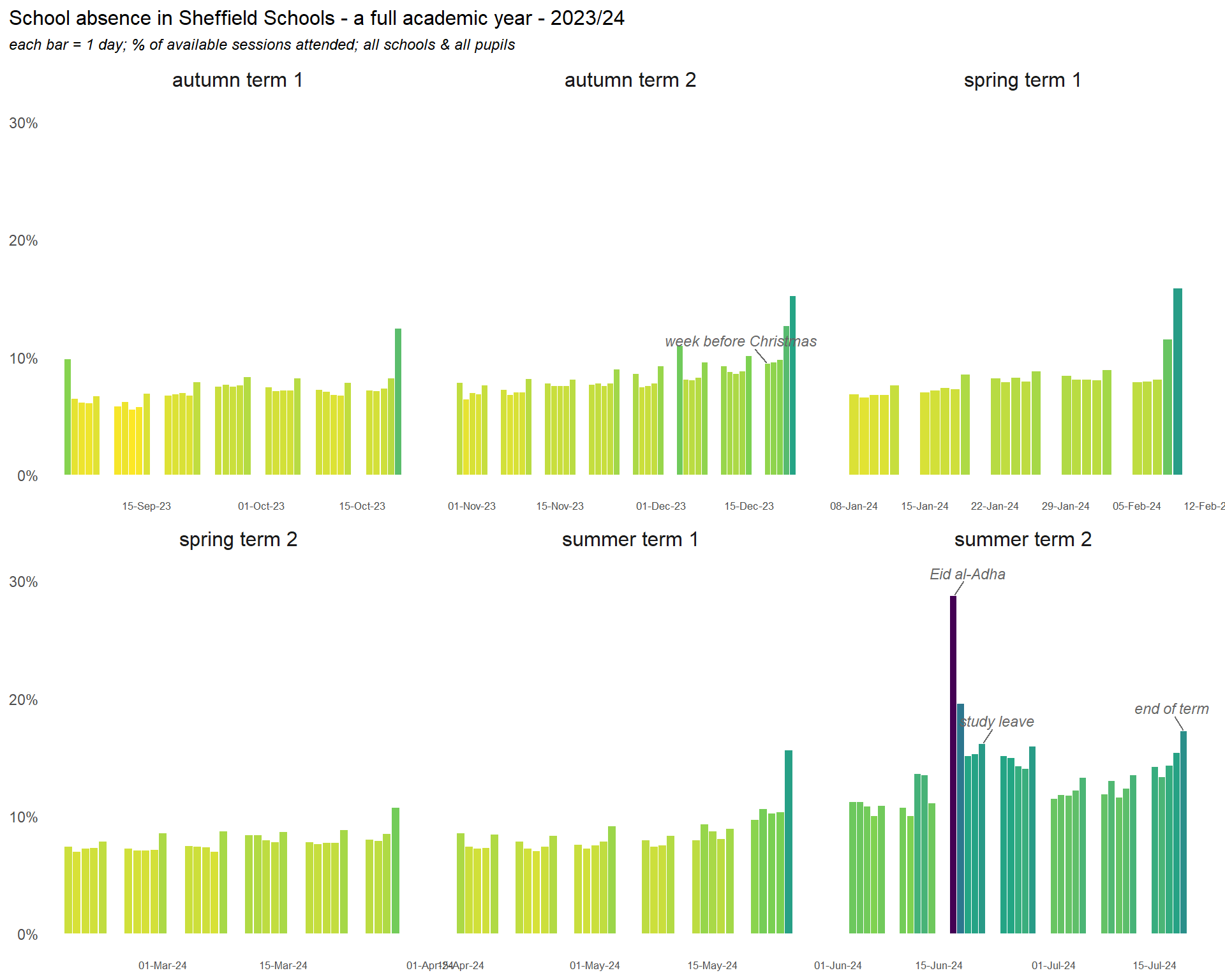
The day level data allows us to visualise an entire school year. Here we see how key points in the year and particular dates impact on school attendance. When the data are aggregated to the term level, there is very little seasonal variation, but differences at the day level are more dramatic than the differences we see between demographic groups.
In particular, we can see the impacts of:
the first and last days of term
a growing absence rates up towards Christmas
a wave of teachers’ strikes
heavy snowfall in March
Eid
the days immediately after bank holidays
study leave
increasing absence through the final summer term
Here is the same chart for the 2023-24 year:
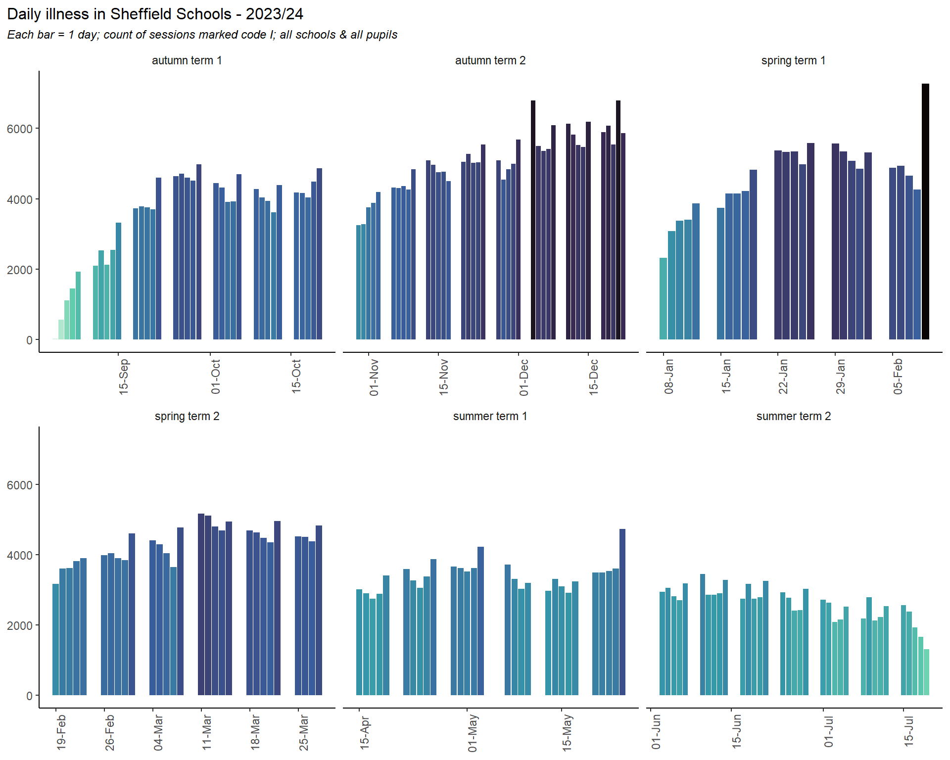
Recreating the same plot for absences coded as illness (though this time showing the count of sick days rather than the % of available sessions) shows how rates increased dramatically through the run up to Christmas, peaks on Fridays (and to a lesser extent Mondays) throughout the year, and a significantly lower rate in the summer. There are also spikes in illness on the last day of each half term (except the summer). This is the plot for 2024 but the pattern is very similar in other years.
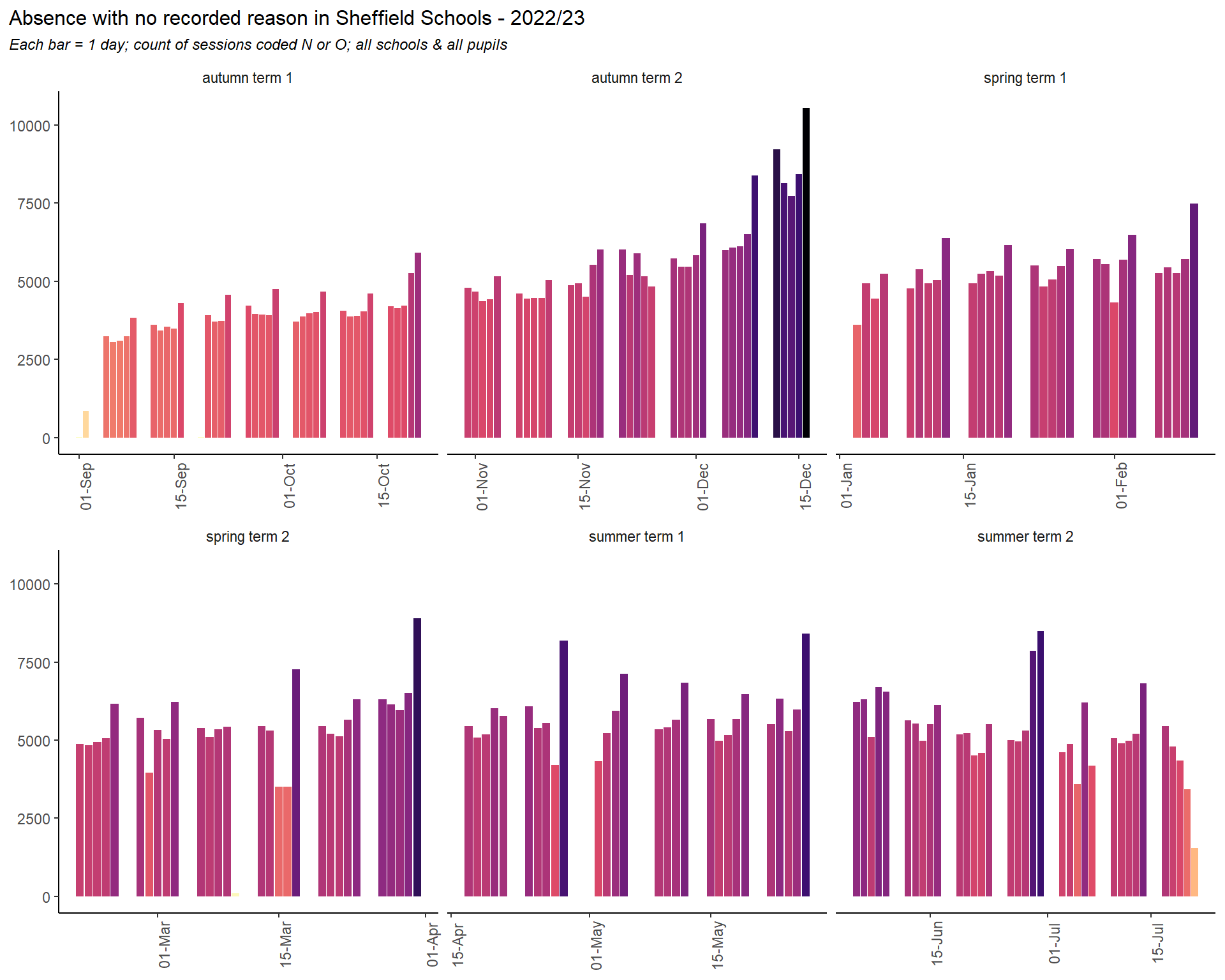
The day level no reason plot shows a similar shape to the illness plot. We could read this as suggesting that at least some of the no reason absences are explained by genuine sickness. Although the major spikes here on the last days of term may be due to unrecorded family holidays or other absences.
It’s worth comparing the 2023 and 2024 plots for no reason absences. As well as reduced levels of no reason absences throughout the year, 2024 sees much less seasonal variation - such as the steady build up to Christmas - although the end of term spikes are more pronounced.
9 Conclusion
School attendance is affected by a multitude of factors: age, economic deprivation, special educational needs, caring responsibilities, the culture of individual schools, the attitude of families and ultimately the children themselves. Factors associated with lower attendance are intersectional and compound each other.
The pandemic dominates the recent history of school attendance (and much else besides). COVID-19 lockdowns, social distancing and school closures were all surely transformative in cultural attitudes to school attendance, and the impacts were felt differently in different places. However, it would be a mistake to place too much emphasis on COVID-19 alone - deprivation & the cost of living; the rise of smartphones and social media; changes around special educational needs (both prevalences and attitudes) - these are all surely factors, many of which will have influenced one-another. Much of this is not recorded in the available data, and the interactions between these forces will be complex.
The good news is that despite the widespread risk factors identified here and despite recent social and cultural shifts, school attendance is recovering. Encouragingly, this recovery is strongest among the youngest cohorts of children. Recent changes to recording and the rules appear to be having an impact, but most inequalities persist, and some continue to widen. The coming years will tell if school attendance can recover to levels seen before the pandemic, and if the most vulnerable children can be helped to attend school as well as their peers.
This report is one of several produced under the inclusion & attendance data science project - there are also dedicted reports around Special Educational Needs (strategic needs analysis), the impact and effectiveness of services & interventions, and attendance by early years foundation stage attainment. Please refer to the links at the top of the SCC Data Science site for links to these.
If you have further questions about the data, analysis and narrative in this report please contact the Sheffield City Council Performance & Insight Team, or email giles.robinson@sheffield.gov.uk
Source Code
---title: "Attendance in Sheffield Schools"author: "Giles Robinson"date: 2025-02-10editor: visualformat: html: code-tools: true code-fold: true toc: true toc-location: left toc-depth: 4 number-sections: true number-depth: 4 fig-cap-location: top other-links: - text: Back to SCC Data Science site home href: https://scc-data-science.sheffield.gov.uk/execute: warning: false message: false echo: falseknitr: opts_chunk: out.width: "100%"---```{r}#| label: setup# clear the environmentremove(list =ls())# load packageslibrary(tidyverse)library(janitor)library(lubridate)library(ggtext)library(ggrepel)library(gghighlight)library(kableExtra)library(MetBrewer)library(corrplot) library(ggcorrplot)#library(shadowtext)library(readxl)library(ggstatsplot)library(geosphere)library(ggridges)library(forecast)library(tsibble)library(gt)library(waffle)library(treemapify)library(waterfalls)# specify data folderdata_folder <-str_c("S:/Public Health/Policy Performance Communications/Business Intelligence/Projects/EIP/data/inclusion/")# copy to excel functioncopy_excel <-function(input) {write.table(input, file ="clipboard-20000", sep ="\t", row.names = F)}# ggplot themeseb <-element_blank()# Set default ggplot themetheme_set(theme_classic() +theme(#plot.title = element_text(),plot.subtitle =element_text(size =9, face ="italic"),plot.caption =element_text(size =8, face ="italic"),plot.title.position ="plot",plot.title =element_markdown(size =12),strip.background = eb ))# theme for minimal bar chartsbarplottheme_minimal <-theme(axis.title.y = eb,axis.line.y = eb,axis.ticks.y = eb,axis.line.x = eb,axis.ticks.x = eb)gannt_theme <-theme_classic() +theme(plot.title =element_text(size =12),plot.subtitle =element_text(size =8, face ="italic"),plot.caption =element_text(size =8, face ="italic"),plot.title.position ="plot",axis.title = eb, axis.line.y = eb,axis.ticks.y = eb,axis.text.y = eb, legend.position ="right",legend.title = eb,legend.text =element_text(size =8) )# Connect to OSCAR database via ODBC#oscar_con <- DBI::dbConnect(# odbc::odbc(),# Driver = "Oracle in OraClient12Home1",# Dbq = "SCPRFLVE",# UID = if (Sys.getenv("oscar_userid") == "") {# rstudioapi::askForPassword("OSCAR User ID")# } else {# Sys.getenv("oscar_userid")# },# PWD = if (Sys.getenv("oscar_pwd") == "") {# rstudioapi::askForPassword("OSCAR Password")# } else {# Sys.getenv("oscar_pwd")# },# timeout = 10#)# Connect to LCS database via ODBC#lcs_con <- DBI::dbConnect(# odbc::odbc(),# Driver = "SQL Server Native Client 11.0",# Server = "shef-biprd-01.syhapp.com, 1438", # Database = "HDM_Local",# UID = if (Sys.getenv("lcs_userid") == "") {# rstudioapi::askForPassword("LCS User ID")# } else {# Sys.getenv("lcs_userid")# },# PWD = if (Sys.getenv("lcs_pwd") == "") {# rstudioapi::askForPassword("LCS Password")# } else {# Sys.getenv("lcs_pwd")# },# timeout = 10#)## connect to LAS database via ODBC#las_con <- DBI::dbConnect(# odbc::odbc(),# #dsn = "LAS",# Driver = "SQL Server Native Client 11.0",# Server = "shef-biprd-01.syhapp.com, 1436",# Database = "HDM",# UID = if (Sys.getenv("las_userid") == "") {# rstudioapi::askForPassword("LAS User ID")# } else {# Sys.getenv("las_userid")# },# PWD = if (Sys.getenv("las_pwd") == "") {# rstudioapi::askForPassword("LAS Password")# } else {# Sys.getenv("las_pwd")# },# timeout = 10#)# summarising attendance function# this is copied from the attendance & exclusion data model.# any changes made there should be reflected here & vice versa# note that the groupings appear TWICE in this function, once for grouped data and once for the "no grouping" scenario (grouping_vars = "none"). Any changes must be consistent across both.summarise_attendance <-function(input_data, grouping_vars) {ifelse (grouping_vars =="none", {# Aggregate without grouping result <- input_data |>mutate(zero_attendance =if_else(present ==0, 1, 0)) |>summarise(child_count =n_distinct(stud_id, na.rm =TRUE),row_count =n(),possible_sessions =sum(possible_sessions, na.rm =TRUE),present =sum(present, na.rm =TRUE),authorised =sum(authorised, na.rm =TRUE),unauthorised =sum(unauthorised, na.rm =TRUE),missing =sum(missing, na.rm =TRUE),excluded =sum(excluded, na.rm =TRUE),family_holiday_agreed =sum(family_holiday_agreed, na.rm =TRUE),family_holiday_not_agreed =sum(family_holiday_not_agreed, na.rm =TRUE),family_holiday_total =sum(family_holiday_total, na.rm =TRUE),illness =sum(illness, na.rm =TRUE),med_appt =sum(med_appt, na.rm =TRUE),no_reason =sum(no_reason, na.rm =TRUE),late_absent =sum(late_absent, na.rm =TRUE),late_pres =sum(late_pres, na.rm =TRUE),late_total =sum(late_absent, na.rm =TRUE) +sum(late_pres, na.rm =TRUE),study_leave =sum(study_leave, na.rm =TRUE),approved_offsite =sum(approved_offsite, na.rm =TRUE),fixed_exclusions =sum(fixed_exclusions, na.rm =TRUE),perm_exclusions =sum(perm_exclusions, na.rm =TRUE),total_exclusions =sum(total_exclusions, na.rm =TRUE),persistent_absent_count =sum(persistent_absence, na.rm =TRUE),severe_absent_count =sum(severe_absence, na.rm =TRUE),zero_attendance_count =sum(zero_attendance, na.rm =TRUE) ) |>mutate(percent_of_pupils = child_count /sum(child_count, na.rm =TRUE),percent_present = present / possible_sessions,percent_auth_absence = authorised / possible_sessions,percent_unauth_absence = unauthorised / possible_sessions,percent_missing = missing / possible_sessions,percent_family_holiday_agreed = family_holiday_agreed / possible_sessions,percent_family_holiday_not_agreed = family_holiday_not_agreed / possible_sessions,percent_family_holiday = family_holiday_total / possible_sessions,percent_excluded = excluded / possible_sessions,percent_illness = illness / possible_sessions,percent_med_appt = med_appt / possible_sessions,percent_no_reason = no_reason / possible_sessions,percent_late_absent = late_absent / possible_sessions,percent_late_pres = late_pres / possible_sessions,percent_late_total = late_total / possible_sessions,percent_study_leave = study_leave / possible_sessions,percent_approved_offsite = approved_offsite / possible_sessions,pc_of_pupils_persistent_absent = persistent_absent_count / row_count,pc_of_pupils_severely_absent = severe_absent_count / row_count,pc_of_pupils_zero_attendance = zero_attendance_count / row_count ) |>mutate(percent_absent =1- percent_present) }, {# Group by specified variables and then summarize result <- input_data |>mutate(zero_attendance =if_else(present ==0, 1, 0)) |>group_by(across(all_of(grouping_vars))) |>summarise(child_count =n_distinct(stud_id, na.rm =TRUE),row_count =n(),possible_sessions =sum(possible_sessions, na.rm =TRUE),present =sum(present, na.rm =TRUE),authorised =sum(authorised, na.rm =TRUE),unauthorised =sum(unauthorised, na.rm =TRUE),missing =sum(missing, na.rm =TRUE),excluded =sum(excluded, na.rm =TRUE),family_holiday_agreed =sum(family_holiday_agreed, na.rm =TRUE),family_holiday_not_agreed =sum(family_holiday_not_agreed, na.rm =TRUE),family_holiday_total =sum(family_holiday_total, na.rm =TRUE),illness =sum(illness, na.rm =TRUE),med_appt =sum(med_appt, na.rm =TRUE),no_reason =sum(no_reason, na.rm =TRUE),late_absent =sum(late_absent, na.rm =TRUE),late_pres =sum(late_pres, na.rm =TRUE),late_total =sum(late_absent, na.rm =TRUE) +sum(late_pres, na.rm =TRUE),study_leave =sum(study_leave, na.rm =TRUE),approved_offsite =sum(approved_offsite, na.rm =TRUE),fixed_exclusions =sum(fixed_exclusions, na.rm =TRUE),perm_exclusions =sum(perm_exclusions, na.rm =TRUE),total_exclusions =sum(total_exclusions, na.rm =TRUE),persistent_absent_count =sum(persistent_absence, na.rm =TRUE),severe_absent_count =sum(severe_absence, na.rm =TRUE),zero_attendance_count =sum(zero_attendance, na.rm =TRUE) ) |>mutate(percent_of_pupils = child_count /sum(child_count, na.rm =TRUE),percent_present = present / possible_sessions,percent_auth_absence = authorised / possible_sessions,percent_unauth_absence = unauthorised / possible_sessions,percent_missing = missing / possible_sessions,percent_family_holiday_agreed = family_holiday_agreed / possible_sessions,percent_family_holiday_not_agreed = family_holiday_not_agreed / possible_sessions,percent_family_holiday = family_holiday_total / possible_sessions,percent_excluded = excluded / possible_sessions,percent_illness = illness / possible_sessions,percent_med_appt = med_appt / possible_sessions,percent_no_reason = no_reason / possible_sessions,percent_late_absent = late_absent / possible_sessions,percent_late_pres = late_pres / possible_sessions,percent_late_total = late_total / possible_sessions,percent_study_leave = study_leave / possible_sessions,percent_approved_offsite = approved_offsite / possible_sessions,pc_of_pupils_persistent_absent = persistent_absent_count / row_count,pc_of_pupils_severely_absent = severe_absent_count / row_count,pc_of_pupils_zero_attendance = zero_attendance_count / row_count )|>mutate(percent_absent =1- percent_present) } )return(result)}# function to create average summary with 95% confidence intervalssummarise_avg <-function(input_data){ summarise (input_data, mean.percent_present =mean(percent_present, na.rm =TRUE),sd.percent_present =sd(percent_present, na.rm =TRUE),n.percent_present =n() ) |>mutate(se.percent_present = sd.percent_present /sqrt(n.percent_present),lower.ci.percent_present = mean.percent_present -qt(1- (0.05/2), n.percent_present -1) * se.percent_present,upper.ci.percent_present = mean.percent_present +qt(1- (0.05/2), n.percent_present -1) * se.percent_present ) }# percentage function with 95 CIpercent_calc <-function(input_data){input_data |>tally() |>mutate(freq = n /sum(n)) |>mutate(l_ci = freq - (1.96*sqrt((freq * (1- freq)) / n)),u_ci = freq + (1.96*sqrt((freq * (1- freq)) / n)) )}# mean attendance function with 95% CIpresence_mean_calc <-function(input_data){input_data |>summarise(mean.percent_present =mean(percent_present, na.rm =TRUE),sd.percent_present =sd(percent_present, na.rm =TRUE),n.percent_present =n() ) |>mutate(se.percent_present = sd.percent_present /sqrt(n.percent_present),lower.ci.percent_present = mean.percent_present -qt(1- (0.05/2), n.percent_present -1) * se.percent_present,upper.ci.percent_present = mean.percent_present +qt(1- (0.05/2), n.percent_present -1) * se.percent_present)}``````{r}#| label: load dataload(str_c(data_folder,"attendance_inclusion_data_model.RData"))```# Introduction## Background & scopeThis work was undertaken by the Sheffield City Council Business Intelligence team from around September 2023. New analysis was carried out on available data with the aim of understanding school attendance Sheffield and informing the requirements of the city's response. This report summarises the findings of that analysis, along with commentary derived from discussions of those findings with colleagues in SCC, Learn Sheffield and from Sheffield schools.This report covers the following:- recent trends\- benchmarking and comparisons\- key drivers of absences\- demographic differences:\- age\- gender\- ethnicity\- geography & deprivation\- distance to school- young carers- severe absence (\<50% attendance)- the absence patterns of annual year cohorts- day level data analysis - mapping out a school yearWithin the same analysis but out of scope of this report are:- special educational needs (this is covered in depth in the SNA report)- the performance of individual schools\- exclusions\- the reach and effectiveness of existing teams, services and interventions::: callout-note## some terms & definitionsUnless otherwise stated, *absence* refers to both *authorised* and *unauthorised* absences. Correspondingly, *attendance* refers to registered time in the classroom. *Absence* in this report may include periods of study leave, approved offsite activityUnless otherwise stated, the word *year* refers to the academic or exam year. So 2023 refers to the period of schooling between September '22 and July '23.:::## Data sources & processingAttendance, exclusion and school registration data and student details used in this report are from Capita One, retrieved from the OSCAR database, which is maintained by the Performance & Analysis Service (PAS). Supplementary information on school types and locations, geography & deprivation are held in spreadsheets.An R script gathers, combines, processes and aggregates this data into a data model. That data model was last updated 16/8/24 to include the first release of the full year 2024 attendance data.## Release notes1/7/24 - Giles Robinson. First complete draft for circulation. 16/8/24 - GR - updated with latest data, full 2024 academic year, various revisions, analysis of daily data; young carers 9/5/24 - GR - significant update with data now available up to Easter 2025.# TrendsRecent changes in overall attendance, by the major reasons covered by Department for Education (DfE) absence codes. We also discuss some codes that do not count as absences, but contribute to the picture around attendance, such as *late present*.## Overall attendanceThe COVID-19 pandemic and lockdowns saw a significant drop in attendance rates - although many of these trends beggan before the pandemic. Secondary age pupils were affected more than those in primary. In 2024 a gap continued to grow, with primary school attendance improving but worsening in secondary (though this was, in part, a result of the return of study leave as a coded reason, accounting for around 1% of secondary absences).::: callout-importantAt the time of writing (May 2025), there has been a significant shift into the current year. Primary school attendance continues to improve, while secondary has improved sharply on the previous year.:::```{r}#| label: plot overall attendance by year and phase post 2018#| fig-height: 4ggplot(attend_year_phase |>filter(phase %in%c("Primary","Secondary"), year >=2018 ) |>mutate(grey_flag =if_else(year==2025,0,1)) , aes(x = year, y = percent_present, alpha = grey_flag, colour = phase)) +geom_point() +geom_line(linetype ="dashed", alpha =0.5) +geom_text(aes(label = year), size =3, vjust =1.5) + barplottheme_minimal +# Use theme_minimal() instead of barplottheme_minimalscale_y_continuous(labels = scales::percent) +labs(title ="Overall attendance in Sheffield <b><span style='color:#dd5129'>primary </span></b>and <b><span style='color:#0f7ba2;'>secondary</b></span> schools",subtitle ="percentage of available sessions marked present per year; 2025 is part year",caption ="data from Capita One") +annotate("text", x =2020.3, y =0.9, label ="COVID-19", size =2.5, hjust =1.1) +geom_vline(xintercept =2020.3, linetype ="longdash", colour ="light gray") +theme(plot.title =element_markdown(size =12),legend.position ="none",axis.text.x = eb, axis.title.x = eb, axis.title.y = eb) + MetBrewer::scale_fill_met_d("Egypt")+coord_cartesian(clip ="off")```Our data prior to 2018 is less reliable and less complete, but taking a longer view suggests that at least some of the drivers of recent trends predate the pandemic. Attendance was improving to a peak in 2016, and was gradually dropping away from there, particularly in secondary schools. Things were getting worse before COVID, but the pandemic changed everything - despite recent improvements, attendance in Secondary schools remains well below pre-pandemic levels.```{r}#| label: plot overall attendance by year and phase all time#| fig-height: 4ggplot(attend_year_phase |>filter(phase %in%c("Primary","Secondary")) |>mutate(grey_flag =if_else(year==2025,0,1)) , aes(x = year, y = percent_present, alpha = grey_flag, colour = phase)) +geom_point() +geom_line(linetype ="dashed", alpha =0.5) +geom_text(aes(label = year), size =3, vjust =1.5) + barplottheme_minimal +# Use theme_minimal() instead of barplottheme_minimalscale_y_continuous(labels = scales::percent) +labs(title ="Attendance in Sheffield <b><span style='color:#dd5129'>primary </span></b>and <b><span style='color:#0f7ba2;'>secondary</b></span> schools",subtitle ="All available data; percentage of available sessions marked present per year; 2025 is part year",caption ="data from Capita One") +annotate("text", x =2020.3, y =0.9, label ="COVID-19", size =3, hjust =1.1) +geom_vline(xintercept =2020.3, linetype ="longdash", colour ="light gray") +theme(plot.title =element_markdown(size =12),legend.position ="none",axis.text.x = eb, axis.title.x = eb, axis.title.y = eb) + MetBrewer::scale_fill_met_d("Egypt")+coord_cartesian(clip ="off")```## IllnessThe recorded data on illness shows an increase year on year. The big rise into 2022 particularly affected primary age children, and was probably a mixture of COVID-19 itself and post-lockdown viral bounce-back. Illness rates increased slightly into 2025.::: callout-cautionPatterns in the day level data, and feedback from head teachers suggests that we are probably not seeing the true picture on illness. Differences in reporting (and the honesty of parents), policy and recording may be as significant here as changes in actual illness.:::```{r}#| label: plot illness by year and phase#| fig-height: 3.5ggplot(attend_year_phase |>filter(phase %in%c("Primary","Secondary"), year >=2018) |>mutate(grey_flag =if_else(year==2025,0,1)) , aes(x = year, y = percent_illness, alpha = grey_flag, colour = phase)) +geom_point() +geom_line(linetype ="dashed", alpha =0.5) +geom_text(aes(label = year), size =3, vjust =1.5) + barplottheme_minimal +# Use theme_minimal() instead of barplottheme_minimalscale_y_continuous(labels = scales::percent, limits =c(0,0.04)) +labs(title ="Illness by academic year in <b><span style='color:#dd5129'>primary </span></b>and <b><span style='color:#0f7ba2;'>secondary</b></span> schools",subtitle ="percentage of sessions missed per year (code I); 2025 is part year",caption ="data from Capita One") +#annotate("text", x = 2020.3, y = 0.001, label = "COVID-19", size = 3, hjust = 1.1) +#geom_vline(xintercept = 2020.3, linetype = "longdash", colour = "light gray") +theme(plot.title =element_markdown(size =12),legend.position ="none",axis.text.x = eb, axis.title.x = eb, axis.title.y = eb) + MetBrewer::scale_fill_met_d("Egypt")+coord_cartesian(clip ="off")```::: callout-tip## recomendationThe data on illness is worth monitoring in 2025 and considering in relation to schools' recording policies, particularly at the day level, and in proximity to bank holidays and half term holidays. It's possible that the new DfE rules around penalty notices and family holidays will create perverse incentives to increase *reported* illness rates, especially as we head into the 2025 summer term. It might be detectable in the day level data (see later in this report).:::## LatenessHead teachers report that lateness, even if marked as *late present* can have a significant can impact on activies that are regularly done first thing in the day, such as phonics. Lateness can be recorded as *late present* or *late absent*, the latter meaning that the child attends only after the registers have closed. Both categories are on the rise, with late absence in primary schools in particular growing problem. In secondary schools, *late present* is more common - and has been rising in recent years.```{r}#| label: plot late present by phase#| fig-height: 3.5late_present <- attend_year_phase |>filter(phase %in%c("Primary","Secondary"), year >=2018) |>select(year, phase, percent_late_pres) |>rename(value = percent_late_pres) |>mutate(category ="late present",grey_flag =if_else(year==2025,0,1) )ggplot( late_present,aes(x = year, y = value, alpha = grey_flag, colour = phase)) +geom_point() +geom_line(linetype ="dashed", alpha =0.5) +geom_text(aes(label = year), size =3, vjust =1.5) + barplottheme_minimal +scale_y_continuous(labels = scales::percent) +labs(title ="Lateness (marked present) by academic year in <b><span style='color:#dd5129'>primary </span></b>and <b><span style='color:#0f7ba2;'>secondary</b></span> schools",subtitle ="percentage of sessions missed per year (code L); 2025 is part year",caption ="data from Capita One") +theme(plot.title =element_markdown(size =12),legend.position ="none", axis.text.x = eb, axis.title.x = eb, axis.title.y = eb,strip.background = eb, strip.placement ="top", strip.text =element_text(size =11)) + MetBrewer::scale_fill_met_d("Egypt") +#facet_grid(rows = vars(category), scales = "free_y") +coord_cartesian(clip ="off")remove(late_present)```Late absent (after registers closed) make up a much smaller percentage of available sessions, but in secondary schools this is dramatically up in 2025 (note that this data does not yet include the summer term):```{r}#| label: plot late absent by phase and lateness type#| fig-height: 3.5late_absent <- attend_year_phase |>filter(phase %in%c("Primary","Secondary"), year >=2018) |>select(year, phase, percent_late_absent) |>rename(value = percent_late_absent) |>mutate(category ="late absent",grey_flag =if_else(year==2025,0,1) )ggplot( late_absent,aes(x = year, y = value, alpha = grey_flag, colour = phase)) +geom_point() +geom_line(linetype ="dashed", alpha =0.5) +geom_text(aes(label = year), size =3, vjust =1.5) + barplottheme_minimal +scale_y_continuous(labels = scales::percent) +labs(title ="Lateness (marked absent) by academic year in <b><span style='color:#dd5129'>primary </span></b>and <b><span style='color:#0f7ba2;'>secondary</b></span> schools",subtitle ="percentage of sessions missed per year (code U); 2025 is part year",caption ="data from Capita One") +theme(plot.title =element_markdown(size =12),legend.position ="none", axis.text.x = eb, axis.title.x = eb, axis.title.y = eb,strip.background = eb, strip.placement ="top", strip.text =element_text(size =11)) + MetBrewer::scale_fill_met_d("Egypt") +coord_cartesian(clip ="off")remove(late_absent)```## Family holidaysAbsences for family holidays are higher in primary, but have risen in secondary also. The cost of living crisis likely plays a part here. Rates appear lower in 2024, but at the time of writing the summer term is missing from the 2024 data, which is excluded from the plot below. Family holidays can be authorised or unauthorised, but due to differences in recording and coding policy between schools, both are grouped together here.```{r}#| label: plot family holidays by year and phase#| fig-height: 3.5ggplot(attend_year_phase |>filter(phase %in%c("Primary","Secondary"), year >=2018) |>mutate(grey_flag =if_else(year==2025,0,1)) , aes(x = year, y = percent_family_holiday, alpha = grey_flag, colour = phase)) +geom_point() +geom_line(linetype ="dashed", alpha =0.5) +geom_text(aes(label = year), size =3, vjust =1.5) + barplottheme_minimal +# Use theme_minimal() instead of barplottheme_minimalscale_y_continuous(labels = scales::percent) +labs(title ="Family holidays by academic year in <b><span style='color:#dd5129'>primary </span></b>and <b><span style='color:#0f7ba2;'>secondary</b></span> schools",subtitle ="percentage of sessions missed per year (codes F, H & G); 2025 is part year",caption ="data from Capita One") +annotate("text", x =2020.3, y =0.001, label ="COVID-19", size =3, hjust =1.1, colour ="gray") +geom_vline(xintercept =2020.3, linetype ="longdash", colour ="light gray") +theme(plot.title =element_markdown(size =12),legend.position ="none",axis.text.x = eb, axis.title.x = eb, axis.title.y = eb) + MetBrewer::scale_fill_met_d("Egypt")+coord_cartesian(clip ="off")```New DfE guidance and harsher penalties around family holiday absences came into effect August 2024, and the chart above appears to show a significant reduction, though this is mostly due to the summer term data is not yet (as of May '25) being available. Breaking this down by term shows two things: - in all previous years (COVID period aside, and the lockdown years have been removed here), the summer term has been the time when most holidays are taken- so far in 2025, the impact of the new rules is apparent in the autumn and spring term data - though the impact appears small, and levels are still well above pre-COVID years. The real test of this policy will be the rates in the summer term```{r}#| label: calculate attendance by year, term name and school phaseattend_year_term_phase <-summarise_attendance(input_data = attend, grouping_vars =c("year","term_name","phase")) |>group_by(phase) |>mutate(label =if_else(year ==max(year),term_name,NA_character_))``````{r}#| label: plot family holidays by term name primaryplot_data <- attend_year_term_phase |>filter(phase =="Primary",!year %in%c(2020,2021), year >=2018)ggplot(plot_data, aes(x = year, y = percent_family_holiday, #alpha = grey_flag, colour = term_name)) +geom_point() +geom_line(data = plot_data |>filter(year<=2020),linetype ="dashed", alpha =0.75) +geom_line(data = plot_data |>filter(year>=2022),linetype ="dashed", alpha =0.75) + barplottheme_minimal +# Use theme_minimal() instead of barplottheme_minimalscale_y_continuous(labels = scales::percent) +scale_x_continuous(breaks =seq(2018,2025, by =1)) +labs(title ="Family holidays by academic year Sheffield primary schools, by year and term",subtitle ="percentage of sessions missed per year (codes F, H & G); 2020 & 2021 removed; summer 2025 Summer not yet available",caption ="data from Capita One") +annotate("text", x =2020.3, y =0.001, label ="COVID-19", size =3, hjust =1.1, colour ="gray") +geom_vline(xintercept =2020.3, linetype ="longdash", colour ="light gray") +theme(plot.title =element_markdown(size =12),legend.position ="top", legend.title = eb,axis.title.x = eb, axis.title.y = eb) + MetBrewer::scale_fill_met_d("Egypt")+coord_cartesian(clip ="off")``````{r}#| label: plot family holidays by term name secondaryplot_data <- attend_year_term_phase |>filter(phase =="Secondary",!year %in%c(2020,2021), year >=2018)ggplot(plot_data, aes(x = year, y = percent_family_holiday, #alpha = grey_flag, colour = term_name)) +geom_point() +geom_line(data = plot_data |>filter(year<=2020),linetype ="dashed", alpha =0.75) +geom_line(data = plot_data |>filter(year>=2022),linetype ="dashed", alpha =0.75) + barplottheme_minimal +# Use theme_minimal() instead of barplottheme_minimalscale_y_continuous(labels = scales::percent) +scale_x_continuous(breaks =seq(2018,2025, by =1)) +labs(title ="Family holidays by academic year Sheffield secondary schools, by year and term",subtitle ="percentage of sessions missed per year (codes F, H & G); 2020 & 2021 removed; summer 2025 Summer not yet available",caption ="data from Capita One") +annotate("text", x =2020.3, y =0.001, label ="COVID-19", size =3, hjust =1.1, colour ="gray") +geom_vline(xintercept =2020.3, linetype ="longdash", colour ="light gray") +theme(plot.title =element_markdown(size =12),legend.position ="top", legend.title = eb,axis.title.x = eb, axis.title.y = eb) + MetBrewer::scale_fill_met_d("Egypt")+coord_cartesian(clip ="off")```## ExclusionsExclusions have risen very rapidly, particularly in secondary schools. This is mostly driven by temporary suspensions, largely as schools clamp down on what is classified as *persistent disruptive behaviour*. This makes only a small contribution to overall absence rates, but is growing, and for some children is a major contribution to their overall school absence. Exclusion rates in 2025 (part year at the time of writing) look to have levelled off.```{r}#| label: plot exclusion by year and phase #| fig-height: 3.5ggplot(attend_year_phase |>filter(phase %in%c("Primary","Secondary"), year >=2018) |>mutate(grey_flag =if_else(year==2025,0,1)) , aes(x = year, y = percent_excluded, alpha = grey_flag, colour = phase)) +geom_point() +geom_line(linetype ="dashed", alpha =0.5) +geom_text(aes(label = year), size =3, vjust =1.5) + barplottheme_minimal +# Use theme_minimal() instead of barplottheme_minimalscale_y_continuous(labels = scales::percent) +labs(title ="Absence due to exclusion, by academic year in <b><span style='color:#dd5129'>primary </span></b>and <b><span style='color:#0f7ba2;'>secondary</b></span> schools",subtitle ="percentage of sessions missed per year (code E); 2025 is part year",caption ="data from Capita One") +#annotate("text", x = 2020.3, y = 0.001, label = "COVID-19", size = 3, hjust = 1.1) +#geom_vline(xintercept = 2020.3, linetype = "longdash", colour = "light gray") +theme(plot.title =element_markdown(size =12),legend.position ="none",axis.text.x = eb, axis.title.x = eb, axis.title.y = eb) + MetBrewer::scale_fill_met_d("Egypt") +coord_cartesian(clip ="off")```## Study leave2024 saw seen the return of study leave as a coded absence reason, with a significant impact on overall attendance levels in secondary and particularly y11. At the time of writing the 2025 data does not include the summer term and shows only minimal study leave.```{r}#| label: plot study leave by year and phase#| fig-height: 3.5ggplot(attend_year_phase |>filter(phase %in%c("Primary","Secondary"), year >=2018) |>mutate(grey_flag =if_else(year==2025,0,1)) , aes(x = year, y = percent_study_leave, alpha = grey_flag, colour = phase)) +geom_point() +geom_line(linetype ="dashed", alpha =0.5) +geom_text(aes(label = year), size =3, vjust =1.5) + barplottheme_minimal +# Use theme_minimal() instead of barplottheme_minimalscale_y_continuous(labels = scales::percent) +labs(title ="Study leave, by academic year in <b><span style='color:#dd5129'>primary </span></b>and <b><span style='color:#0f7ba2;'>secondary</b></span> schools",subtitle ="percentage of sessions missed per year (code S); 2025 is part year",caption ="data from Capita One") +annotate("text", x =2020.3, y =0.001, label ="COVID-19", size =3, hjust =1.1) +geom_vline(xintercept =2020.3, linetype ="longdash", colour ="light gray") +theme(plot.title =element_markdown(size =12),legend.position ="none",axis.text.x = eb, axis.title.x = eb, axis.title.y = eb) + MetBrewer::scale_fill_met_d("Egypt") +coord_cartesian(clip ="off")```## No reasonThe plot below comprises two DfE codes. Code N is intended as a placeholder until schools can establish a reason for absence, and code 0 is for unknown or other circumstances. Here both are grouped together - though the bulk is code O.::: callout-importantThe increase in _no reason_ absences levelled off into 2024 and is down dramatically 2025. Some of this is likely due to the changes to recording from September 2024. Even so, the *no reason* category remains the biggest contributor to overall absence rates in secondary, and the increase in *no reason* absences are the biggest contribution to the post-pandemic rise in absences. Furthermore, *no reason* absences are significantly more prevalent in more deprived areas of the city, where attendance in general is poorer.:::We can draw two possible conclusions from this: parents and children are not reporting the true reasons for absence, and the DfE codes are no longer suitable for capturing those reasons. In either case, this represents a serious blind spot in the data.::: callout-tip## recomendationAnalysis of recorded case notes and text on Capita One, along with interviews or surveys of pupils, teachers, parents or community groups may help to understand the stories behind these *no reason* absences:::```{r}#| label: plot no reason by year and phase#| fig-height: 3.5ggplot(attend_year_phase |>filter(phase %in%c("Primary","Secondary"), year >=2018) |>mutate(grey_flag =if_else(year==2025,0,1)) , aes(x = year, y = percent_no_reason, alpha = grey_flag, colour = phase)) +geom_point() +geom_line(linetype ="dashed", alpha =0.5) +geom_text(aes(label = year), size =3, vjust =1.5) + barplottheme_minimal +# Use theme_minimal() instead of barplottheme_minimalscale_y_continuous(labels = scales::percent) +labs(title ="Absent with no reason, by academic year in <b><span style='color:#dd5129'>primary </span></b>and <b><span style='color:#0f7ba2;'>secondary</b></span> schools",subtitle ="percentage of sessions missed per year (codes N & O); 2025 is part year",caption ="data from Capita One") +annotate("text", x =2020.3, y =0.001, label ="COVID-19", size =3, hjust =1.1) +geom_vline(xintercept =2020.3, linetype ="longdash", colour ="light gray") +theme(plot.title =element_markdown(size =12),legend.position ="none",axis.text.x = eb, axis.title.x = eb, axis.title.y = eb) + MetBrewer::scale_fill_met_d("Egypt")+coord_cartesian(clip ="off")```Finally, the two charts below summarise the contributions of each of these coded absence reasons to the overall absence picture, during 2023-2024:```{r}#| label: get 2024 summary by phase and coded reasoncoded_absence_2024 <- attend_year_phase |>ungroup() |>filter( year ==2024, phase %in%c("Primary","Secondary") ) |>select(phase,`missing data`= percent_missing,illness = percent_illness,`family holidays`= percent_family_holiday,excluded = percent_excluded,`medical appointments`= percent_med_appt,late = percent_late_absent,`study leave`= percent_study_leave,`approved offsite activity`= percent_approved_offsite,`no reason`= percent_no_reason) |>pivot_longer(-phase,names_to ="category",values_to ="percent") |>arrange(percent)``````{r}#| label: plot coded absence primary#| fig-height: 4wf <-coded_absence_2024 |>filter(phase =="Primary") |>mutate(cat_wrap =str_wrap(category, width =10)) |>select(-phase, -category)waterfall(wf, rect_text_labels = scales::percent(wf$percent, accuracy =0.1),calc_total =TRUE,total_rect_text = scales::percent(sum(wf$percent),0.1),total_axis_text ="total",total_rect_color ="gray" ) +theme(axis.line = eb, axis.ticks = eb, axis.text.y = eb) +labs(title ="Coded absences in Sheffield primary schools - 2023-24",subtitle ="% of available sessions missed")``````{r}#| label: plot coded absence secondary#| fig-height: 4wf <-coded_absence_2024 |>filter(phase =="Secondary") |>mutate(cat_wrap =str_wrap(category, width =10)) |>select(-phase, -category)waterfall(wf, rect_text_labels = scales::percent(wf$percent, accuracy =0.1),calc_total =TRUE,total_rect_text = scales::percent(sum(wf$percent),0.1),total_axis_text ="total",total_rect_color ="gray" ) +theme(axis.line = eb, axis.ticks = eb, axis.text.y = eb) +labs(title ="Coded absences in Sheffield secondary schools - 2023-24",subtitle ="% of available sessions missed")```# DemographicsLooking at how attendance varies with age, gender and ethnicity, and how this picture is changing over time.## AgeAbsence is little higher in Y1 and Y2 when children are very young, and is level through primary. The transition to secondary school is associated with a big increase in absence, which continues year on year up to Y11. As we'll see later on - this *transition drop* into Y7 and subsequent decline is more severe for groups with particular risk factors.```{r}#| label: calculate and plot attendance by school year #| fig-height: 4# calculate average presence by ncyattend_ncy <- attend |>filter(year >=2018, ncy >=1& ncy <=11) |>summarise_attendance(grouping_vars =c("ncy", "stud_id")) |>group_by(ncy) |>summarise (mean.percent_absent =mean(percent_absent, na.rm =TRUE),sd.percent_absent =sd(percent_absent, na.rm =TRUE),n.percent_absent =n() ) |>mutate(se.percent_absent = sd.percent_absent /sqrt(n.percent_absent),lower.ci.percent_absent = mean.percent_absent -qt(1- (0.05/2), n.percent_absent -1) * se.percent_absent,upper.ci.percent_absent = mean.percent_absent +qt(1- (0.05/2), n.percent_absent -1) * se.percent_absent)# plotggplot(attend_ncy, aes(x = ncy, y = mean.percent_absent)) +geom_col(position =position_dodge(0.9), fill ="#0072B2")+geom_errorbar(aes(ymin = lower.ci.percent_absent, ymax = upper.ci.percent_absent), width =0.2, position =position_dodge(0.9))+geom_text(aes(label = scales::percent(round(mean.percent_absent,3))), vjust =2, colour ="white", size =3, position =position_dodge(0.9)) +labs(title ="Absence by school year",subtitle ="Average percentage of available sessions not attended +- 95 CI; all reason codes; all Sheffield schools & pupils, 2018 - 2024",x ="national curriculum year",caption ="data from Capita One")+ barplottheme_minimal +theme(axis.text.y = eb) +scale_x_continuous(breaks =seq(1,11))```::: callout-noteThe ImpactEd report [Understanding Attendance - Report 1](https://www.evaluation.impactedgroup.uk/research-and-resources/understanding-attendance) identified an emerging trend of a jump in absence between Y7 and y8. The Sheffield data does not support this, with the increase from Y7 to Y8 looking broadly the same - around 1% increase in absence - as any other year on year increase within secondary years.:::Looking at trends over time for primary school years, we see that the youngest and oldest primary age children were most affected. There are encouraging signs of recovery among all primary years into 2024, and particularly in Y1.```{r}#| label: plot attendance by year & ncy - primary#| fig-height: 3.5attend |>filter(year !=2020, year >=2018, school_ed_phase_corrected =="Primary") |>ungroup() |>summarise_attendance(grouping_vars =c("ncy","year","school_ed_phase_corrected")) |>filter(ncy <=11& ncy >=1, child_count >1000) |>ungroup() |>mutate(label =ifelse(year ==max(year), ncy, NA_character_),ncy =factor(ncy)) |>ggplot(aes(x = year,y = percent_present,colour = ncy,group = ncy,label = label ) ) +geom_point(shape =1) +geom_line() +geom_label_repel(hjust =TRUE,min.segment.length =Inf,max.overlaps =Inf,size =2.5) +scale_y_continuous(labels = scales::percent) +scale_x_continuous(limits =c(2018,2026), breaks =seq(2018,2025)) +theme(legend.position ="none", axis.title = eb, strip.background = eb, axis.line = eb, axis.ticks = eb) +labs(title ="Primary school attendance over time by national curriculum year",subtitle ="% of available sessions attended; all Sheffield schools; 2020 excluded; 2025 is part-year",caption ="data from Capita One") +coord_cartesian(clip ="off")```In secondary schools, we can see how disproportionately affected children in Y11, and encouraging signs of recovery in years 7 and 9. It is worth noting that the children in years 10 and 11 in 2024 were those who had their crucial Y6 and y7 transition years disrupted by the pandemic.```{r}#| label: plot attendance by year & ncy - secondary#| fig-height: 3.5attend |>filter(year !=2020, year >=2018, school_ed_phase_corrected =="Secondary") |>ungroup() |>summarise_attendance(grouping_vars =c("ncy","year","school_ed_phase_corrected")) |>filter(ncy <=11& ncy >=1, child_count >1000) |>ungroup() |>mutate(label =ifelse(year ==max(year), ncy, NA_character_),ncy =factor(ncy)) |>ggplot(aes(x = year,y = percent_present,colour = ncy,group = ncy,label = label ) ) +geom_point(shape =1) +geom_line() +geom_label_repel(hjust =TRUE,min.segment.length =Inf,max.overlaps =Inf,size =2.5) +scale_y_continuous(labels = scales::percent) +scale_x_continuous(limits =c(2018,2026), breaks =seq(2018,2025)) +theme(legend.position ="none", axis.title = eb, strip.background = eb, axis.line = eb, axis.ticks = eb) +labs(title ="Secondary school attendance over time by national curriculum year",subtitle ="% of available sessions attended; all Sheffield schools; 2020 excluded; 2025 is part-year",caption ="data from Capita One") +coord_cartesian(clip ='off')```::: callout-infoThe drop off in Y11 is driven in part driven by study leave in 2024; this is yet to occur in the 2025 year:::These trends will be explored in more detail in the *Trends by annual cohort* section later in this report.## GenderLooking at overall school attendance since 2021, girls attend slightly better than boys, a difference of about 0.5%.The gender time series show boys and girls moving in lockstep through primary school, separated by about half a percentage point:```{r}#| label: plot primary attendance by gender#| fig-height: 3#| warning: falseattend_year_gender_phase |>filter(!is.na(gender), year >=2018, phase =="Primary") |>ungroup() |>mutate(label =if_else(year ==max(year), case_when(gender =="M"~"boys", gender =="F"~"girls"), NA_character_)) |>ggplot(aes(x = year,y = percent_present,colour = gender, group = gender,label = label)) +geom_point(size =3) +geom_line() + barplottheme_minimal +theme(legend.position ="none", axis.title.x = eb, legend.title = eb) +scale_y_continuous(labels = scales::percent) +scale_x_continuous(breaks =seq(2018,2026, by =1)) +geom_text_repel(hjust =TRUE, nudge_x =0.5, min.segment.length =Inf) +labs(title ="Primary school attendance by year and gender", subtitle ="% of sessions attended per year; 2025 is part year",caption ="data from Capita One")```In secondary we see boys' attendance overtaking girls in the aftermath of the pandemic, but all continuing to decline into 2024.```{r}#| label: plot secondary attendance by gender#| fig-height: 3#| warning: falseattend_year_gender_phase |>filter(!is.na(gender), year >=2018, phase =="Secondary") |>ungroup() |>mutate(label =if_else(year ==max(year), case_when(gender =="M"~"boys", gender =="F"~"girls"), NA_character_)) |>ggplot(aes(x = year,y = percent_present,colour = gender, group = gender,label = label)) +geom_point(size =3) +geom_line() + barplottheme_minimal +theme(legend.position ="none", axis.title.x = eb, legend.title = eb) +scale_y_continuous(labels = scales::percent) +scale_x_continuous(breaks =seq(2018,2026, by =1)) +geom_text_repel(hjust =TRUE, nudge_x =0.5, min.segment.length =Inf) +labs(title ="Secondary school attendance by year and gender", subtitle ="% of sessions attended per year; 2025 is part year",caption ="data from Capita One")``````{r}#| label: plot attendance by ncy and gender#| fig-height: 3#| warning: falseattend |>filter(!is.na(gender), gender !="U", year >=2018, ncy >=0, ncy <=11) |>group_by(ncy, gender) |>presence_mean_calc() |>ungroup() |>mutate(label =if_else(ncy ==max(ncy), case_when(gender =="M"~"boys", gender =="F"~"girls"), NA_character_)) |>ggplot(aes(x = ncy,y = mean.percent_present,colour = gender, group = gender,label = label)) +geom_point(size =1) +geom_line() +geom_errorbar(aes(ymin = lower.ci.percent_present, ymax = upper.ci.percent_present), width =0.2, alpha =0.6)+ barplottheme_minimal +theme(legend.position ="none", axis.title.x = eb, legend.title = eb) +scale_y_continuous(labels = scales::percent) +scale_x_continuous(breaks =seq(0,11, by =1)) +geom_text_repel(hjust =TRUE, nudge_x =0.5, min.segment.length =Inf) +labs(title ="School attendance by national curriculum year and gender", subtitle ="% of sessions attended per year since 2018",caption ="data from Capita One")```Looking at age, gender and deprivation together, we see the pattern reversed in older children. In poorer wards of the city, girls consistently attend better than boys across all ages. In the most affluent wards, this is reversed in older children, with a gender gap widening from Y8 onwards, where boys have higher attendance.```{r}attend |>left_join(stud_details_joined |>select(-gender), by ="stud_id") |>filter(year >=2018, ncy >=1, ncy <=11,!is.na(gender), imd_quartile %in%c(1,4)) |>mutate(imd_quart_name =if_else(imd_quartile ==1, "most affluent 25%", "most deprived 25%")) |>select(-imd_quartile) |>group_by(imd_quart_name,ncy,gender) |>presence_mean_calc() |>ggplot(aes(x = ncy, y = mean.percent_present,colour = gender, group = gender)) +geom_point() +geom_line() +scale_y_continuous(labels = scales::percent) +scale_x_continuous(breaks =seq(1:11)) +facet_grid(rows =vars(imd_quart_name)) +theme(axis.title.y = eb, legend.position ="top", legend.title = eb) +labs(title ="Secondary school attendance by IMD quartile, national curriculum year and gender", subtitle ="% of sessions attended per year; 2025 is part year",caption ="data from Capita One")```## EthnicityThe ethnic makeup of Sheffield's population continues to change, and there are differences in attendance rates between children in different ethnic groups. Here we summarise the data around ethnicity.::: callout-cautionThe ethnic groups and subgroups used in this analysis are those available the Capita One source data. These don't necessarily align with the groupings used by ONS for census data, other organisations, or in other SCC data and reporting:::With the caveat that data prior to 2018 may not be wholly complete, the attendance data allows us to look at a long term view of changes in the ethnic makeup of the Sheffield school population. Note the free y-axis scales on the following chart, means that the lines are not directly comparable:```{r}#| label: ethnic groups over time#| warning: false#| message: falseeth_category_volumes <- attend |>select(year, stud_id, ethnicity_category) |>unique() |>group_by(year, ethnicity_category) |>summarise(student_count =n_distinct(stud_id)) |>mutate(freq = student_count /sum(student_count)) |>ungroup() |>mutate(label =ifelse(year ==max(year), ethnicity_category, NA_character_),label_n =ifelse(year %in%c(2008,2012,2016,2020,2024,2025),student_count,NA_real_) )ggplot(eth_category_volumes,aes(x = year, y = student_count, colour = ethnicity_category)) +geom_line() +scale_x_continuous(breaks =seq(2006,2024, by =2)) +geom_label_repel(aes(label = label), nudge_x =4, nudge_y =0, alpha =0.75, size =2.5,min.segment.length =Inf) +geom_text_repel(aes(label = label_n), size =2.5) +facet_grid(rows =vars(fct_rev(ethnicity_category)), scales ="free_y") + barplottheme_minimal +theme(strip.background = eb, axis.title.x = eb, legend.position ="none", strip.text = eb, axis.text.y = eb) +labs(title ="Pupils in Sheffield by ethnicity category",subtitle ="unique count of pupils in attendance data per year",caption ="data from Capita One") +scale_colour_brewer(palette ="Dark2")``````{r}#| label: ethnicity description SEN summary table#| message: false#| fig-width: 10attend_eth_des_phase <- attend |>#select(-phase) |> #rename(phase = school_ed_phase_corrected) |> filter(year ==2024, phase %in%c("Primary","Secondary"), ncy >=1, ncy <=11) |>group_by(ethnicity_description, phase) |>summarise_attendance(grouping_vars =c("ethnicity_description", "phase")) |>select(ethnicity_description, phase, child_count, percent_of_pupils, percent_absent)attend_eth_des_total <- attend |>#select(-phase) |> #rename(phase = school_ed_phase_corrected) |> filter(year ==2024, phase %in%c("Primary","Secondary"), ncy >=1, ncy <=11) |>summarise_attendance(grouping_vars ="ethnicity_description") |>select(ethnicity_description, child_count, percent_of_pupils, percent_absent) |>mutate(phase ="Total")attend_phase_total <- attend |>#select(-phase) |> #rename(phase = school_ed_phase_corrected) |> filter(year ==2024, phase %in%c("Primary","Secondary"), ncy >=1, ncy <=11) |>summarise_attendance(grouping_vars ="phase") |>select(phase, child_count, percent_of_pupils, percent_absent) |>mutate(#phase = "Total",ethnicity_description ="all children")attend_total <- attend |>#select(-phase) |> #rename(phase = school_ed_phase_corrected) |> filter(year ==2024, phase %in%c("Primary","Secondary"), ncy >=1, ncy <=11) |>summarise_attendance(grouping_vars ="none") |>select(child_count, percent_of_pupils, percent_absent) |>mutate(phase ="Total",ethnicity_description ="all children")eth_des_table <-rbind( attend_eth_des_phase, attend_eth_des_total, attend_phase_total, attend_total) |>pivot_wider(names_from = phase, values_from =c(child_count,percent_of_pupils, percent_absent)) |>rename(`ethnicity description`= ethnicity_description) |>ungroup() |>arrange(desc(child_count_Total)) |>select(`ethnicity description`,contains("Total"),contains("Primary"),contains("Secondary") )eth_des_table |>gt(rowname_col ="ethnicity description") |>tab_spanner(id =1, label ="Primary", columns = dplyr::contains("Primary")) |>tab_spanner(id =2, label ="Secondary", columns = dplyr::contains("Secondary")) |>tab_spanner(id =3, label ="Total", columns = dplyr::contains("Total")) |>cols_label(contains("count") ~"count",contains("percent_of_pupils") ~"% of pupils",contains("percent_absent") ~"% absent 2023/24" ) |>tab_header(title ="Pupils and attendance in Sheffield by ethnicity description",subtitle ="pupils on roll in 2023/24; data from School Census & Capita One attendance records") |>tab_options(table.align ="left",table.font.size =10,heading.title.font.size =12,heading.subtitle.font.size=10,heading.align ="left",column_labels.font.size =12,stub.font.size =12 ) |>cols_align("left",'ethnicity description' ) |>fmt_percent(columns =contains("percent"),decimals =1) |>data_color(columns = percent_absent_Primary,method ="numeric",palette ="viridis") |>data_color( columns = percent_absent_Secondary,method ="numeric",palette ="viridis") |>data_color( columns = percent_absent_Total,method ="numeric",palette ="viridis")```# Geography & deprivationThere are many ways to divide up the city geographically, but we'll look at the 28 wards, and in particular their deprivation as measured in the 2019 Indices of Multiple Deprivation (IMD) scores. More recent (and older) measures of deprivation may be available, but the analysis is broadly the same.## Attendance by wardThe table below shows overall attendance by ward of residence during 2023-24.```{r}#| label: ward summary table#| message: false#| fig-width: 10attend_ward_phase <- attend |>#select(-phase) |> #rename(phase = school_ed_phase_corrected) |> filter(year ==2024, phase %in%c("Primary","Secondary"), ncy >=1, ncy <=11) |>#group_by(ward, phase) |>summarise_attendance(grouping_vars =c("ward", "phase")) |>select(ward, phase, child_count, percent_of_pupils, percent_absent)attend_ward_total <- attend |>#select(-phase) |> #rename(phase = school_ed_phase_corrected) |> filter(year ==2024, phase %in%c("Primary","Secondary"), ncy >=1, ncy <=11) |>summarise_attendance(grouping_vars ="ward") |>select(ward, child_count, percent_of_pupils, percent_absent) |>mutate(phase ="Total")attend_phase_total <- attend |>#select(-phase) |> #rename(phase = school_ed_phase_corrected) |> filter(year ==2024, phase %in%c("Primary","Secondary"), ncy >=1, ncy <=11) |>summarise_attendance(grouping_vars ="phase") |>select(phase, child_count, percent_of_pupils, percent_absent) |>mutate(#phase = "Total",ward ="Sheffield")attend_total <- attend |>#select(-phase) |> #rename(phase = school_ed_phase_corrected) |> filter(year ==2024, phase %in%c("Primary","Secondary"), ncy >=1, ncy <=11) |>summarise_attendance(grouping_vars ="none") |>select(child_count, percent_of_pupils, percent_absent) |>mutate(phase ="Total",ward ="Sheffield")ward_table <-rbind( attend_ward_phase, attend_ward_total, attend_phase_total, attend_total) |>filter(!is.na(ward)) |>pivot_wider(names_from = phase, values_from =c(child_count,percent_of_pupils, percent_absent)) |>rename(`ethnicity description`= ward) |>ungroup() |>arrange(desc(child_count_Total)) |>select(`ethnicity description`,contains("Total"),contains("Primary"),contains("Secondary") )ward_table |>gt(rowname_col ="ethnicity description") |>tab_spanner(id =1, label ="Primary", columns = dplyr::contains("Primary")) |>tab_spanner(id =2, label ="Secondary", columns = dplyr::contains("Secondary")) |>tab_spanner(id =3, label ="Total", columns = dplyr::contains("Total")) |>cols_label(contains("count") ~"count",contains("percent_of_pupils") ~"% of children",contains("percent_absent") ~"% absent 2023/24" ) |>tab_header(title ="Pupils in Sheffield, by ward of residence",subtitle ="pupils on roll & attendance in 2023/24; data from School Census & Capita One attendance records") |>tab_options(table.align ="left",table.font.size =10,heading.title.font.size =12,heading.subtitle.font.size=10,heading.align ="left",column_labels.font.size =12,stub.font.size =12 ) |>cols_align("left",'ethnicity description' ) |>fmt_percent(columns =contains("percent"),decimals =1) |>data_color(columns = percent_absent_Primary,method ="numeric",palette ="viridis") |>data_color( columns = percent_absent_Secondary,method ="numeric",palette ="viridis") |>data_color(columns = percent_absent_Total,method ="numeric",palette ="viridis")```## Economic deprivationThese ward level attendance figures line up neatly with deprivation indicators. Plotting attendance against the 2019 Indices of Multiple Deprivation (IMD) scores shows a tight correlation.::: callout-cautionSince school attendance figures one of the input variables to the IMD scores, there is some circular logic at work here. Even so, attendance is only one of 39 inputs, so this analysis is worth pursuing.:::```{r}#| label: plot attendance by ward level imd score#| warning: falseattend |>filter(year ==2024) |>summarise_attendance(grouping_vars =c("ward","ward_imd_score")) |>ggplot(aes(x = ward_imd_score, y = percent_present, )) +geom_point() +geom_text_repel(aes(label = ward), size =2.5,segment.colour ="gray") +#geom_smooth(method = "lm") +scale_y_continuous(labels = scales::percent) +labs(title ="School attendance by ward level deprivation", subtitle ="Average % of sessions attended 2024; ward of residence; all ages",caption ="data from Capita One",y ="attendance",x ="Indices of multiple deprivation score (2019)")```The link to deprivation has always been there but is stronger today - recreating the chart above with 2010 attendance and IMD scores shows a weaker relationship.The link to deprivation less evident in primary schools, but stronger in secondary schools, and the gap between primary and secondary attendance widens in poorer areas of the city.```{r}#| label: plot attendance by ward level imd score and phase#| warning: false#| message: falseward_data <- attend |>#select(-phase) |> #rename(phase = school_ed_phase_corrected) |> filter(year ==2023, phase %in%c("Primary","Secondary"), ncy >=1, ncy <=11) |>summarise_attendance(grouping_vars =c("ward","ward_imd_score", "phase")) |>arrange(ward_imd_score)grid <-seq(from =min(ward_data$ward_imd_score, na.rm =TRUE), to =max(ward_data$ward_imd_score, na.rm =TRUE),length.out = ward_data |>ungroup() |>select(ward) |>distinct() |>tally() |>pull())ward_grid <- ward_data |>select(ward, ward_imd_score) |>distinct() |>arrange(ward_imd_score) |>cbind(grid) |>rename(label_sequence =3) |>ungroup() |>select(-ward_imd_score)plot_data <- ward_data |>left_join(ward_grid, by ="ward")ggplot(plot_data,aes(x = ward_imd_score, y = percent_present, colour = phase, group = ward,label = ward)) +geom_point(size =2.5, alpha =0.7) +geom_line(colour ="grey70") +scale_y_continuous(labels = scales::percent) +#coord_cartesian(expand = FALSE, clip = "off") +geom_text_repel(data = plot_data |>filter(phase =="Primary"), aes(x = label_sequence, y =0.75),colour ="grey40", size =2.5,#force_pull = 0,min.segment.length =Inf, angle =90,#segment.angle = 90,#point.padding = 0,#max.overlaps = Inf,#direction = "x", nudge_y =0.04#,#hjust = 0,#max.iter = 1e4, max.time = 1 ) +labs(title ="School attendance in <b><span style='color:#dd5129'>primary </span></b>and <b><span style='color:#0f7ba2;'>secondary</b></span> schools, by ward level deprivation score",subtitle ="% of available sessions attended in 2023 by ward of residence",caption ="data from Capita One",y ="attendance",x ="Indices of multiple deprivation score (2019)") +theme(plot.title =element_markdown(size =12),legend.position ="none" ) + MetBrewer::scale_fill_met_d("Egypt")```This longer term view below compares the trend in attendance between the top and bottom quartiles of the ward level deprivation scores, at the half-term level with a trend-line. The middle two quartiles are excluded from this plot. The gap between the most and least deprived areas narrowed towards the peak attendance rate in 2016, so gains were disproportionately made in poorer areas, but the most deprived quartile then falls away more rapidly since the pandemic.```{r}#| label: plot attendance by imd quartile and half term with trend#| warning: falseattend |>left_join(stud_details_joined, by ="stud_id") |>filter(imd_quartile %in%c(1,4)) |>mutate(imd_quartile =factor(imd_quartile)) |>summarise_attendance(grouping_vars =c("ht_id","ht_start_date","imd_quartile")) |>ggplot(aes(x = ht_start_date, y = percent_present, fill = imd_quartile, colour = imd_quartile)) +geom_point() +geom_smooth(alpha =0.2) + barplottheme_minimal +scale_y_continuous(labels = scales::percent) +scale_x_date()+labs(title ="Attendance of children living in the <b><span style='color:#ce9642'>most deprived </span></b>and <b><span style='color:#3b7c70;'>least deprived</b></span> wards of the city",subtitle ="groups are upper & lower quartiles of the IMD score of the ward of residence (2019); data points are half terms with trendline",caption ="data from Capita One")+theme(plot.title =element_markdown(size =12),legend.position ="none",axis.title.x = eb) + MetBrewer::scale_fill_met_d("Kandinsky") + MetBrewer::scale_colour_met_d("Kandinsky")``````{r}#| label: get data attendance by imd quartile and year#| warning: false# get attendanceattend_imdq_year <- attend |>left_join(stud_details_joined, by ="stud_id") |>filter(imd_quartile %in%c(1,4), year >=2018) |>mutate(imd_quartile =factor(imd_quartile)) |>summarise_attendance(grouping_vars =c("year","imd_quartile","phase"))# calculate the gap between most & least deprived quartilesattend_imdq_gap <- attend_imdq_year |>filter(!phase %in%c("Nursery","6th form")) |>select(year, phase, imd_quartile, percent_present) |>pivot_wider(names_from ="imd_quartile", values_from ="percent_present") |>mutate(gap =`1`-`4`)``````{r}#| label: plot primary attendance by imd quartile and year#| warning: falseggplot(attend_imdq_year |>filter(phase =="Primary"),aes(x = year, y = percent_present, fill = imd_quartile, colour = imd_quartile)) +geom_point() +geom_line() +#geom_smooth(alpha = 0.2) + barplottheme_minimal +scale_y_continuous(labels = scales::percent_format(accuracy =5L)) +#scale_x_date()+labs(title ="Primary school attendance of children in the <b><span style='color:#ce9642'>most deprived </span></b>and <b><span style='color:#3b7c70;'>least deprived</b></span> wards of Sheffield",subtitle ="groups are upper & lower quartiles of the IMD score of the ward of residence (2019); data points are half terms with trendline",caption ="data from Capita One")+theme(plot.title =element_markdown(size =12),legend.position ="none",axis.title.x = eb) + MetBrewer::scale_colour_met_d("Kandinsky")``````{r}#| label: plot secondary attendance by imd quartile and year#| warning: falseggplot(attend_imdq_year |>filter(phase =="Secondary"),aes(x = year, y = percent_present, fill = imd_quartile, colour = imd_quartile)) +geom_point() +geom_line() + barplottheme_minimal +scale_y_continuous(labels = scales::percent_format(accuracy =5L)) +scale_x_continuous(breaks =seq(2018,2025,by =1))+labs(title ="Secondary school attendance of children in the <b><span style='color:#ce9642'>most deprived </span></b>and <b><span style='color:#3b7c70;'>least deprived</b></span> wards of Sheffield",subtitle ="groups are upper & lower quartiles of the IMD score of the ward of residence (2019); data points are half terms with trendline",caption ="data from Capita One")+theme(plot.title =element_markdown(size =12),legend.position ="none",axis.title.x = eb) + MetBrewer::scale_colour_met_d("Kandinsky")```Finally here, since it's not so easy to read from the above charts we we can look at the change in the _difference_ in attendance between the most and least deprived quartiles of the city. Plotting this reveals that although attendance is increasing in both primary & secondary, and across all levels of deprivation, the gap between the most and least deprived quartiles of the city is reducing in primary schools, but continues to grow in secondary:```{r}#| label: plot the gap between imd q 1 and 4 by yearggplot(attend_imdq_gap,aes(x = year,y = gap,colour = phase,fill = phase)) +geom_point() +geom_line(linetype ="dashed", alpha =0.5) +geom_text(aes(label = year), size =3, vjust =1.5) + barplottheme_minimal +# Use theme_minimal() instead of barplottheme_minimalscale_y_continuous(labels = scales::percent) +labs(title ="The <i> deprivation gap</i> in Sheffield in Sheffield <b><span style='color:#dd5129'>primary </span></b>and <b><span style='color:#0f7ba2;'>secondary</b></span> schools",subtitle ="Difference in % attendance between top 25% and bottom 25% indices of multiple deprivation (IMD) score by ward of residence",caption ="data from Capita One") +geom_vline(xintercept =2020.3, linetype ="longdash", colour ="light gray") +theme(plot.title =element_markdown(size =12),plot.subtitle =element_text(size =8),legend.position ="none",axis.text.x = eb, axis.title.x = eb, axis.title.y = eb) + MetBrewer::scale_fill_met_d("Egypt")+coord_cartesian(clip ="off")```The age profile by deprivation quartile shows how children in poorer areas have a steeper drop off through secondary school. Children in the most affluent 25% of wards attend better across all years, but show a more significant dropoff into Y11. Could study leave be a factor here?```{r}#| label: plot attendance age profile by imd quartileattend_deprivation_quartile_ncy <- attend |>filter(year >=2018, ncy >=1, ncy <=11) |>left_join(stud_details_joined, by ="stud_id") |>filter(imd_quartile %in%c(1,4)) |>mutate(imd_quartile =factor(imd_quartile)) |>group_by(imd_quartile, ncy) |>summarise_avg() ggplot(attend_deprivation_quartile_ncy, aes(x = ncy, y = mean.percent_present,colour = imd_quartile, group = imd_quartile, )) +geom_point() +geom_line() +geom_errorbar(aes(ymin = lower.ci.percent_present, ymax = upper.ci.percent_present), width =0.2, alpha =0.7)+scale_y_continuous(labels = scales::percent) +scale_x_continuous(breaks =seq(1,11)) +labs(title ="Attendance of children living in the <b><span style='color:#ce9642'>most deprived </span></b>and <b><span style='color:#3b7c70;'>least deprived</b></span> wards of the city",subtitle ="avg % of sessions attended since 2018 +-95CI; groups are upper & lower quartiles of the IMD score of the ward of residence (2019)",caption ="data from Capita One")+theme(plot.title =element_markdown(size =12),legend.position ="none",axis.title.x = eb) + MetBrewer::scale_fill_met_d("Kandinsky") + MetBrewer::scale_colour_met_d("Kandinsky") +theme(axis.title.y = eb, legend.position ="none") +geom_vline(aes(xintercept =6.5), linetype ="dotted", colour ="gray70", size =1.2) +annotate("text", label ="primary", y =0.99, x =3.5, colour ="gray40") +annotate("text", label ="secondary", y =0.99, x =9, colour ="gray40")```## Free School MealsFree School Meal (FSM) status is perhaps a better indicator of socio-economic status of children than ward of residence, since it is means tested at the family level.```{r}#| label: table of children by phase and free school meal#| message: falsefsm_table_data <- attend |>mutate(fsm =replace_na(fsm, "0")) |>#mutate(fsm = factor(fsm, levels = c("T","F"))) |> #select(-phase) |> #rename(phase = school_ed_phase_corrected) |> filter(year ==2024, phase %in%c("Primary","Secondary"), ncy >=1, ncy <=11) |>summarise_attendance(grouping_vars =c("phase","fsm")) |>select(phase, fsm, child_count, percent_of_pupils, percent_absent) |>pivot_wider(names_from = phase, values_from =c(child_count,percent_of_pupils, percent_absent)) |>mutate(fsm =fct_recode(fsm, "free school meal eligible"="T","no fsm"="F")) |>ungroup()fsm_table_total_row <- attend |>#select(-phase) |> #rename(phase = school_ed_phase_corrected) |> filter(year ==2024, phase %in%c("Primary","Secondary"), ncy >=1, ncy <=11) |>summarise_attendance(grouping_vars =c("phase")) |>select(phase, child_count, percent_of_pupils, percent_absent) |>pivot_wider(names_from = phase, values_from =c(child_count,percent_of_pupils, percent_absent)) |>mutate(fsm ="total") |>ungroup() fsm_table_data |>rbind(fsm_table_total_row) |>rename(`free school meal`= fsm) |>gt(rowname_col ="free school meal") |>tab_spanner(id =1, label ="Primary", columns = dplyr::contains("Primary")) |>tab_spanner(id =2, label ="Secondary", columns = dplyr::contains("Secondary")) |>#tab_spanner(id = 3, label = "Total", columns = dplyr::contains("Total")) |> cols_label(contains("count") ~"count",contains("percent_of_pupils") ~"% of children",contains("percent_absent") ~"avg % absent (2023)" ) |>tab_header(title ="Pupils in Sheffield, by free school meal status",subtitle ="count of pupils on roll in 2023/24; data from School Census & Capita One attendance records") |>tab_options(table.align ="left",table.font.size =10,heading.title.font.size =12,heading.subtitle.font.size=10,heading.align ="left",column_labels.font.size =14,stub.font.size =12 ) |>cols_align("left",'free school meal') |>fmt_percent(columns =contains("percent"),decimals =1) |>data_color(columns = percent_absent_Primary,method ="numeric",palette ="viridis",alpha =0.7) |>data_color( columns = percent_absent_Secondary,method ="numeric",palette ="viridis",alpha =0.7)``````{r}#| label: attendance by fsm status and half termggplot(attend_year_ht_fsm, aes(x = ht_start_date, y = percent_present, fill = fsm, colour = fsm)) +geom_point() +geom_smooth() + barplottheme_minimal +scale_y_continuous(labels = scales::percent) +annotate("text", x =date("2020-03-31"), y =0.6, label ="COVID-19", size =2.5, hjust =1.1, colour ="dark gray") +geom_vline(xintercept =date("2020-03-31"), linetype ="longdash", colour ="dark gray") +labs(title ="Attendance by <b><span style='color:#dd5129'>children receiving free school meals </span></b>and <b><span style='color:#0f7ba2;'>not on fsm</b></span>",subtitle ="% of available sessions attended, with trend",caption ="data from Capita One")+theme(plot.title =element_markdown(size =12),legend.position ="none",axis.title.x = eb) +#MetBrewer::scale_fill_met_d("Egypt") +scale_fill_manual(values =c("#0f7ba2","#dd5129")) +scale_colour_manual(values =c("#0f7ba2","#dd5129"))```More concerning are the exclusion rates for children with Free School Meals, which are rapidly diverging from those without.```{r}ggplot(attend_year_ht_fsm |>filter(ht_start_date >=as_date("2016-09-01")), aes(x = ht_start_date, y = percent_excluded, fill = fsm, colour = fsm)) +geom_point() +geom_smooth() + barplottheme_minimal +scale_y_continuous(labels = scales::percent) +annotate("text", x =date("2020-03-31"), y =0.01, label ="COVID-19", size =2.5, hjust =1.1, colour ="dark gray") +geom_vline(xintercept =date("2020-03-31"), linetype ="longdash", colour ="dark gray") +labs(title ="Exclusion rates by <b><span style='color:#dd5129'>children receiving free school meals </span></b>and <b><span style='color:#0f7ba2;'>not on fsm</b></span>",subtitle ="% of available sessions missed, with trend line",caption ="data from Capita One")+theme(plot.title =element_markdown(size =12),legend.position ="none",axis.title.x = eb) +#MetBrewer::scale_fill_met_d("Egypt") +scale_fill_manual(values =c("#0f7ba2","#dd5129")) +scale_colour_manual(values =c("#0f7ba2","#dd5129"))#geom_hline(yintercept = excl_2023_avg, linetype = "dashed", colour = "dark grey") +#annotate("text", x = date("2023-03-31"), y = 0.0025, label = "2023 average", size = 2.5, hjust = 1.1, colour = "dark gray")```## Distance to schoolWe used the postcodes of each child's home address and school location to calculate a measure of straight-line distance between the two.Attendance is significantly better, on average for children who live closer to school. Children living very close to school (\<100m) attend about 1.5% better on average in Primary. For secondary schools this difference is 2.3%. Conversely,```{r average absence by binned school distance all provision}# calculated average by binned distance primarydist_data <- sch_dist_sheff_23 |> filter(school_ed_phase_corrected %in% c("Primary","Secondary"), sen_level != "EHCP" ) |> rename(phase = school_ed_phase_corrected)sch_dist_binned_pri <- dist_data |> filter(phase == "Primary") |> mutate(dist_bin = cut(dist_crow, breaks = c(0,100,200,500,1000,2000,5000,10000,1000000))) |> group_by(dist_bin) |> presence_mean_calc() |> filter(!is.na(dist_bin)) |> mutate(dist_bin_label = c("<100m", "100 - 200m", "200 - 500m", "500m - 1km","1-2km","2-5km","5-10km","10km+"), phase = "Primary")# calculated avg by binned distance secondarysch_dist_binned_sec <- dist_data |> filter(phase == "Secondary") |> mutate(dist_bin = cut(dist_crow, breaks = c(0,100,200,500,1000,2000,5000,10000,1000000))) |> group_by(dist_bin) |> presence_mean_calc() |> filter(!is.na(dist_bin)) |> mutate(dist_bin_label = c("<100m", "100 - 200m", "200 - 500m", "500m - 1km","1-2km","2-5km","5-10km","10km+"), phase = "Secondary")# calculate overall averages by phasesch_dist_binned_overall <- dist_data |> mutate( dist_bin = NA_character_, dist_bin_label = "overall avg") |> group_by(dist_bin, dist_bin_label, phase) |> presence_mean_calc()sch_dist_binned <- rbind(sch_dist_binned_pri, sch_dist_binned_sec, sch_dist_binned_overall) |> mutate(fill_code = case_when(dist_bin_label == 'overall avg' ~ 'total', TRUE ~ 'others')) # plotggplot(sch_dist_binned, aes(x = reorder(dist_bin_label,mean.percent_present), y = mean.percent_present, fill = fill_code)) + geom_col(position = position_dodge(0.9))+ geom_errorbar(aes(ymin = lower.ci.percent_present, ymax = upper.ci.percent_present), width = 0.2, position = position_dodge(0.9))+ geom_text(aes(label = scales::percent(round(mean.percent_present,3))), hjust = 1, colour = "white", size = 3, position = position_dodge(0.9) ) + labs(title = "Attendance by distance to school", subtitle = "Avg % sessions attended, 2023 +-95CI; straight line home to school distance; excluding children with EHCP", caption = "data from Capita One")+ barplottheme_minimal + theme(axis.title.x = eb, axis.text.y = element_text(size = 8), axis.text.x = eb, legend.position = "none", plot.subtitle = element_text(size = 8, face = "italic"), strip.background = eb) + coord_flip() + facet_grid(cols = vars(phase)) + scale_fill_manual(values = c("others"= "#0072B2", "total" = "#b47846"))```Plotting the average distance travelled against average attendance rates for secondary schools reveals four groupings:- on the right are two specialist facilities - UTC Sheffield & UTC Sheffield Olympic Legacy Park) and two catholic schools - All Saints and Notre Dame. All of these may incentivise pupils to travel further than normal.- the main bunch of schools in the middle seems to show a linear relationship between distance and attendance. Though this relationship is weak, and relies on us discarding the outliers (more on these below), and may not be a causal relationship.- Outlying this group above, Mercia, Tapton and High Storrs schools, are all in affluent areas of the city, and show higher attendance with average distance travelled- Below this group Chaucer school shows average distance travelled and below average attendance. Though, as we'll see below, the average distance travelled disguises some significant differences.```{r}#| label: plot secondary school distance travelled v attendance#| fig-height: 6.5# the distance data is already filtered to just Sheffield schools, but here we want to remove specials & nursery:dist_data <- sch_dist_sheff_23 |>filter(school_type =="mainstream", school_ed_phase =="Secondary")dist_by_sch <- dist_data |>group_by(school_short_name, school_ed_phase) |>summarise(mean.dist_crow =mean(dist_crow, na.rm =TRUE),sd.dist_crow =sd(dist_crow, na.rm =TRUE),n.dist_crow =n() ) |>mutate(se.dist_crow = sd.dist_crow /sqrt(n.dist_crow),lower.ci.dist_crow = mean.dist_crow -qt(1- (0.05/2), n.dist_crow -1) * se.dist_crow,upper.ci.dist_crow = mean.dist_crow +qt(1- (0.05/2), n.dist_crow -1) * se.dist_crow)dist_attend_by_sch <- dist_data |>group_by(school_short_name, school_ed_phase) |>presence_mean_calc()sch_dist_by_sch <-inner_join( dist_by_sch, dist_attend_by_sch)# plotggplot(sch_dist_by_sch, aes(x = mean.dist_crow,y = mean.percent_present#,#colour = "dark blue" ) ) +geom_point(alpha =0.7, colour ="steel blue")+geom_errorbar(aes(ymin = lower.ci.percent_present, ymax = upper.ci.percent_present), colour ="steel blue", alpha =0.5) +geom_errorbar(aes(xmin = lower.ci.dist_crow, xmax = upper.ci.dist_crow), colour ="steel blue", alpha =0.5) +geom_text_repel(aes(label = school_short_name), size =2.5, colour ="steel blue") +labs(title ="Attendance vs distance travelled",subtitle ="Sheffield Secondary schools; 2023 attendance rates",x ="average straight line distance from home to school (m)",y ="average % of sessions attended") +scale_y_continuous(labels = scales::percent) +theme(legend.position ="none")```Plotting the distance travelled against attendance at the child level reveals further differences. In the plot below we take one example from each of the four groups described above.We can think of dividing these plots into four quadrants: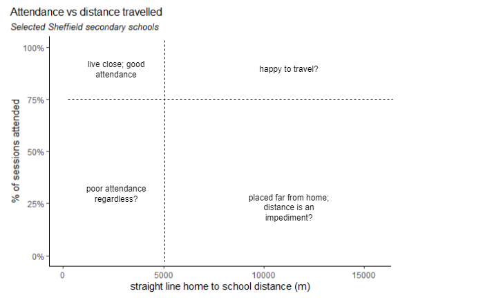*Notre Dame High* has good attendance across the board, which varies regardless of the distance travelled. *Mercia* has excellent attendance, and a limited distance travelled, presumably due to it's oversubscription and high demand, with most datapoints appearing in the top left. The trend line points slightly down, as a few children who live further away have lower attendance.\*Meadowhead* has typical average values for both attendance and distance, appearing in the middle of the pack in the plot above. Most children attend well and those with poorer attendance generally live close by - there are few in the bottom right. *Chaucer* by contrast has a small but significant number of points in the bottom right quadrant - those who attend very poorly and live far away. Some of this may be explained by families failing to secure a place at closer schools, and being placed across the city, with the distance then contributing to poor attendance.```{r}#| label: plot distance v attendance at child level#| fig-height: 6sch_dist_sheff_23 |>filter(school_short_name %in%c("Chaucer", "Mercia", "Notre Dame High",#)) |>"Meadowhead")) |>mutate(school =factor(school_short_name, levels =c("Notre Dame High","Mercia","Meadowhead","Chaucer"))) |>ggplot(aes(x = dist_crow,y = percent_present,colour = school,group = school)) +geom_point(alpha =0.6, size =1.5) +geom_smooth(alpha =0.4) +scale_y_continuous(labels = scales::percent) +facet_wrap(vars(school)) +theme(legend.title = eb,legend.text =element_text(size =7.5),legend.position ="none", strip.background = eb ) +labs(title ="Attendance vs distance travelled",subtitle ="Selected Sheffield secondary schools",x ="straight line home to school distance (m)",y ="% of sessions attended")```# Young carersIt is difficult to establish the true number of young carers in the city - and perhaps dependent on definitions & methods. A 2023 all party parliamentary group (APPG) for young carers and adult carers [report](https://carers.org/downloads/appg-for-young-carers-and-young-adults-carers-reportlr.pdf) cites several sources:- 1.6% of pupils (2021 Census)- 0.5% of pupils (2023 school census) Though it places little confidence in these first two, preferring the estimates of two surveys:- 10% of all pupils provide high or very high levels of care (BBC / University of Nottingham)- 13% of pupils surveyed (COVID Social Mobility & Opportunities study)```{r}#| label: estimate Sheffield young carer volumesyc_estimate_10pc <- sheffield_pupil_population_20241 *0.1```Applying the 10% figure to Sheffield's pupil population would indicate over 7000 young carers in the city. Our local data identifies just `r young_carers |> select(stud_id) |> distinct() |> tally() |> pull()` since 2020, so we provide the analysis here with the following caveat:::: callout-caution## data on young carersThe data used in this section of the report comes from *young carer* type involvements in capita one, covering around 900 children from 2020 onwards. Clearly our data doesn't capture all young carers (and may skew towards those at the more severe end of the caring spectrum) and/or we are working with different definitions of what a *young carer* is. Issues with getting people of all ages to self-identify as carers are well known, and the perceived stigma attached to caring roles is likely more acute in young people - indeed this is probably a factor in explaining differences in school attendance.:::The involvements have an open date, but no close date, so a time series analysis of volumes isn't possible, and also that the data implicitly assumes that a young carer remains so for the rest of their school career.A descriptive of demographic analysis may also be misleading, but we can make a comparison of attendance rates, which shows a significant impact. Primary age young carers attend just under 4% less that those without a caring role. In secondary school this gap rises to 10%:```{r}#| label: calculate young carers summary data# can't do a time series on volumes as there are no close dates# yc_time_series <- # seq(ymd('2015-04-01'),ymd('2024-07-1'), by = '3 months')# young_carersattend_yc_phase <- attend |>filter(ncy >=1, ncy <=11,!phase %in%c("Nursery","6th form"), year >=2020) |>left_join(young_carers,join_by(stud_id == stud_id, ht_start_date >= open_date)) |>mutate(yc_flag =replace_na(code_des,"not young carer")) |>group_by(yc_flag, phase) |>presence_mean_calc()attend_yc_ncy <- attend |>filter(ncy >=1, ncy <=11, year >=2020) |>left_join(young_carers,join_by(stud_id == stud_id, ht_start_date >= open_date)) |>mutate(yc_flag =replace_na(code_des,"not young carer")) |>group_by(yc_flag, ncy) |>presence_mean_calc()attend_yc_year <- attend |>filter(ncy >=1, ncy <=11, year >=2020) |>left_join(young_carers,join_by(stud_id == stud_id, ht_start_date >= open_date)) |>mutate(yc_flag =replace_na(code_des,"not young carer")) |>group_by(yc_flag, year) |>presence_mean_calc()``````{r}#| label: plot attendance by young carers & phase#| fig-height: 3ggplot(attend_yc_phase, aes(x =reorder(yc_flag,mean.percent_present, desc =TRUE), y = mean.percent_present )) +geom_col(fill ="steel blue", position =position_dodge(0.9))+geom_errorbar(aes(ymin = lower.ci.percent_present, ymax = upper.ci.percent_present), width =0.2, position =position_dodge(0.9))+geom_text(aes(label = scales::percent(round(mean.percent_present,3))), hjust =1, colour ="white", size =5,position =position_dodge(0.9)) +labs(title ="Attendance of young carers",subtitle ="Avg % sessions attended, 2023 +-95CI; young carer status from capita one involvements",caption ="data from Capita One")+ barplottheme_minimal +theme(axis.title.x = eb, axis.text.y =element_text(size =8), axis.text.x = eb,legend.position ="none", plot.subtitle =element_text(size =8, face ="italic"),strip.background = eb) +coord_flip() +facet_grid(cols =vars(phase))```As we did for deprivation quartiles above, we can create an age profile of attendance for young carers, and compare it to pupils with no caring role. Again we see the greater impact on attendance as age increases, and presumably the expectations and stigmatisation around caring roles also increases. There is a particular drop in attendance going into year 8.```{r}ggplot(attend_yc_ncy, aes(x = ncy, y = mean.percent_present,colour = yc_flag, group = yc_flag,#label = label)) +geom_point() +geom_line() +#geom_label_repel(hjust = 0, nudge_y = c(0.05,0.02,0.02), min.segment.length = Inf, alpha = 0.8) +geom_errorbar(aes(ymin = lower.ci.percent_present, ymax = upper.ci.percent_present), width =0.2, alpha =0.7)+scale_y_continuous(labels = scales::percent) +scale_x_continuous(breaks =seq(1,11)) +labs(title ="Attendance of<b><span style='color:#ce9642'> young carers </span></b>and <b><span style='color:#3b7c70;'>those without</b></span> a caring role",subtitle ="average % of sessions attended since 2020; young carers data from Capita One involvements",#caption = "data from Capita One" )+theme(plot.title =element_markdown(size =12),legend.position ="none",axis.title.x = eb) + MetBrewer::scale_fill_met_d("Kandinsky") + MetBrewer::scale_colour_met_d("Kandinsky") +theme(axis.title.y = eb, legend.position ="none") +geom_vline(aes(xintercept =6.5), linetype ="dotted", colour ="gray70", linewidth =1.2) +annotate("text", label ="primary", y =0.99, x =3.5, colour ="gray40") +annotate("text", label ="secondary", y =0.99, x =9, colour ="gray40")```Along with other groups, the attendance of young carers improved into 2025.Note that some of the decline seen effect here may be a function of the cumulative nature of the data, which has no end dates attached, so our cohort of young carers is ageing in in the system```{r}#| label: plot attendance by young carers over time#| fig-height: 3ggplot(attend_yc_year |>filter(year >2020), aes(x = year, y = mean.percent_present,colour = yc_flag, group = yc_flag, )) +geom_point() +geom_line() +geom_errorbar(aes(ymin = lower.ci.percent_present, ymax = upper.ci.percent_present), width =0.2, alpha =0.7)+scale_y_continuous(labels = scales::percent) +labs(title ="Attendance of<b><span style='color:#ce9642'> young carers </span></b>and <b><span style='color:#3b7c70;'>those without</b></span> a caring role",subtitle ="average % of sessions attended since 2020; young carers data from Capita One involvements; 2025 data is part year",caption ="data from Capita One" )+theme(plot.title =element_markdown(size =12),legend.position ="none",axis.title = eb,axis.line = eb,axis.ticks = eb) + MetBrewer::scale_fill_met_d("Kandinsky") + MetBrewer::scale_colour_met_d("Kandinsky")```::: callout-tip## recomendationBetter long term data is required to understand volumes, impacts & the geographical distribution of young carers, as well as change over time and the provision of services to young carers.:::# Trends by annual cohortHe we show how attendance is changing for each annual year group cohort of children, and explore some of the intersectionality between age, deprivation and special educational needs. This analysis particularly demonstrates differences in how the COVID pandemic, lockdowns and subsequent societal shifts have affected different groups.Annual cohorts of children are referred to here as, for example, the "class of 2025" meaning the year group who began year 1 in September 2014 and will complete Y11 in July 2025. In each case there is a separate small line chart for each annual cohort. Data are labelled with the academic year and the % attendance rates, and the time period is divided into three phases: *pre* pandemic, *during* (2020 & 2021), and *post* pandemic - all years since. The time periods are denoted by colours or shapes, depending on the chart.The first chart shows the overall picture in secondary schools. The first cohort shown here is the class of 2020, who completed most of Y11 before the pandemic struck, their GCSE exams were wildly disrupted, but their attendance follows only a shallow decline from Y7 through to Y11, while the classes of '23 to '25 (on the middle row), saw dramatic drops during the COVID years, and a *continued decline* in the period since. The classes of '24 and '25 were perhaps worse hit by the pandemic, effectively missing Y6-7 and Y7-8 respectively. Finally, the bottom row shows the latest three cohorts and some small but encouraging signs of recovery: the class of '27 have less of a drop off to Y8, and the class of '28 had the best attendance in Y7 since before the pandemic.```{r}#| label: plot attendance by annual cohort & ncy - secondary#| fig-height: 8#| warning: false#| message: falseannual_cohort_theme <-theme(legend.position ="top",legend.direction ="vertical",legend.box ="horizontal",legend.title =element_text(size =8), legend.text =element_text(size =8),axis.title = eb, strip.background = eb, axis.line.y = eb, axis.text.y = eb, axis.ticks.y = eb)attend |>mutate(covid_year_flag =case_when(year <2020~"pre-COVID", year ==2020~"lockdown years", year ==2021~"lockdown years", year >2021~"post-pandemic")) |>filter(cohort >=2010, phase =="Secondary") |>summarise_attendance(grouping_vars =c("ncy","class_of","year","covid_year_flag","phase")) |>filter(ncy <=11& ncy >=1, child_count >1000 ) |>ggplot(aes(x = ncy,y = percent_present,colour = covid_year_flag,group = class_of )) +geom_point() +geom_line() +scale_colour_manual(values =c("pre-COVID"="#4DAF4A" ,"lockdown years"="#E41A1C", "post-pandemic"="#377EB8")) +geom_text(aes(label = year), size =2.5, nudge_y =-0.02, colour ="darkgrey") +geom_text(aes(label = scales::percent(percent_present, accuracy =0.1L)), size =2.5, nudge_y =0.02, alpha =0.7) +facet_wrap(vars(class_of)) + annual_cohort_theme +theme(axis.title.x =element_text()) +labs(title ="Secondary school attendance by national curriculum year and annual cohort",subtitle ="% of available sessions attended; all Sheffield schools; pandemic years are 2020 and 2021",x ="NCY", colour ="pandemic time period", caption ="data from Capita One") +coord_cartesian(clip ="off")```The picture in primary schools looks very different. Children generally attend better in years 2 to 4 than they do in Y1, so the underlying profile is more of a hump than a steady decline seen in secondary. The pandemic had a less dramatic effect on primary age children, and the decline also persisted into the post-pandemic years for many cohorts. However the big difference here, and an encouraging sign for the future, is that all cohorts from the class of '29 onwards show improvements in recent years (here coloured blue), and that the youngest cohorts are showing the fastest improvements of all.```{r}#| label: plot attendance by annual cohort & ncy - primary#| fig-height: 8#| warning: falseattend |>#select(-phase) |> #rename(phase = school_ed_phase_corrected) |> mutate(covid_year_flag =case_when(year <2020~"pre-COVID", year ==2020~"lockdown years", year ==2021~"lockdown years", year >2021~"post-pandemic")) |>mutate(covid_year_flag =fct_relevel(covid_year_flag, c("pre-COVID","lockdown years","post-pandemic"))) |>filter(cohort >=2016, phase =="Primary") |>summarise_attendance(grouping_vars =c("ncy","class_of","year","covid_year_flag","phase")) |>filter(ncy <=11& ncy >=1, child_count >1000 ) |>ggplot(aes(x = ncy,y = percent_present,colour = covid_year_flag,group = class_of )) +geom_point() +geom_line() +scale_colour_manual(values =c("pre-COVID"="#4DAF4A" ,"lockdown years"="#E41A1C", "post-pandemic"="#377EB8")) +geom_text(aes(label = year), size =2.5, nudge_y =-0.005, colour ="darkgrey") +geom_text(aes(label = scales::percent(percent_present, accuracy =0.1L)), size =2.5, nudge_y =0.005, alpha =0.7) +scale_x_continuous(breaks =seq(1:6)) +coord_cartesian(expand =FALSE, clip ="off") +facet_wrap(vars(class_of))+ annual_cohort_theme +theme(axis.title.x =element_text()) +labs(title ="Primary school attendance by national curriculum year and annual cohort",subtitle ="% of available sessions attended; all Sheffield schools; pandemic years are 2020 and 2021",x ="NCY", colour ="time period: ", caption ="data from Capita One") +coord_cartesian(clip ="off")```Re-creating the same plot but split by deprivation quartile, it becomes clear how the effects of the pandemic were concentrated in the more deprived areas of the city. Here the middle two quartiles of deprivation have been removed, and the pairs of lines show the most and least deprived quartiles of the school population, according to the 2019 indices of multiple deprivation scores of their ward of residence.For all annual cohorts, the gap is stark, children living in more deprived areas were worse affected during the pandemic and have seen worse post-pandemic declines in attendance. If there is good news here, it is a narrowing of the gap in the latest Y7 intake.```{r}#| label: plot attendance by deprivation, annual cohort & ncy - secondary#| fig-height: 8#| warning: falseplot_data <- attend |>left_join(stud_details_joined, by ="stud_id") |>filter(imd_quartile %in%c(1,4)) |>mutate(imd_quartile =case_when(imd_quartile ==1~"least deprived", imd_quartile ==4~"most deprived")) |>mutate(covid_year_flag =case_when(year <2020~"pre-COVID", year ==2020~"lockdown years", year ==2021~"lockdown years", year >2021~"post-pandemic")) |>mutate(covid_year_flag =fct_relevel(covid_year_flag, c("pre-COVID","lockdown years","post-pandemic"))) |>filter(cohort >=2010, phase =="Secondary") |>ungroup() |>summarise_attendance(grouping_vars =c("ncy","class_of","year","covid_year_flag","phase","imd_quartile" )) |>filter(ncy <=11& ncy >=1, child_count >100 )ggplot(plot_data,aes(x = ncy,y = percent_present,colour = imd_quartile,group = imd_quartile,label = year,shape = covid_year_flag)) +geom_point(size =2.5) +scale_shape_manual(values =c("pre-COVID"=1, "lockdown years"=8, "post-pandemic"=4)) +geom_line() +geom_text(data = plot_data |>filter(imd_quartile ==4), aes(label = year), size =2.5, nudge_y =-0.02, colour ="darkgrey") +geom_text(aes(label = scales::percent(percent_present, accuracy =0.1L)), size =2.5, nudge_y =0.02, alpha =0.7) +scale_y_continuous(labels = scales::percent) +facet_wrap(vars(class_of))+ annual_cohort_theme +theme(strip.text =element_text(size =7), legend.text =element_text(size =7)) +labs(title ="Secondary school attendance over time by annual cohort, national curriculum year and deprivation quartile",subtitle ="% of available sessions attended, top & bottom 25% by 2019 Indices of Multiple Deprivation (IMD) score of ward of residence",caption ="data from Capita One",shape ="COVID time period",colour ="IMD quartile") +coord_cartesian(clip ="off")```Repeating the same deprivation analysis for primary, and again we see how the pandemic disproportionately affected children in more deprived areas, with steeper dropoffs during the lockdown years. But we can also see recovery after the pandemic, for all cohorts and with steeper rates of increase for children in more deprived areas - but the deprivation gap still remains.```{r}#| label: plot attendance by deprivation, annual cohort & ncy - primary#| fig-height: 8#| warning: falseplot_data <- attend |>#select(-phase) |> left_join(stud_details_joined, by ="stud_id") |>filter(imd_quartile %in%c(1,4)) |>mutate(imd_quartile =case_when(imd_quartile ==1~"least deprived", imd_quartile ==4~"most deprived")) |>#rename(phase = school_ed_phase_corrected) |>mutate(covid_year_flag =case_when(year <2020~"pre-COVID", year ==2020~"lockdown years", year ==2021~"lockdown years", year >2021~"post-pandemic")) |>mutate(covid_year_flag =fct_relevel(covid_year_flag, c("pre-COVID","lockdown years","post-pandemic"))) |>filter(cohort >=2016, phase =="Primary") |>ungroup() |>summarise_attendance(grouping_vars =c("ncy","class_of","year","covid_year_flag","phase","imd_quartile" )) |>filter(ncy <=11& ncy >=1, child_count >100 ) |>group_by(class_of)ggplot(plot_data,aes(x = ncy,y = percent_present,colour = imd_quartile,group = imd_quartile,label = year,shape = covid_year_flag)) +geom_point(size =3) +scale_shape_manual(values =c("pre-COVID"=1, "lockdown years"=8, "post-pandemic"=4)) +geom_line() +geom_text(data = plot_data |>filter(imd_quartile ==4), aes(label = year), size =2.5, nudge_y =-0.01, colour ="darkgrey") +geom_text(aes(label = scales::percent(percent_present, accuracy =0.1L)), size =2.5, nudge_y =0.01, alpha =0.7) +scale_y_continuous(labels = scales::percent) +scale_x_continuous(breaks =seq(1,6))+facet_wrap(vars(class_of))+ annual_cohort_theme +theme(axis.title.x =element_text()) +labs(title ="Primary school attendance over time by annual cohort, national curriculum year and deprivation quartile",subtitle ="% of available sessions attended, top & bottom 25% by 2019 Indices of Multiple Deprivation (IMD) score of ward of residence",caption ="data from Capita One",shape ="COVID time period",colour ="IMD quartile") +coord_cartesian(clip ="off")``````{r}#| label: plot attendance by cohort & SEN level - secondary#| fig-height: 8#| warning: false#| message: falseplot_data <- attend |>mutate(covid_year_flag =case_when(year <2020~"pre-COVID", year ==2020~"lockdown years", year ==2021~"lockdown years", year >2021~"post-pandemic")) |>mutate(covid_year_flag =fct_relevel(covid_year_flag, c("pre-COVID","lockdown years","post-pandemic"))) |>filter(cohort >=2010, phase =="Secondary", ncy >=7, ncy <=11) |>ungroup() |>summarise_attendance(grouping_vars =c("ncy","class_of","year","covid_year_flag","sen_level" )) |>filter(ncy <=11, ncy >=1)#group_by(class_of)# because children sometimes repeat years, there are some small groups who attended a given NCY in a different year to the rest of their cohort. Here we'll remove those:# find the top rows by child counttop_rows = plot_data |>group_by(ncy, class_of, sen_level) |>slice_max(child_count) |>ungroup()# filter the plot data to remove smaller groupsplot_data = plot_data |>inner_join(top_rows) |>filter(child_count >100)# plotggplot(plot_data,aes(x = ncy,y = percent_present,colour = sen_level,group = sen_level,label = year,shape = covid_year_flag)) +geom_point(size =3) +scale_shape_manual(values =c("pre-COVID"=1, "lockdown years"=8, "post-pandemic"=4)) +geom_line() +geom_text(data = plot_data |>filter(sen_level =="EHCP"), aes(label = year), size =2.5, nudge_y =-0.05, colour ="darkgrey") +geom_text(aes(label = scales::percent(percent_present, accuracy =0.1L)), size =2.5, nudge_y =0.01, alpha =0.7) +scale_y_continuous(labels = scales::percent) +scale_x_continuous(breaks =seq(7,11))+facet_wrap(vars(class_of))+ annual_cohort_theme +theme(axis.title.x =element_text()) +labs(title ="Secondary school attendance over time by annual cohort, national curriculum year, and SEN level",subtitle ="% of available sessions attended, top & bottom 25% by 2019 Indices of Multiple Deprivation (IMD) score of ward of residence",caption ="data from Capita One",shape ="COVID time period",colour ="SEN level")``````{r}#| label: plot attendance by cohort & SEN level - primary#| fig-height: 8#| warning: false#| message: falseplot_data <- attend |>mutate(covid_year_flag =case_when(year <2020~"pre-COVID", year ==2020~"lockdown years", year ==2021~"lockdown years", year >2021~"post-pandemic")) |>mutate(covid_year_flag =fct_relevel(covid_year_flag, c("pre-COVID","lockdown years","post-pandemic"))) |>filter(cohort >=2016, phase =="Primary") |>ungroup() |>summarise_attendance(grouping_vars =c("ncy","class_of","year","covid_year_flag","phase","sen_level" )) |>filter(ncy <=11& ncy >=1) |>group_by(class_of)# because children sometimes repeat years, there are some small groups who attended a given NCY in a different year to the rest of their cohort. Here we'll remove those:# find the top rows by child counttop_rows = plot_data |>group_by(ncy, class_of, sen_level) |>slice_max(child_count) |>ungroup()# filter the plot data to remove smaller groupsplot_data = plot_data |>inner_join(top_rows) |>filter(child_count >100)ggplot(plot_data,aes(x = ncy,y = percent_present,colour = sen_level,group = sen_level,label = year,shape = covid_year_flag)) +geom_point(size =2) +scale_shape_manual(values =c("pre-COVID"=1, "lockdown years"=8, "post-pandemic"=4)) +geom_line() +#geom_text(data = plot_data |> filter(imd_quartile == 4), # aes(label = year), size = 2.5, nudge_y = -0.01, colour = "darkgrey") +geom_text(aes(label = scales::percent(percent_present, accuracy =0.1L)), size =2.5, nudge_y =0.01, alpha =0.7) +scale_y_continuous(labels = scales::percent) +scale_x_continuous(breaks =seq(1,6))+facet_wrap(vars(class_of)) + annual_cohort_theme +theme(axis.title.x =element_text()) +labs(title ="Primary school attendance over time by national curriculum year, and SEN level",subtitle ="% of available sessions attended, top & bottom 25% by 2019 Indices of Multiple Deprivation (IMD) score of ward of residence",caption ="data from Capita One",shape ="COVID time period",colour ="SEN level")```# Severe absencesChildren are classed as severely absent if they miss over 50% of available sessions in any given period. This section explores the characteristics of severely absent children, and how this is changing over time.::: callout-importantAlmost 1 in 20 children at Sheffield secondary schools was severely absent in 2023.:::Severe absences in secondary schools appear to have peaked in 2024.```{r}#| label: plot severe absences by year and phase#| fig-height: 4ggplot(attend_year_phase |>filter(phase %in%c("Primary","Secondary"), year >=2018) |>mutate(grey_flag =if_else(year==2025,0,1)) , aes(x = year, y = pc_of_pupils_severely_absent, alpha = grey_flag, colour = phase)) +geom_point() +geom_line(linetype ="dashed", alpha =0.5) +geom_text(aes(label = year), size =3, vjust =1.5) + barplottheme_minimal +scale_y_continuous(labels = scales::percent) +labs(title ="Severe absence by academic year in <b><span style='color:#dd5129'>primary </span></b>and <b><span style='color:#0f7ba2;'>secondary</b></span> schools",subtitle ="percentage of pupils missing over half of available sessions; 2025 is part year",caption ="data from Capita One") +annotate("text", x =2020.3, y =0.045, label ="COVID-19", size =3, hjust =1.1) +geom_vline(xintercept =2020.3, linetype ="longdash", colour ="light gray") +theme(plot.title =element_markdown(size =12),legend.position ="none",axis.text.x = eb, axis.title.x = eb, axis.title.y = eb) + MetBrewer::scale_fill_met_d("Egypt")```Next we look at the severe attendance rates of groups with different characteristics in 2023-24. The groupings here are chosen as those that show significant differences in severe absence rates. Note that the characteristics given here are not mutually exclusive. Children with an EHCP plan were nearly 8% more likely to be severely absent than average. Children in Y11 have twice the average rate.All primary years, and a few ethnic groups have significantly lower severe absence rates.```{r severe absence characteristics}sev_pc_all <- attend_stud_year |> filter(year == 2024) |> group_by(severe_absence) |> tally() |> mutate(pc = n / sum(n), category = "all children") |> filter(severe_absence == 1) |> select(pc) |> pull()sev_pc_eth_cat <- attend_stud_year_ethcat |> filter(year == 2024) |> group_by(ethnicity_category, severe_absence) |> tally() |> mutate(pc = n / sum(n)) |> mutate(category = str_c("ethnicity category ",ethnicity_category)) |> ungroup() |> select(-ethnicity_category) |> filter(severe_absence == 1)sev_pc_eth_cat_2 <- attend |> filter(year == 2024) |> summarise_attendance(grouping_vars = "ethnicity_category")sev_pc_gender <- attend_stud_year_gender |> filter(year == 2024) |> group_by(gender, severe_absence) |> tally() |> mutate(pc = n / sum(n)) |> mutate(category = str_c("gender ",gender)) |> ungroup() |> select(-gender) |> filter(severe_absence == 1)sev_pc_ncy <- attend_stud_year_ncy |> filter(year == 2024) |> group_by(ncy, severe_absence) |> tally() |> mutate(pc = n / sum(n)) |> mutate(category = str_c("ncy ",ncy)) |> ungroup() |> select(-ncy) |> filter(severe_absence == 1)sev_pc_fsm <- attend_stud_year_fsm |> filter(year == 2024) |> group_by(fsm, severe_absence) |> tally() |> mutate(pc = n / sum(n)) |> mutate(category = if_else(fsm == 1, "free school meals", "not on free school meals")) |> ungroup() |> select(-fsm) |> filter(severe_absence == 1)sev_pc_sen_level <- attend_stud_year_sen_level |> filter(year == 2024) |> group_by(sen_level, severe_absence) |> tally() |> mutate(pc = n / sum(n)) |> mutate(category = str_c("SEN level - ",sen_level)) |> ungroup() |> select(-sen_level) |> filter(severe_absence == 1)sev_plot_data <- rbind( #sev_pc_all, sev_pc_eth_cat, #sev_pc_gender, sev_pc_ncy, sev_pc_fsm, sev_pc_sen_level) |> filter(!is.na(category))ggplot(sev_plot_data, aes(x = reorder(category,pc), y = pc, fill = pc)) + geom_col() + geom_text(aes(label = scales::percent(pc, accuracy = 1.1L)), size = 2.5, colour = "darkgrey", nudge_y = 0.004) + scale_y_continuous(labels = scales::percent) + theme(axis.title = eb, legend.position = "none", axis.text.y = element_text(size = 7.5)) + labs(title = "Severe absence rates by selected pupil characteristics", subtitle = "% of children in each group attending less than 50% of available sessions in 2024") + geom_hline(aes(yintercept = sev_pc_all), linetype = "dotted") + geom_text(label = str_c("all pupils ",scales::percent(sev_pc_all, accuracy = 1.1L)), x = 4.5, y = 0.045, size = 3, colour = "dark gray") + coord_flip() + scale_fill_distiller(palette = "Spectral")```The chart above shows relative severe absence *rates* of different groups, but we'll complement that by quantifying the cohort of severely absent pupils in 2023 by their characteristics.```{r}#| label: get severe absence 2023 characteristics datasa_2023 <- attend |>filter(year ==2023, ncy >=1, ncy <=11, severe_absence ==1 ) |>left_join(stud_details_joined |>select(stud_id, imd_quartile), by ="stud_id") |>select(stud_id, gender, ncy, imd_quartile, primary_specific_need) |>group_by(stud_id) |>slice(1)``````{r}#| label: waffle plot severe absence by ncysa_2023 |>mutate(ncy =factor(ncy, levels =c(1,2,3,4,5,6,7,8,9,10,11))) |>group_by(ncy) |>count() |>ggplot(aes(fill = ncy,values = n)) +expand_limits(x=c(0,0), y=c(0,0)) +coord_equal() +labs(title ="Severely absent children in Sheffield, by national curriculum year",subtitle ="Pupils missing over 50% of sessions in 2022-23",fill =NULL, colour =NULL) +#theme_ipsum_rc(grid="") +theme_enhance_waffle() +#theme(axis.line = eb, axis.text = eb, axis.ticks = eb) +geom_waffle(size =0.5,n_rows =10,colour ="white",#radius = unit(1, "pt")flip = TRUE#,#make_proportional = TRUE ) +facet_grid(~ncy) +theme(axis.line = eb, axis.ticks = eb, axis.text = eb, legend.position ="none")``````{r}#| label: waffle plot severe absence by imd quartilesa_2023 |>filter(!is.na(imd_quartile)) |>mutate(imd_quartile =factor(imd_quartile, levels =c(1,2,3,4))) |>group_by(imd_quartile) |>count() |>ggplot(aes(fill = imd_quartile, values = n)) +expand_limits(x=c(0,0), y=c(0,0)) +coord_equal() +labs(title ="Severely absent children in Sheffield, by deprivation quartile",subtitle ="Pupils missing over 50% of sessions in 2022-23",fill =NULL, colour =NULL) +#theme_ipsum_rc(grid="") +theme_enhance_waffle() +#theme(axis.line = eb, axis.text = eb, axis.ticks = eb) +geom_waffle(size =0.5,n_rows =40,colour ="white",#radius = unit(1, "pt")flip = TRUE#,#make_proportional = TRUE ) +geom_text(aes(x =c(1,2,3,4), y = (n /40) +2, label = n), nudge_x =27, size =2.5) +facet_grid(~imd_quartile) +theme(axis.line = eb, axis.ticks = eb, axis.text = eb, legend.position ="none")``````{r}#| label: waffle plot severe absence by sen specific needsa_2023 |>mutate(primary_specific_need =replace_na(primary_specific_need, "No SEN")) |>mutate(primary_specific_need =factor(primary_specific_need)) |>group_by(primary_specific_need) |>tally() |>mutate(primary_specific_need =reorder(primary_specific_need,desc(n))) |>ggplot(aes(fill = primary_specific_need, area = n,label =paste(primary_specific_need,n, sep ="\n"))) +labs(title ="Severely absent children in Sheffield, by primary specific need",subtitle ="Pupils missing over 50% of sessions in 2022-23",fill =NULL, colour =NULL) +geom_treemap() +geom_treemap_text(place ="centre",size =8,force.print.labels =TRUE,reflow =TRUE) +theme(legend.position ="none")```## Severe absence - turnover and retentionIt seems likely that there are children for whom severe absence is for some reason a persistent behaviour, and children for whom a severe absence happens in one or more years for some specific reason - like a crisis of health or personal circumstances. To try to understand this, we looked at year on year turnover and retention in the cohort of severely absent children.In the chart below, severely absent children are classed as *retained* if they were also severely absent the year before, and *new* if not. Both categories have risen in recent years:```{r}#| label: plot severely absent children by retention category#| warning: false#| message: false#| fig-height: 3.5sa <- attend_stud_year |>left_join(stud_details_joined) |>#might want this but not yetleft_join(attend |>select(stud_id, year, school_ed_phase_corrected) |>distinct()) |>filter(severe_absence ==1, school_ed_phase_corrected =="Secondary") |>select(stud_id, year) |>mutate(sa =1,prev_year = year -1)sa_yoy <- sa |>left_join(sa |>select(-prev_year) |>rename(retained = sa),join_by(stud_id == stud_id, prev_year == year)) |>mutate(retained =if_else(is.na(retained),0,1),new =if_else(retained ==0,1,0) )sa_yoy_crunched <- sa_yoy |>group_by(year) |>summarise(total =sum(sa),new =sum(new),retained =sum(retained),pc_retained =sum(retained) /sum(sa)) |>pivot_longer(cols =-year,names_to ="category",values_to ="value") |>filter(year >2006)ggplot(sa_yoy_crunched |>filter(year >=2018, category %in%c("new","retained")),aes(x = year,y = value,colour = category,group = category)) +geom_point() +geom_line() +labs(title ="Severely absent children: <b><span style='color:#dd5129'>new in the year </span></b>and <b><span style='color:#0f7ba2;'>retained from the previous year</b></span>",subtitle ="Secondary provision only; count of children attending less than 50% of available sessions; 2024 data excludes the summer term",caption ="data from Capita One") +theme(plot.title =element_markdown(size =12),legend.position ="none", axis.title = eb) + MetBrewer::scale_fill_met_d("Egypt")```So the problem of severe absence is, in part, due to a cohort we could describe as *chronically severely absent*.The retention rate here is calculated as the percentage of all severely absent pupils in a given year that were also severely absent the year before. In secondary schools, in 2023, this was around 40% of children who were severely absent in 2023 were also severely absent in 2022.This retention rate has risen in recent years:```{r}#| label: plot severely absent retention rate over time#| fig-height: 3ggplot(sa_yoy_crunched |>filter(year >=2018, category =="pc_retained"),aes(x = year,y = value, label = scales::percent(value, accuracy =1.1L))) +geom_point() +geom_line(linetype ="dotted") +geom_text(size =2.5, nudge_y =-0.02) +#geom_text(aes(label = scales::percent(pc_retained, accuracy = 1.1L, size = 3))) +#geom_col(position = position_stack()) +labs(title ="Year on year severe absence retention rate (secondary)",subtitle ="% of severely absent children who were severely absent in the previous year",caption ="data from Capita One") +theme(plot.title =element_markdown(size =12),legend.position ="none", axis.title = eb, axis.line.y = eb, axis.text.y = eb, axis.ticks.y = eb) + MetBrewer::scale_fill_met_d("Egypt")```Plotting the retention rate by NCY shows increased year on year retention as children grow older. Here we've included the NCY profiles of two years: 2018 and 2024, showing the increased retention rates across the board into 2024.```{r}#| label: plot sa retention rate by NCYsa_ncy <- attend_stud_year_ncy |>left_join(stud_details_joined) |>#might want this but not yetleft_join(attend |>select(stud_id, year, school_ed_phase_corrected) |>distinct()) |>filter(severe_absence ==1,#school_ed_phase_corrected == "Secondary", ncy >=6, ncy <=11) |>select(stud_id, year, ncy) |>mutate(sa =1,prev_year = year -1)sa_yoy <- sa_ncy |>left_join(sa_ncy |>select(-prev_year, -ncy) |>rename(retained = sa),join_by(stud_id == stud_id, prev_year == year)) |>mutate(retained =if_else(is.na(retained),0,1),new =if_else(retained ==0,1,0) ) |>filter(ncy >=7)sa_yoy_ncy_crunched <- sa_yoy |>filter(year %in%c(2018,#2019,#2020,#2021,#2022,#2023,2024)) |>group_by(year, ncy) |>summarise(total =sum(sa),new =sum(new),retained =sum(retained),pc_retained =sum(retained) /sum(sa)) |>#pivot_longer(cols = c(-year,-ncy),# names_to = "category",# values_to = "value") |> mutate(year =factor(year)) |>mutate(label =if_else(ncy ==max(ncy), year, NA_character_))ggplot(sa_yoy_ncy_crunched,#|> filter(category == "pc_retained"),aes(x = ncy,y = pc_retained,colour = year,group = year,label = label)) +geom_point() +geom_line() +geom_label_repel() +scale_y_continuous(labels = scales::percent)+labs(title ="Severely absent children - year on year retention rate by NCY",subtitle ="Secondary schools only; of children severely absent for the year, the % who were also severely absent the previous year",caption ="data from Capita One") +theme(plot.title =element_markdown(size =12),legend.position ="none", axis.title = eb)```# Daily attendance patternsThe analysis so far in this report has used data aggregated up to the half term or annual level. During the course of this project we processed the raw daily data (recorded as a string of symbols and codes) to allow analysis of attendance at the level of the individual day.## Week dayFridays,(to a lesser extent Mondays) see significantly lower attendance than the other days of the week.```{r}load(file ="S:/Public Health/Policy Performance Communications/Business Intelligence/Projects/EIP/data/inclusion/attendance_inclusion_day_level_data_model_part_1.RData")load(file ="S:/Public Health/Policy Performance Communications/Business Intelligence/Projects/EIP/data/inclusion/attendance_inclusion_day_level_data_model_part_2.RData")``````{r}#| label: plot attendance by week dayggplot(attend_weekday_phase |>filter(!week_day %in%c("Sat","Sun")),aes(x = week_day,y = percent_present,#fill = phase,label = scales::percent(percent_present, accuracy =0.1L)) ) +geom_col(fill ="steel blue", position ="dodge") +geom_text(position =position_dodge(0.9), colour ="white", size =3, vjust =1.5, fontface ="bold")+scale_y_continuous(labels = scales::percent) +labs(title ="Attendance by day of the week",subtitle ="percentage of sessions attended since 2016; all Sheffield pupils",caption ="data from Capita One") +theme(plot.title =element_markdown(size =12),legend.position ="none", axis.title = eb,strip.background = eb, axis.text.y = eb) +facet_grid(cols =vars(phase)) + barplottheme_minimal```Looking at a time series, we see that Friday's lower attendance is nothing new, and the gap has not really changed over time:```{r}ggplot(attend_weekday_phase_year |>filter(year <=2024) |>mutate(label =if_else(year ==max(year), week_day, NA_character_)),aes(x = year,y = percent_present,colour = week_day,group = week_day,label = label)) +geom_point() +geom_line() +geom_label_repel(aes(x =2023.5),size =2,vjust =1,min.segment.length =Inf) +facet_wrap(vars(phase), scales ="free_y", nrow =2) +scale_x_continuous(limits =c(2018,2025), breaks =seq(2018,2024)) +theme(legend.position ="none", axis.title = eb, strip.background = eb,strip.placement ="top")+labs(title ="Attendance by weekday & year")```## School attendance across the yearThe day level data allows us to visualise an entire school year. Here we see how key points in the year and particular dates impact on school attendance. When the data are aggregated to the term level, there is very little seasonal variation, but differences at the day level are more dramatic than the differences we see between demographic groups.In particular, we can see the impacts of:- the first and last days of term- a growing absence rates up towards Christmas- a wave of teachers' strikes- heavy snowfall in March- Eid- the days immediately after bank holidays- study leave- increasing absence through the final summer term```{r}#| label: plot 2023 full year#| message: false#| warning: false#| fig-height: 8#| fig-width: 10ggplot(day_2023 |>filter(half_term !=0, date !=as_date("2023-05-01"),!is.na(year), total_sessions >1000) |>mutate(label =case_when( date ==as_date("2022-12-12") ~"week before Christmas", date ==as_date("2023-03-10") ~"heavy snowfall", date ==as_date("2023-02-01") ~"teachers strike", date ==as_date("2023-02-28") ~"teachers strike", date ==as_date("2023-03-16") ~"teachers strikes", date ==as_date("2023-04-21") ~"Eid al-Fitr", date ==as_date("2023-06-21") ~"study leave", date ==as_date("2023-06-28") ~"Eid al-Adha", date ==as_date("2023-07-21") ~"end of term",TRUE~NA_character_)),aes(x = date,y =1- percent_present,fill =1- percent_present,label = label )) +geom_col() +geom_text_repel(fontface ="italic", nudge_x =-1, size =3, nudge_y =0.02, colour ="gray40") +scale_y_continuous(labels = scales::percent) +theme(legend.position ="none", strip.background = eb, axis.title = eb,axis.text.x =element_text(size =6.5), axis.line = eb, axis.ticks = eb, strip.text =element_text(size =12)) +scale_x_date(date_labels ="%d-%b-%y") +scale_fill_viridis_c(option ="viridis", direction =-1) +facet_wrap(vars(half_term_name), scales ="free_x") +labs(title ="School absence in Sheffield Schools - a full academic year - 2022/23",subtitle ="each bar = 1 day; % of available sessions attended; all schools & all pupils")```Here is the same chart for the 2023-24 year:```{r}#| label: plot 2024 full year#| message: false#| warning: false#| fig-height: 8#| fig-width: 10ggplot(day_2024 |>filter(half_term !=0,#date != as_date("2023-05-01"),!is.na(year), total_sessions >1000, half_term_name !="summer holiday") |>mutate(label =case_when( date ==as_date("2023-12-18") ~"week before Christmas",#date == as_date("2023-03-10") ~ "heavy snowfall",#date == as_date("2023-02-01") ~ "teachers strike",#date == as_date("2023-04-21") ~ "Eid al-Fitr", date ==as_date("2024-06-21") ~"study leave", date ==as_date("2024-06-17") ~"Eid al-Adha", date ==as_date("2024-07-19") ~"end of term",TRUE~NA_character_)),aes(x = date,y =1- percent_present,fill =1- percent_present,label = label )) +geom_col() +geom_text_repel(fontface ="italic", nudge_x =2, size =3, nudge_y =0.02, colour ="gray40") +scale_y_continuous(labels = scales::percent) +theme(legend.position ="none", strip.background = eb, axis.title = eb,axis.text.x =element_text(size =6.5), axis.line = eb, axis.ticks = eb, strip.text =element_text(size =12)) +scale_x_date(date_labels ="%d-%b-%y") +scale_fill_viridis_c(option ="viridis", direction =-1) +facet_wrap(vars(half_term_name), scales ="free_x") +labs(title ="School absence in Sheffield Schools - a full academic year - 2023/24",subtitle ="each bar = 1 day; % of available sessions attended; all schools & all pupils")```Recreating the same plot for absences coded as *illness* (though this time showing the count of sick days rather than the % of available sessions) shows how rates increased dramatically through the run up to Christmas, peaks on Fridays (and to a lesser extent Mondays) throughout the year, and a significantly lower rate in the summer. There are also spikes in illness on the last day of each half term (except the summer). This is the plot for 2024 but the pattern is very similar in other years.```{r}#| label: plot 2024 full year illness#| fig-height: 8#| fig-width: 10ggplot(attend_daily |>filter(year ==2024, time_category =="term time", half_term_name !="summer holiday"),aes(x = date,y = illness,fill = illness)) +geom_col() +theme(legend.position ="none", strip.background = eb, axis.title = eb,axis.text.x =element_text(angle =90)) +scale_x_date(date_labels ="%d-%b") +scale_fill_viridis_c(option="mako",direction =-1) +facet_wrap(vars(half_term_name), scales ="free_x") +labs(title ="Daily illness in Sheffield Schools - 2023/24",subtitle ="Each bar = 1 day; count of sessions marked code I; all schools & all pupils")```The day level *no reason* plot shows a similar shape to the illness plot. We could read this as suggesting that at least some of the *no reason* absences are explained by genuine sickness. Although the major spikes here on the last days of term may be due to unrecorded family holidays or other absences.It's worth comparing the 2023 and 2024 plots for *no reason* absences. As well as reduced levels of no reason absences throughout the year, 2024 sees much less seasonal variation - such as the steady build up to Christmas - although the end of term spikes are more pronounced.```{r}#| label: plot 2023 full year no_reason#| fig-height: 8#| fig-width: 10ggplot(attend_daily |>filter(year ==2023, time_category =="term time", half_term_name !="summer holiday"),aes(x = date,y = no_reason,fill = no_reason)) +geom_col() +theme(legend.position ="none", strip.background = eb, axis.title = eb,axis.text.x =element_text(angle =90)) +scale_x_date(date_labels ="%d-%b") +scale_fill_viridis_c(option="magma", direction =-1) +facet_wrap(vars(half_term_name), scales ="free_x") +labs(title ="Absence with no recorded reason in Sheffield Schools - 2022/23",subtitle ="Each bar = 1 day; count of sessions coded N or O; all schools & all pupils")``````{r}#| label: plot 2024 full year no_reason#| fig-height: 8#| fig-width: 10ggplot(attend_daily |>filter(year ==2024, time_category =="term time", half_term_name !="summer holiday"),aes(x = date,y = no_reason,fill = no_reason)) +geom_col() +theme(legend.position ="none", strip.background = eb, axis.title = eb,axis.text.x =element_text(angle =90)) +scale_x_date(date_labels ="%d-%b") +scale_fill_viridis_c(option="magma", direction =-1) +facet_wrap(vars(half_term_name), scales ="free_x") +labs(title ="Absence with no recorded reason in Sheffield Schools - 2023/24",subtitle ="Each bar = 1 day; count of sessions coded N or O; all schools & all pupils")```# ConclusionSchool attendance is affected by a multitude of factors: age, economic deprivation, special educational needs, caring responsibilities, the culture of individual schools, the attitude of families and ultimately the children themselves. Factors associated with lower attendance are intersectional and compound each other.The pandemic dominates the recent history of school attendance (and much else besides). COVID-19 lockdowns, social distancing and school closures were all surely transformative in cultural attitudes to school attendance, and the impacts were felt differently in different places. However, it would be a mistake to place too much emphasis on COVID-19 alone - deprivation & the cost of living; the rise of smartphones and social media; changes around special educational needs (both prevalences and attitudes) - these are all surely factors, many of which will have influenced one-another. Much of this is not recorded in the available data, and the interactions between these forces will be complex. The good news is that despite the widespread risk factors identified here and despite recent social and cultural shifts, school attendance is recovering. Encouragingly, this recovery is strongest among the youngest cohorts of children. Recent changes to recording and the rules appear to be having an impact, but most inequalities persist, and some continue to widen. The coming years will tell if school attendance can recover to levels seen before the pandemic, and if the most vulnerable children can be helped to attend school as well as their peers.This report is one of several produced under the inclusion & attendance data science project - there are also dedicted reports around Special Educational Needs (strategic needs analysis), the impact and effectiveness of services & interventions, and attendance by early years foundation stage attainment. Please refer to the links at the top of the [SCC Data Science site](https://scc-data-science.sheffield.gov.uk/) for links to these. If you have further questions about the data, analysis and narrative in this report please contact the Sheffield City Council Performance & Insight Team, or email [giles.robinson@sheffield.gov.uk](mailto:giles.robinson@sheffield.gov.uk)